Behind every successful machine learning model lies a silent hero: the mathematical framework that predicts outcomes with startling accuracy. Understanding these foundational patterns isn’t just academic—it’s the difference between guessing and knowing in fields like finance, healthcare, and AI development.
This guide unlocks the tools to map uncertainty and forecast trends. Modern libraries simplify what once required advanced calculus, letting professionals focus on strategic insights rather than complex equations. Whether analyzing customer behavior or optimizing supply chains, these methods turn raw data into actionable intelligence.
We’ll explore how leading innovators leverage visualization and real-world examples to decode variability. From bell curves to power laws, each concept builds toward mastering predictive analytics. Ready to transform how you interpret randomness?
Key Takeaways
- Distribution models form the backbone of predictive analytics and risk assessment
- Python’s ecosystem provides accessible tools for both novices and experts
- Visualization bridges theoretical concepts to practical problem-solving
- Real-world applications span fraud detection to climate modeling
- Mastery empowers professionals to quantify uncertainty strategically
Understanding the Basics of Probability Distributions
Every dataset tells a story shaped by underlying mathematical principles. These patterns—called probability distributions—reveal how values spread across observations. They answer critical questions: How likely are specific outcomes? What ranges matter most?
Definitions That Drive Decisions
A probability distribution maps possible outcomes and their likelihoods. Key parameters like mean (central tendency) and variance (spread) define these models. For instance:
- Normal distributions model heights or test scores
- Binomial distributions track yes/no outcomes like sales conversions
- Poisson distributions predict rare events, such as server outages
From Theory to Real-World Impact
In machine learning, these tools decode patterns in training data. Fraud detection systems use normal distribution thresholds to flag anomalies. Retailers apply binomial models to forecast inventory demand.
Consider network traffic analysis. Poisson distributions help predict peak loads—vital for cloud infrastructure planning. By quantifying uncertainty, teams allocate resources strategically rather than guessing.
Mastering these concepts transforms raw numbers into actionable strategies. It’s not just math—it’s the language of informed decision-making.
Getting Started with Python for Statistical Analysis
Modern analytics demands tools that transform raw numbers into strategic assets. The right environment unlocks capabilities ranging from basic calculations to advanced predictive modeling—all through intuitive code.

Installing Python and Essential Libraries
Begin by downloading the latest Python version from the official website. Package managers like pip streamline library installation:
- Open your terminal and run
pip install scipy matplotlib seaborn - Verify installations with
import scipyin a Python shell
These libraries provide critical functions for handling datasets. SciPy offers statistical methods, while Matplotlib and Seaborn turn complex information into clear visual narratives.
Create a test dataset to confirm everything works. Use this snippet to generate random values:
import numpy as np
sample_data = np.random.normal(size=1000)
Common issues include version conflicts and missing dependencies. Virtual environments prevent these headaches—tools like venv isolate project-specific packages.
Effective testing involves plotting a basic histogram. If your density plot appears without errors, you’re ready to explore deeper insights. This validation step ensures your toolkit functions as intended before tackling real-world data challenges.
Mastering Probability Distributions in Python
Data-driven decisions require models that mirror reality’s unpredictability. Three foundational patterns dominate this landscape—each defined by unique parameters that shape outcomes.
Overview of Key Distribution Types
Normal distributions follow symmetrical bell-shaped curves. Their mean and standard deviation determine where values cluster. Retailers use this to predict weekly sales fluctuations.
Binomial models track success/failure rates across fixed trials. A marketing team might calculate campaign conversion likelihoods using these parameters:
- Number of attempts (n=1000 ads)
- Success probability (p=0.03 per click)
Poisson distributions excel with rare event forecasting. Cybersecurity teams apply them to estimate hourly intrusion attempts. The lambda parameter (λ) represents average occurrence rates.
Real-World Examples and Applications
Consider manufacturing defect analysis. Engineers model production errors as binomial events:
from scipy.stats import binom
defect_prob = binom.pmf(k=5, n=1000, p=0.01)
Hospital emergency rooms use Poisson calculations to staff appropriately:
from scipy.stats import poisson
patient_flow = poisson.pmf(k=8, mu=6)
A random variable acts as the bridge between theory and observation. Whether measuring server response times or customer wait periods, these variables transform abstract math into measurable metrics.
Financial analysts combine multiple curve types to assess portfolio risks. This layered approach captures complex market behaviors that single models miss.
Deep Dive into the Normal Distribution
Why do heights, test scores, and manufacturing errors share a hidden mathematical blueprint? The answer lies in the normal distribution—a pattern so prevalent that it shapes outcomes across industries. Often called the Gaussian curve, this model reveals order within apparent chaos.

Characteristics and Properties of the Gaussian Curve
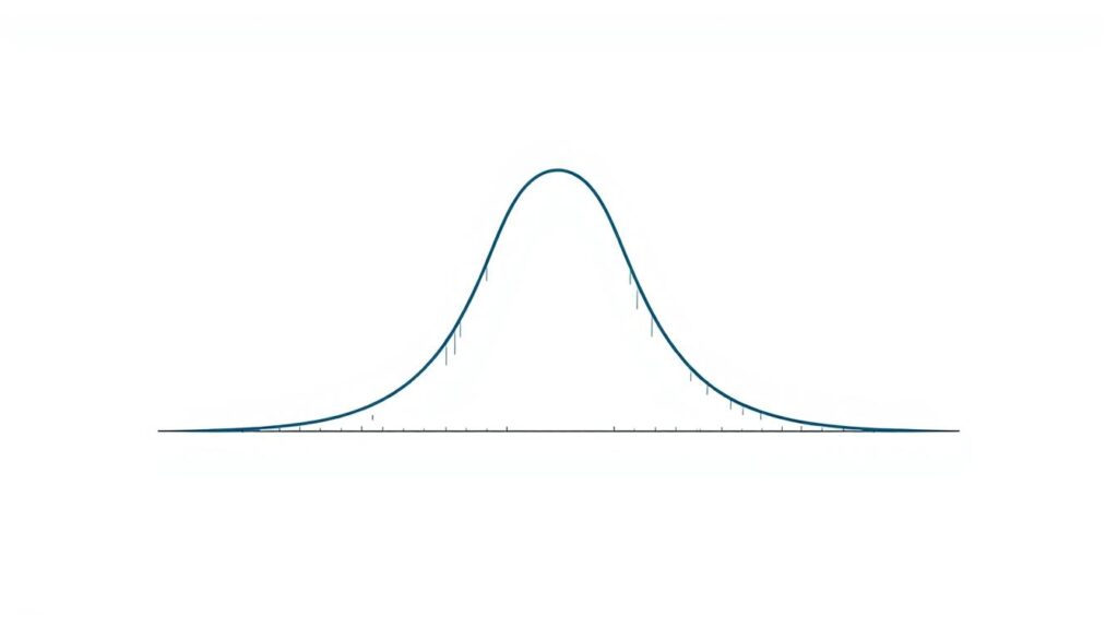
The bell-shaped curve balances symmetry with predictable spread. Three rules define its behavior:
- 68% of values cluster within one standard deviation of the mean
- 95% fall within two deviations
- 99.7% sit within three deviations
This concentration around the center makes it ideal for quality control. Imagine measuring bolt lengths—most cluster near the target size, with fewer outliers.
Visualizing the Bell Curve with Python
Modern tools transform theory into tangible insights. This code generates and plots synthetic data:
import seaborn as sns
import numpy as np

data = np.random.normal(loc=50, scale=10, size=1000)
sns.kdeplot(data, fill=True)
The density function smooths raw data into the iconic curve. Adjusting the loc (mean) and scale (standard deviation) parameters reshapes its center and width.
Understanding Parameters: Mean and Standard Deviation
These values act as the distribution’s DNA. The mean anchors the peak, while standard deviation controls spread. A pharmaceutical company might track drug efficacy:
- Mean = 85% success rate
- Standard deviation = 5% variability
Wider deviations indicate unpredictable results—critical for risk assessment. By mastering these levers, analysts quantify uncertainty with surgical precision.
Analyzing Binomial and Poisson Distributions
What do customer purchases and network outages have in common? Both follow predictable patterns captured by two powerful models. Binomial and Poisson tools decode binary outcomes and rare events—critical for decisions ranging from marketing budgets to infrastructure planning.
Generating Binomial Data Using Python
The binomial distribution function tracks successes in fixed trials. Imagine testing ad campaign performance with 10,000 impressions. Each view represents a trial—click or no click. Use this code to simulate results:
import numpy as np
successes = np.random.binomial(n=10000, p=0.02, size=30)
Key parameters:
- n: Total attempts
- p: Success chance per trial
- size: Simulations to run
Marketers analyze these outputs to predict conversion rates. A cluster around 200 clicks (2% of 10,000) confirms expected performance.
Interpreting the Poisson Distribution for Count Data
Poisson models excel with infrequent, independent events. Cybersecurity teams use it to estimate hourly intrusion attempts. Generate server attack data:
incidents = np.random.poisson(lam=3, size=100)
Lambda (λ) represents average event frequency. This code simulates 100 hours with 3 expected attacks per hour. Histograms reveal clusters between 1-5 incidents—normal fluctuation around the mean.
| Distribution | Use Case | Key Parameter | Code Function |
|---|---|---|---|
| Binomial | Marketing conversions | Probability (p) | np.random.binomial |
| Poisson | IT security monitoring | Lambda (λ) | np.random.poisson |
| Both | Quality control | Sample size | Matplotlib visualization |
Continuous random variables differ fundamentally—they measure uncountable outcomes like time or temperature. Discrete models like these focus on countable numbers: clicks, errors, or alerts. Mastering both types empowers teams to quantify uncertainty in measurable terms.
Exploring Exponential and Uniform Distributions
Time governs outcomes in scenarios ranging from machine maintenance to retail trends. Two models decode these patterns: exponential for intervals between events, and uniform for equally likely possibilities. Their applications reshape how teams predict system failures and optimize resource allocation.
Applications and Real-World Scenarios
The exponential distribution answers critical timing questions. It models continuous random intervals—like hours between equipment breakdowns. Survival analysis uses its memoryless property to predict component lifespans. A cumulative distribution function calculates failure probabilities before specific time thresholds.
Uniform models shine when all values share equal likelihood. Retailers apply them to forecast daily sales between set minimum and maximum thresholds. For example, a store might expect uniform revenue between $8,000-$12,000 on weekdays.
Python implementations reveal these patterns:
from scipy.stats import expon, uniform
# Exponential: 3 failures per year on average
expon.cdf(4, scale=1/3) # Probability of failure within 4 years

# Uniform sales between 100-200 units
uniform.rvs(loc=100, scale=100, size=30)
Adjusting parameters reshapes outcomes. Doubling an exponential rate (λ) shortens expected wait times. Expanding uniform bounds widens potential values while maintaining equal probabilities. Teams use these levers to simulate worst-case scenarios and stress-test systems.
For deeper insights into common distribution models, practitioners combine these tools with domain knowledge. This fusion turns abstract math into predictive power—whether scheduling maintenance or balancing inventory.
Visualizing Data: From Histograms to Density Plots
Raw numbers become meaningful when transformed into visual narratives. Effective graphical representations expose hidden trends, outliers, and concentration areas that spreadsheets obscure. Consider customer wait times: a density plot might reveal peak demand hours invisible in raw timestamps.
Techniques for Effective Data Visualization
Histograms and density plots work together like microscope and telescope. The former bins data into countable intervals, while the latter smooths noise to reveal underlying patterns. This code combines both approaches:
import seaborn as sns
data = [2.1, 3.5, 1.9, 4.2, 3.3]
sns.histplot(data, kde=True, stat='density')
plt.show()
Three customization tips enhance clarity:
- Adjust bin counts to balance detail and simplicity
- Use color gradients to highlight cumulative distribution trends
- Overlay multiple datasets with transparency effects
“A well-crafted visualization answers questions before they’re asked.”
| Technique | Strength | Use Case |
|---|---|---|
| Histogram | Shows exact frequency counts | Identifying data gaps |
| Density Plot | Reveals shape patterns | Comparing overlapping groups |
| Cumulative Plot | Tracks progression | Analyzing percentile thresholds |
The probability density function becomes tangible through these methods. Teams can pinpoint where 80% of errors occur or predict service bottlenecks. Strategic visualization turns abstract functions into decision-making fuel.
Advanced Techniques in Statistical Analysis
Statistical models gain true power when tested against uncertainty. Rigorous validation separates reliable insights from coincidental patterns. This process hinges on two pillars: verifying assumptions through hypothesis testing and refining model accuracy through parameter optimization.
Hypothesis Testing Using Distribution Functions
The Kolmogorov-Smirnov test compares empirical data with theoretical models. Consider testing whether website load times follow an exponential pattern:
from scipy.stats import kstest
data = [2.3, 1.9, 3.1, 4.5, 2.8]
result = kstest(data, 'expon')
print(f"D-statistic: {result.statistic:.3f}, p-value: {result.pvalue:.3f}")
A p-value below 0.05 rejects the null hypothesis. This approach helps validate assumptions about data behavior before building predictive systems.
Parameter Estimation and Model Evaluation Strategies
Maximum likelihood estimation (MLE) pinpoints optimal parameters for observed data. For normal models, MLE calculates:
- Sample mean as central tendency
- Unbiased variance for spread measurement
Evaluate models using metrics like AIC (Akaike Information Criterion). Lower scores indicate better balance between complexity and fit. Teams use these tools to compare alternative distributions objectively.
| Technique | Purpose | Key Metric |
|---|---|---|
| KS Test | Distribution Fit | D-statistic |
| MLE | Parameter Tuning | Log-likelihood |
| AIC | Model Selection | Score Comparison |
Understanding deviation patterns and likelihood surfaces enables precise adjustments. For example, narrowing standard deviation parameters might reveal hidden data clusters. These advanced statistical significance methods transform raw outputs into actionable intelligence.
“Testing isn’t about proving right—it’s about reducing wrong.”
Conclusion
In the realm of data-driven decision-making, mathematical frameworks act as silent architects—shaping predictions through functions that map uncertainty. These models, also called foundational patterns, transform raw numbers into strategic clarity. From bell curves to event-count tools, each distribution serves as a lens for interpreting real-world variability.
Mastery begins with understanding parameters like mean and lambda—values that define how outcomes cluster or spread. A random variable bridges theory and observation, whether tracking server outages or customer conversions. The density function becomes actionable when paired with modern coding examples, turning abstract concepts into measurable insights.
Professionals thrive by experimenting with these tools. Test binomial success rates or simulate Poisson scenarios using the provided snippets. Every analysis strengthens the ability to quantify risks and opportunities systematically.
For those ready to deepen their expertise, resources like SciPy documentation and interactive visualization libraries offer next-level exploration. Embrace these methods not as formulas, but as frameworks for turning ambiguity into advantage. The future belongs to those who decode randomness with precision.
FAQ
How do probability distributions improve machine learning models?
They provide frameworks for modeling uncertainty in data, enabling algorithms to make predictions based on likelihoods. For example, Gaussian distributions help optimize parameters like mean and standard deviation in regression tasks.
What’s the practical difference between binomial and Poisson distributions?
Binomial models count successes in fixed trials (e.g., coin flips), while Poisson describes rare events over time (e.g., website visits per hour). Python’s scipy.stats library simplifies implementing both for count-based analysis.
Why is the normal distribution called "bell-shaped"?
Its symmetric curve peaks at the mean, with probabilities tapering equally on both sides. This shape emerges naturally in datasets like heights or test scores, where most values cluster around a central point.
Can Python visualize exponential distributions effectively?
Yes. Libraries like matplotlib and seaborn create density plots to show exponential decay patterns, useful for modeling wait times or equipment failure rates.
How do mean and standard deviation shape a Gaussian curve?
The mean centers the curve, while the standard deviation controls its spread. A smaller deviation creates a taller, narrower bell curve, reflecting tightly clustered data points.
When should hypothesis testing use distribution functions?
When validating assumptions about data behavior. For instance, testing if a sample follows a Poisson pattern or comparing observed vs. expected outcomes using cumulative distribution functions.
What makes uniform distributions unique in statistical analysis?
All outcomes have equal likelihood within a defined range. They’re ideal for simulating fairness in scenarios like random number generation or Monte Carlo methods.
Are density plots better than histograms for continuous data?
Density plots smooth histogram bins into continuous curves, revealing trends without binning bias. Tools like kdeplot in Python enhance clarity for variables like income or sensor readings.


