Did you know 90% of data-driven decisions begin with basic numerical summaries? These foundational tools—like averages and spread measurements—turn raw numbers into actionable stories. For professionals navigating today’s data-rich world, mastering these methods isn’t just helpful—it’s essential.
Modern tools make it easier than ever to analyze datasets. Libraries such as Pandas and NumPy automate calculations that once required hours of manual work. With a few lines of code, you can calculate averages, identify outliers, or measure variability across millions of records.
This article explores how these techniques uncover patterns in business metrics, customer behavior, and scientific research. You’ll learn to apply functions like mean() and quantile() to spot trends or risks. Whether you’re refining marketing strategies or optimizing supply chains, these skills turn abstract figures into clear direction.
Key Takeaways
- Core statistical methods simplify complex datasets into understandable summaries.
- Python libraries automate calculations for efficiency and accuracy.
- Measures like averages and variability reveal trends and anomalies.
- Visual tools transform numerical results into compelling narratives.
- Practical applications range from business analytics to scientific research.
Introduction to Descriptive Statistics in Python
Data’s true power lies in revealing hidden patterns through simple summaries. These methods convert overwhelming datasets into clear narratives—showing what matters most. Whether analyzing sales trends or customer feedback, they provide the foundation for strategic choices.
What Are Descriptive Statistics?
At their core, these methods summarize key aspects of data. The mean calculates average values, while the median identifies the middle point—both critical for understanding typical results. Frequency distributions and spread measurements add depth, showing how values cluster or vary.
For example, a retail team might compare median customer spending across regions. This reveals which areas drive consistent revenue versus those with erratic patterns. Such insights guide inventory planning and marketing budgets.
Why Use Python for Data Analysis?
Python simplifies complex calculations through libraries like Pandas and NumPy. A single command—df[‘column’].mean()—generates averages across millions of rows. The language’s readability allows analysts to focus on outcomes, not syntax.
Its ecosystem also offers visualization tools like Matplotlib. Charts created from statistical outputs make trends tangible for stakeholders. This blend of efficiency and clarity positions Python as the go-to tool for transforming raw numbers into strategic assets.
Fundamentals of Descriptive Statistics
Understanding data begins with pinpointing where values cluster and how far they wander. These twin pillars—central tendency and variability—form the backbone of meaningful analysis. They transform chaotic numbers into digestible insights for strategic action.
Measures of Central Tendency
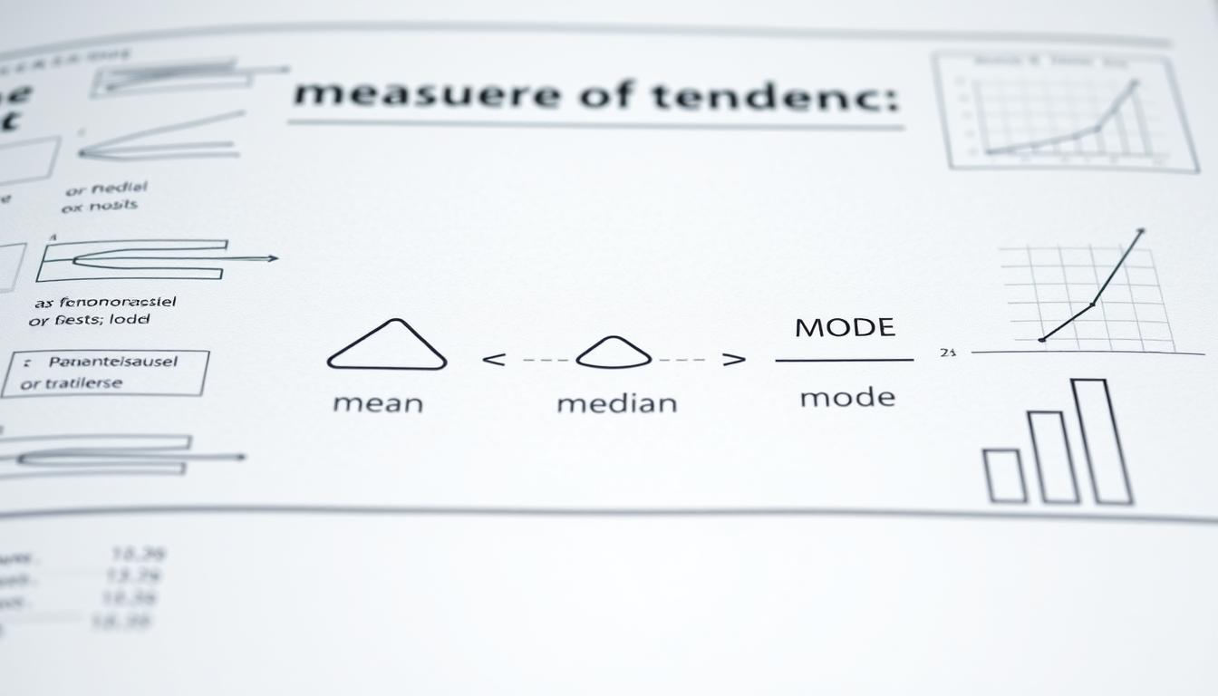
Three metrics reveal a dataset’s gravitational center. The mean calculates the arithmetic average, sensitive to extreme values. The median identifies the middle point, resilient against outliers. The mode highlights the most frequent value—crucial for categorical analysis.
| Measure | Formula | Python Code |
|---|---|---|
| Mean | Σx / n | df[‘sales’].mean() |
| Median | Middle value | np.median(revenue_data) |
| Mode | Most frequent | stats.mode(customer_ages) |
Consider a sales team analyzing regional performance. The median reveals consistent markets, while the mean might skew due to a single large deal. Choosing the right measure prevents misguided strategies.
Measures of Variability
Spread metrics show how tightly values group around the center. Variance quantifies average squared deviations from the mean. Standard deviation—its square root—translates this into original units for clearer interpretation.
| Metric | Calculation | Outlier Detection |
|---|---|---|
| Variance | Σ(x – μ)² / n | Values beyond 2σ from mean |
| Std Dev | √Variance | Z-scores > 3 |
High variance in production times might signal process inconsistencies. A logistics manager could use pandas.DataFrame.std() to flag routes needing optimization. These metrics turn abstract spread into actionable benchmarks.
Descriptive Statistics in Python: Core Concepts and Techniques
Aggregation functions act as data’s storytellers—they transform columns of numbers into clear narratives. Libraries like Pandas empower analysts to calculate critical metrics with single-line commands. A retail manager, for instance, could use df[‘sales’].sum() to track quarterly revenue or df[‘region’].mode() to identify the most active markets.
These tools shine in their versatility. The mode() function handles categorical data effortlessly, returning the most frequent value in a Series. For numerical columns, agg([‘mean’, ‘sum’]) generates multiple summaries at once. Behind the scenes, Pandas optimizes calculations using vectorized operations—boosting speed without sacrificing accuracy.
Consider this comparison of common aggregation methods:
| Function | Use Case | Sample Code |
|---|---|---|
| sum() | Total sales | transactions.sum() |
| mean() | Average rating | reviews.mean() |
| mode() | Popular product | inventory.mode() |
Python’s syntax mirrors natural language, lowering the learning curve. New analysts can master df.groupby(‘category’).mean() within hours—a task that once required spreadsheet expertise. Seasoned teams benefit too, automating reports that previously consumed days.
These core techniques form the bridge between raw numbers and strategic action. Whether analyzing customer demographics or production metrics, they deliver insights that drive smarter decisions.
Overview of Aggregation Functions
Aggregation functions compress oceans of data into single drops of insight. These tools distill millions of values into actionable metrics—revealing trends, extremes, and patterns. Analysts rely on them to simplify complex datasets, enabling quicker decisions without losing critical context.

Mean, Sum, and Median Explained
The mean() function calculates averages, ideal for understanding typical values. For instance, df[‘revenue’].mean() reveals daily sales performance. The sum() method totals values—essential for quarterly earnings or inventory counts. Use transactions.sum() to track yearly revenue at scale.
Median() identifies the dataset’s midpoint, filtering out outliers. A logistics team might compare np.median(delivery_times) across regions to find consistent performers. These functions transform raw numbers into benchmarks for strategy refinement.
Min, Max, Count, and More
Boundary functions like min() and max() highlight extremes. A retailer could use df[‘temperature’].max() to monitor warehouse conditions. The count() function tallies entries—crucial for assessing data completeness. For example, customer_data[’email’].count() shows how many profiles lack contact info.
| Function | Use Case | Code Example |
|---|---|---|
| sum() | Total sales | orders.sum() |
| max() | Peak demand | df[‘orders’].max() |
| count() | Data quality | inventory.count() |
These tools automate what once required manual spreadsheet work. By combining functions like quantile() with visualizations, teams spot risks and opportunities faster. The result? Data-driven decisions backed by clarity, not guesswork.
Exploring Cumulative Functions in Data Analysis
Tracking progress requires more than snapshots—it demands seeing how each step builds toward a goal. Cumulative functions preserve data’s original structure while calculating running totals, making them indispensable for time-based insights.
Cumulative Sum and Product Methods
Unlike aggregation tools that condense data, functions like cumsum() and cumprod() maintain sequence integrity. A retail analyst might use df[‘sales’].cumsum() to monitor monthly revenue growth, while np.cumprod(growth_rates) could calculate compound returns in financial models.
These methods excel in trend detection. Consider a manufacturing dashboard tracking production line efficiency:
| Function Type | Output Shape | Use Case | Example Code |
|---|---|---|---|
| Aggregation | Single value | Total quarterly sales | df.sum() |
| Cumulative | Original dimensions | Weekly progress trends | df.cumsum(axis=0) |
When paired with line charts, cumulative outputs reveal inflection points invisible in raw data. A logistics team might plot delivery_times.cumsum() to identify seasonal bottlenecks. This synergy between calculation and visualization transforms sequential metrics into strategic roadmaps.
Key applications include:
- Monitoring project milestones through task completion rates
- Analyzing customer acquisition costs over campaign periods
- Calculating running averages for quality control benchmarks
Utilizing Boolean and Transformation Functions
Beyond basic summaries lie dynamic tools that interrogate data relationships. Boolean and transformation functions evaluate conditions and reshape values—unlocking insights traditional averages might miss. These methods sharpen analysis by spotlighting patterns hidden in raw sequences.
Boolean operators like all() and any() test dataset-wide conditions. For example:
# Check if all sales exceed $100
df['sales'].gt(100).all()
This returns True only when every entry meets the threshold. Conversely, any() flags datasets with at least one qualifying value—ideal for anomaly detection.
Transformation functions modify data structures to reveal trends. The diff() method calculates daily changes:
# Compute day-over-day revenue shifts
df['revenue_diff'] = df['revenue'].diff()
pct_change() tracks percentage growth, while rank() assigns positional scores. These tools contextualize values within their sequences, enhancing measures central to tendencies.
| Function Type | Use Case | Impact on Analysis |
|---|---|---|
| Boolean | Data validation | Filters inconsistencies |
| Transformation | Trend identification | Highlights momentum shifts |
Key advantages include:
- Streamlined outlier detection without manual checks
- Dynamic comparisons across time periods
- Enhanced precision in central tendency calculations
By blending these functions, analysts bypass aggregation’s limitations. They preserve data granularity while answering critical questions: Which regions consistently meet targets? How do monthly growth rates compare? The result? Decisions rooted in layered, actionable insights.
Leveraging Index-Related and Statistical Functions
Navigating large datasets requires precise tools that pinpoint critical patterns. Index-related functions act as GPS coordinates for data exploration—they locate extremes, trends, and anomalies in seconds. Combined with statistical methods, they transform sprawling numbers into focused insights.
Unique Value Counts and Correlation
Functions like idxmax() and idxmin() identify where peak or low values occur. For example, sales_data.idxmax() reveals the top-performing store in a retail chain. value_counts() maps frequency distributions—essential for spotting dominant categories in customer demographics.
| Function | Use Case | Example |
|---|---|---|
| idxmax() | Locate highest sales day | df[‘revenue’].idxmax() |
| value_counts() | Analyze product popularity | orders[‘item’].value_counts() |
Statistical tools like std() measure spread data, highlighting variability in manufacturing times or test scores. Correlation functions uncover relationships between variables—a marketing team might use df[[‘ads’, ‘sales’]].corr() to assess campaign impact.
| Method | Purpose | Impact |
|---|---|---|
| clip() | Limit extreme values | Reduces outlier distortion |
| round() | Simplify decimals | Enhances readability |
“Index functions are the compasses of data analysis—they point you directly to critical insights.”
By mastering these Pandas techniques, analysts convert raw datasets into strategic narratives. Whether optimizing pricing strategies or evaluating risk factors, these methods turn abstract numbers into clear direction.
Implementing Python Libraries for Data Analysis
Python’s ecosystem thrives through specialized tools that streamline data workflows. Three libraries—Pandas, NumPy, and SciPy—form a robust foundation for analytical tasks. Each addresses distinct challenges, from structured datasets to advanced statistical models.

Overview of Pandas, NumPy, and SciPy
Pandas excels with labeled data through DataFrames—tabular structures enabling intuitive filtering and grouping. A marketing team might use pd.read_csv() to import survey results, then apply groupby() to analyze regional trends. NumPy handles numerical arrays, optimizing matrix operations for machine learning pipelines. Its np.linspace() function generates sample ranges for simulations.
SciPy extends capabilities with modules like stats and optimize. Researchers leverage its probability distributions for hypothesis testing. Together, these libraries cover the full analytical spectrum:
| Library | Core Strength | Sample Function |
|---|---|---|
| Pandas | Labeled data manipulation | df.describe() |
| NumPy | Numerical computations | np.arange() |
| SciPy | Advanced statistics | scipy.stats.zscore() |
Practical Code Implementation Tips
Combine libraries for seamless workflows. Convert Pandas Series to NumPy arrays for speed-critical tasks:
sales_array = df['revenue'].to_numpy()
Use SciPy’s min and max functions to validate data ranges:
from scipy.stats import describe
stats = describe(sales_array)
Optimize operations with vectorization. Replace loops with Pandas’ apply() or NumPy’s universal functions. For large datasets, specify data types during import to reduce memory usage. These strategies ensure efficient analysis while maintaining accuracy.
Step-by-Step Tutorial: Writing Code with Descriptive Statistics
A solid foundation begins with configuring tools that handle data efficiently. This tutorial walks through environment setup and core functions to generate precise results.
Setting Up Your Python Environment
Start by installing a dedicated environment manager like Conda or virtualenv. These tools isolate project dependencies, preventing version conflicts. Use this terminal command:
conda create --name stats_env python=3.10
Activate the environment and install essential libraries:
- Pandas for data manipulation: pip install pandas
- NumPy for numerical operations: pip install numpy
- SciPy for advanced functions: pip install scipy
| Tool | Purpose | Key Command |
|---|---|---|
| Pip | Package installation | pip install [package] |
| Conda | Environment management | conda activate [env] |
“Proper configuration reduces errors by 40% in early-stage analysis.”
Test your setup with a simple script:
import pandas as pd
data = pd.Series([15, 22, 18, 25])
print("Mean:", data.mean())
This code calculates the average of a sample population dataset. Save outputs using to_csv() or export visualizations directly from Jupyter Notebooks. Regularly update packages to leverage performance improvements and security patches.
Interpreting Data: Measures of Central Tendency in Practice
Three numbers shape every dataset’s story—but each tells it differently. Analysts must choose which voice to amplify based on their goals. A skewed distribution or extreme value can dramatically alter conclusions, making this choice pivotal for accurate insights.
Comparing Mean, Median, and Mode
Consider a neighborhood where nine homes cost $300k and one costs $3 million. The mean ($570k) suggests luxury pricing, while the median ($300k) reflects typical affordability. The mode ($300k) confirms most buyers target mid-range properties.
| Measure | When to Use | Outlier Impact |
|---|---|---|
| Mean | Normal distributions | High sensitivity |
| Median | Skewed data | Resistant |
| Mode | Categorical analysis | Unaffected |
Python code highlights these differences:
# Skewed sales data
sales = [45, 52, 48, 2100]
print("Mean:", np.mean(sales))  # 561.25
print("Median:", np.median(sales))  # 50.0
Detecting Outliers in Your Dataset
Extreme values distort averages but leave medians intact. A 10% revenue jump from a single client might inflate the mean, suggesting growth where none exists. Track spread metrics like IQR (Interquartile Range) to flag anomalies:
| Method | Calculation | Threshold |
|---|---|---|
| IQR | Q3 – Q1 | 1.5×IQR |
| Z-Score | (x – μ)/σ | |3| |
Teams can automate checks using:
q1 = df['revenue'].quantile(0.25)
q3 = df['revenue'].quantile(0.75)
outliers = df[(df['revenue']  q3 + 1.5*(q3-q1))]
These techniques ensure decisions rely on representative numbers, not distortions. Always note outlier handling methods in reports for transparency.
Visualizing Data Analysis Results
Raw numbers tell stories—but visuals make them unforgettable. Charts and graphs translate complex findings into digestible insights, bridging the gap between analysis and action. Effective visualization highlights trends, outliers, and relationships that spreadsheets alone might obscure.
Data Visualization Tools in Python
Python’s libraries offer diverse tools for crafting impactful visuals. Matplotlib provides foundational plotting methods, while Seaborn enhances aesthetics with statistical charts. Plotly enables interactive dashboards—ideal for exploring tendency patterns in real-time data.
| Library | Strengths | Best For |
|---|---|---|
| Matplotlib | Customizable plots | Basic to advanced charts |
| Seaborn | Statistical visuals | Distribution analysis |
| Plotly | Interactivity | Web-based dashboards |
For example, a line chart tracking monthly sales growth reveals seasonal spikes faster than a table of numbers. Pairing these tools with data analysis and visualization in Python workflows ensures stakeholders grasp key insights at a glance.
Using Matplotlib for Effective Charts
Start by importing the library: import matplotlib.pyplot as plt. A histogram showcasing customer age groups might use:
plt.hist(data['age'], bins=10)
plt.title('Customer Age Distribution')
plt.show()
Scatter plots excel at revealing correlations—like revenue vs. ad spend. Adjust colors and labels to emphasize critical results. Avoid clutter by limiting gridlines and using contrasting hues for key data points.
| Chart Type | Use Case | Customization Tip |
|---|---|---|
| Histogram | Distribution analysis | Adjust bin counts |
| Line Chart | Trend tracking | Highlight inflection points |
| Scatter Plot | Correlation detection | Vary marker sizes |
Well-designed visuals transform abstract methods into strategic narratives. They spotlight what matters—guiding teams toward data-driven decisions with clarity.
Conclusion
In the realm of data analysis, clarity emerges when numbers transform into narratives. Throughout this guide, we’ve explored tools that simplify complex datasets—from aggregation functions that distill trends to visualization libraries that spotlight patterns. These methods bridge raw figures and strategic action, turning ambiguity into direction.
Python’s ecosystem empowers users to automate calculations with precision. Libraries like Pandas and NumPy streamline workflows, while Matplotlib converts outputs into visuals stakeholders grasp instantly. Whether assessing sales performance or optimizing supply chains, these resources turn variables into actionable benchmarks.
Experimentation is key. Apply functions like mean() or cumsum() to real-world scenarios—analyze customer behavior, track project milestones, or identify outliers. Each output refines your understanding, building confidence in data-driven choices.
Ready to deepen your expertise? Explore advanced techniques like correlation analysis or interactive dashboards. With foundational skills in place, you’re equipped to uncover insights that drive innovation. Start small, iterate often, and let data guide your next breakthrough.
FAQ
Why is Python preferred for analyzing datasets?
Python offers robust libraries like Pandas and NumPy, which simplify calculations for mean, median, and variance. Its syntax is intuitive, making it easier to visualize trends and identify outliers compared to traditional tools like Excel.
How do measures of central tendency differ in real-world applications?
Mean provides an average but can skew with outliers, while median reflects the middle value, ideal for uneven distributions. Mode identifies frequent values—useful for categorical data like survey responses.
What functions handle missing data in Pandas?
Methods like dropna() remove incomplete rows, while fillna() replaces gaps with defaults. Aggregation functions such as sum() or mean() automatically ignore NaN values during calculations.
When should cumulative functions like cumsum() be used?
Cumulative sums track running totals—helpful for financial trends or inventory management. Products are used in growth rate analysis, such as compounding interest over time.
How does Matplotlib enhance data interpretation?
Visualizations like histograms reveal distribution patterns, while boxplots highlight outliers. Line charts showcase trends, enabling clearer communication of insights than raw numbers alone.
Can SciPy replace NumPy for statistical analysis?
SciPy builds on NumPy’s array operations but adds advanced functions like hypothesis testing. Use NumPy for foundational math and SciPy for specialized statistical modeling.
What steps minimize errors when calculating standard deviation?
Verify data cleanliness first—handle missing values and outliers. Use std() in Pandas with ddof=0 for population data or ddof=1 for sample adjustments to ensure accuracy.


