Did you know that over 80% of medical studies predicting outcomes like blood pressure or disease risk rely on a foundational predictive method? This technique doesn’t just shape healthcare—it powers decisions in finance, marketing, and climate science. At its core, it’s about uncovering hidden patterns in data to forecast trends with precision.
Imagine identifying how factors like diet and exercise influence weight changes or determining which business metrics drive revenue growth. This approach connects independent variables (predictors) to a dependent variable (outcome) through a straight-line relationship. By plotting this line, professionals estimate values, test hypotheses, and make data-backed choices.
From assessing patient health risks to optimizing sales strategies, its applications are vast. Researchers use it to isolate critical factors in disease progression, while companies apply it to forecast customer behavior. The method’s simplicity—paired with its adaptability—makes it indispensable for translating raw numbers into actionable insights.
In this guide, we’ll explore how this tool works, why variables matter, and how to implement it effectively. Whether analyzing clinical trials or market trends, you’ll gain strategies to harness its full potential.
Key Takeaways
- Identifies relationships between predictors and outcomes through a straight-line equation.
- Widely used in medical research for risk assessment and treatment analysis.
- Helps businesses forecast trends like sales performance and customer demand.
- Relies on clearly defined independent and dependent variables for accuracy.
- Simplifies complex data into visual, interpretable models.
Introduction to Linear Regression Modeling
From finance to healthcare, a simple line holds the key to forecasting outcomes. This method—central to predictive analytics—transforms scattered data points into actionable predictions by revealing hidden connections.
Understanding the Basics
Regression analysis identifies how changes in predictors influence outcomes. Imagine plotting house prices against square footage on a graph. The regression line—drawn through these points—shows the average relationship. It’s calculated using the least squares method, minimizing distances between data points and the line.
When working with one independent variable, like studying how study hours affect test scores, the model stays simple. Add more variables—like sleep quality or tutoring—and predictions become nuanced. This distinction shapes model accuracy and complexity.
Purpose and Application in Data Analysis
Why do analysts rely on this approach? It answers critical questions: Which factors drive sales spikes? How does exercise duration impact heart health? By quantifying relationships between variables, professionals test theories and make evidence-based decisions.
For a deeper dive into the fundamentals, explore our guide on regression analysis. Upcoming sections will unpack how to interpret coefficients, validate models, and avoid common pitfalls—equipping you to turn raw data into strategic insights.
Fundamentals of Statistical Analysis
Everyday decisions—from budgeting to fitness planning—gain clarity when grounded in structured data patterns. At its core, statistical analysis builds frameworks to decode how factors interact, transforming raw numbers into narratives that drive smarter choices.
Key Concepts in Regression Analysis
A well-designed model acts like a translator for complex data. Consider a company analyzing how advertising spend impacts sales. The line drawn through their scatterplot doesn’t just connect dots—it quantifies the relationship between investment and revenue. This visual tool simplifies trends, letting teams predict outcomes like holiday sales spikes.
Role of Independent and Dependent Variables
Think of independent variables as levers and the dependent one as the outcome they influence. For example:
- Home price (dependent) shifts based on square footage and location (independent).
- Blood sugar levels (dependent) respond to diet and medication (independent).
Each predictor adds nuance. A real estate model might reveal that proximity to schools affects prices more than backyard size. By weighing these relationships, analysts isolate what truly matters—turning guesswork into precision.
Linear Regression Modeling, Statistical Analysis Overview
In predictive analytics, equations act as bridges between raw data and actionable insights. They transform abstract relationships into measurable predictions—whether estimating crop yields from rainfall or customer spending based on income. Let’s dissect the core components that make these calculations possible.
Defining the Regression Equation
The foundation lies in the formula Y = a + bX. Here, Y represents the outcome we want to predict, while X is the predictor. The intercept (a) indicates the baseline value when X is zero, and the slope (b) quantifies how much Y changes per unit of X.
Consider predicting weight based on height. If the equation is Weight = -120 + 5(Height), each additional inch correlates with a 5-pound increase. However, the intercept (-120) suggests unrealistic weight at zero height—a reminder to interpret values within data ranges.
Interpreting the Regression Coefficient
Coefficients reveal relationships. A positive b means variables move together; a negative value implies an inverse trend. For instance:
- A coefficient of 0.8 for exercise hours in a heart health model shows strong benefits from activity.
- A -0.3 coefficient for smoking frequency signals reduced lung capacity.
Missteps occur when analysts overlook context. A steep slope might seem impactful, but if predictors have narrow ranges (e.g., age 50-55 in a study), its real-world significance could be minimal. Always pair coefficient analysis with practical relevance checks.
Preparing and Visualizing Your Data
Before crunching numbers, smart analysts know: clean data tells clearer stories. Preparing datasets involves removing outliers, filling gaps, and selecting variables that truly drive outcomes. A well-organized spreadsheet might reveal hidden patterns—like how exercise frequency impacts blood pressure more than age in a fitness study.
Using Scatter Plots to Determine Linearity
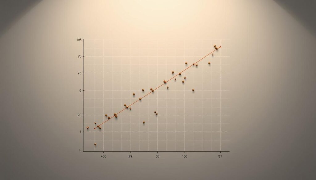
Scatter plots turn raw numbers into visual narratives. Each dot represents a data point—like a person’s income versus their spending habits. When these points cluster along a diagonal path, it signals a linear relationship. If they scatter randomly, the connection may be weak or nonlinear.
Variance matters too. A tight cluster around an imaginary line suggests low variability—ideal for reliable predictions. Wide spreads indicate heteroscedasticity, where accuracy fluctuates across values. Tools like correlation coefficients quantify this relationship numerically, ranging from -1 (perfect inverse) to +1 (direct alignment).
Consider a marketing team analyzing ad spend versus sales. A scatter plot might show higher spending correlates with revenue spikes—but only up to a point. Beyond that threshold, additional investment yields diminishing returns. This visual insight guides smarter budget decisions than raw tables ever could.
By combining graphs with statistical checks, analysts validate assumptions early. They spot skewed distributions, outliers, or unexpected trends—turning messy data into trustworthy models ready for deeper exploration.
Implementing Simple vs. Multiple Regression
How do you choose between a single predictor and a multi-factor approach when analyzing data? The answer lies in understanding the problem’s complexity and the relationships you aim to uncover. Let’s explore how univariable and multivariable methods serve distinct purposes in research.
Differences Between Univariable and Multivariable Models
Simple regression uses one independent variable to predict a value dependent variable. For example, predicting weight based solely on calorie intake. It’s ideal for straightforward relationships where external factors have minimal influence.
Multiple regression, however, incorporates several predictors. A study analyzing job satisfaction might include salary, workload, and workplace culture as variables. This approach isolates each factor’s impact while controlling for others—revealing which drivers matter most.
| Aspect | Simple Regression | Multiple Regression |
|---|---|---|
| Variables | 1 independent | 2+ independent |
| Use Case | Basic trend analysis | Complex relationship mapping |
| Complexity | Low | High (risk of multicollinearity) |
Practical Examples for Effective Modeling
In healthcare research, a univariable model could link exercise duration to heart rate. But adding age and diet as predictors creates a multivariable model with higher accuracy. Each step in this process refines the equation’s predictive power.
Consider a marketing team using linear regression analysis to forecast sales. A simple model might use ad spend as the sole predictor. A multiple approach would include social media engagement, seasonality, and competitor pricing—delivering nuanced insights for budget allocation.
Choosing the right model depends on your one dependent variable and the data’s context. While multivariable methods offer depth, they require larger datasets and careful variable selection to avoid overfitting. Balance simplicity with precision to maximize your research outcomes.
Regression Diagnostics and Validity Testing
Building a predictive model is only half the battle—ensuring its accuracy demands rigorous checks. Diagnostics act as quality control, revealing hidden flaws that could skew results. Without these tests, even a regression model with a perfect straight line might mislead decision-makers.
Assessing Residuals and Homoscedasticity
Residuals—the gaps between predicted and actual values—tell the real story. Analysts plot these errors to check for patterns. Randomly scattered points suggest a well-fitted regression model. Clusters or curves hint at missed relationships.
Homoscedasticity means residuals have consistent spread across all predictor values. For example, a study using one independent variable like education level to predict income should show similar variance for high school and college graduates. Uneven spreads (heteroscedasticity) often require data transformations or model adjustments.
Significance Tests: F-Test and T-Test
Two tests validate a regression model used in research:
| Test | Purpose | Interpretation |
|---|---|---|
| F-Test | Assesses overall model significance | A low p-value ( |
| T-Test | Evaluates individual regression coefficient significance | Identifies which variables (e.g., ad spend vs. seasonality) drive results |
These tests prevent overfitting—a pitfall where models perform well on training data but fail with new inputs. For instance, a healthcare study might discard nonsignificant variables like patient age if the t-test shows no meaningful link to recovery time.
By combining residual analysis with statistical testing, analysts turn raw outputs into trustworthy tools. This process ensures every straight line in simple models—and complex equations in multivariable ones—deliver actionable, reliable insights.
Variable Selection and Model Optimization
Crafting a precise predictive model starts with choosing the right ingredients—variables that matter. Strategic selection separates impactful insights from statistical noise, ensuring your equation reflects reality rather than assumptions.
Streamlining Predictors with Selection Techniques
Three methods dominate variable refinement:
- Forward selection: Begins with zero predictors, adding variables one by one based on statistical significance.
- Backward elimination: Starts with all candidates, removing the least impactful iteratively.
- Stepwise approach: Combines both methods, reassessing variables at each step for optimal balance.
Imagine analyzing customer retention. A stepwise method might retain “support response time” and discard “website color scheme” as irrelevant. This pruning preserves the linear relationship between key drivers and outcomes while reducing computational complexity.
Overfitting risks escalate when models include too many data points. A marketing study with 50 variables might achieve 95% accuracy on historical data—but fail with new inputs. Cross-validation techniques, like splitting datasets into training and testing groups, help identify true predictive power.
“A model with five well-chosen variables often outperforms one with twenty loosely connected predictors.”
When outcomes are categorical—like yes/no purchase decisions—logistic regression replaces linear methods. For instance, predicting loan defaults (binary outcome) requires different math than forecasting home prices (continuous scale). Scatter plots remain vital here, visually confirming relationships before committing to complex calculations.
Best practice? Start simple. Test univariable regression models first, then expand cautiously. Tools like AIC (Akaike Information Criterion) quantify trade-offs between model simplicity and explanatory power—guiding smarter choices for actionable results.
Best Practices for Reporting and Interpreting Results
What separates a reliable study from a misleading one in data analysis? Transparent reporting and disciplined interpretation. Even robust models lose credibility if findings aren’t communicated with precision.
Common Pitfalls in Regression Analysis
Three traps undermine trust in results:
- Misapplying the null hypothesis: Failing to reject it doesn’t “prove” no effect—it indicates insufficient evidence.
- Overlooking relationship variables: Ignoring interactions between predictors (e.g., exercise and diet in health studies) skews conclusions.
- Confusing correlation with causation: A strong link between ice cream sales and drowning rates doesn’t mean one causes the other.
| Pitfall | Solution |
|---|---|
| Omitting value dependent context | Compare predictions against real-world benchmarks |
| Misreporting p-values | Use exact values (e.g., p=0.032) instead of thresholds |
| Ignoring multicollinearity | Check variance inflation factors (VIF) for relationship independent variables |
Tips for Clear Communication of Findings
Transform numbers into narratives. Instead of stating “b=0.4 (p<0.05),” explain: “Each additional hour of training increases productivity by 4%, with 95% confidence.” Use visual aids like coefficient plots to show which predictors impact the one dependent variable most.
“Reports should answer three questions: What did we find? Why does it matter? How sure are we?”
When discussing relationship variables, quantify practical significance. A marketing model might show social media ads boost sales—but if the cost per conversion exceeds profits, the finding loses value. Tools like regression analysis frameworks help structure these discussions.
Always disclose limitations. If your value dependent outcome (e.g., customer satisfaction scores) has measurement errors, note how this affects conclusions. By balancing rigor with clarity, you turn complex outputs into trusted decision-making tools.
Conclusion
At its core, predictive analytics thrives on simplicity—translating raw data into reliable forecasts through tools like the regression equation. This formula, built on the relationship two variables share, turns abstract connections into measurable insights. By interpreting coefficients, analysts uncover how predictors influence outcomes—whether tracking sales trends or health risks.
Clear communication of value remains critical. Every model used must highlight which factors drive results and why. Diagnostic tests refine accuracy, while variable selection sharpens focus on meaningful patterns. Together, these steps transform theoretical equations into strategies that shape decisions in finance, healthcare, and beyond.
Apply these methods with confidence. Start by defining your two variables, validate assumptions, and present findings transparently. Whether optimizing marketing budgets or assessing treatment efficacy, the regression equation bridges data and action—empowering professionals to turn uncertainty into opportunity.
FAQ
What’s the primary purpose of using this method in data analysis?
It identifies relationships between variables by fitting a straight line to observed data. For example, businesses use it to predict sales based on advertising spend or analyze how education levels impact income.
How do independent and dependent variables differ in these models?
The dependent variable represents the outcome being studied—like house prices. Independent variables, such as square footage or location, are inputs believed to influence that outcome. The model quantifies their individual impacts.
When should someone choose multiple regression over simple regression?
Use multiple regression when multiple factors influence the outcome. For instance, predicting crop yields requires analyzing rainfall, soil quality, and fertilizer use together, rather than isolating one factor.
What does a regression coefficient like “0.75” actually mean?
A coefficient of 0.75 suggests that for every one-unit increase in the independent variable, the dependent variable rises by 0.75 units—assuming other factors remain constant. It quantifies the strength and direction of the relationship.
Why is checking residuals critical for model validity?
Residuals—the differences between observed and predicted values—reveal patterns like heteroscedasticity. Randomly scattered residuals indicate a well-fitted model, while trends suggest missing variables or nonlinear relationships.
How do forward selection techniques improve model accuracy?
Forward selection starts with no variables, then iteratively adds the most statistically significant predictors. This avoids overfitting and prioritizes factors with the strongest impact, streamlining the model.
What common mistakes should analysts avoid with this approach?
Overlooking multicollinearity—when predictors are correlated—can distort results. Also, extrapolating beyond the data range or ignoring outliers often leads to unreliable predictions. Always validate assumptions first.
Can scatter plots help assess if a linear relationship exists?
Yes. Scatter plots visually reveal trends. If points cluster around a straight line, linearity is plausible. Curved patterns suggest nonlinear methods—like polynomial regression—might be better suited.
How does R-squared differ from adjusted R-squared in interpretation?
R-squared measures the proportion of variance explained by the model. Adjusted R-squared penalizes adding unnecessary variables, providing a more accurate metric for comparing models with different numbers of predictors.
