There are moments when a fast prototype feels like a victory—and later becomes the source of quiet friction. Teams recall a sprint where a quick build ran, but decisions were scattered across chats and lost over time. That leftover debt steals focus and adds time to every review.
After Andrej Karpathy’s 2025 post, vibe coding surged and tools like Cursor, Figma, Replit, and Claude Code made runnable interfaces easier to produce. Yet speed revealed gaps: linear iteration, naming drift, and decisions trapped in threads. This guide connects that background with a practical path forward.
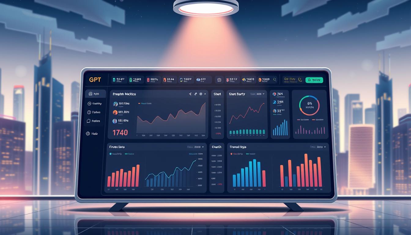
Here we outline a pragmatic approach: name the shared style choices—color, type, spacing, motion—so designers and engineers share a clear language. Supernova, Magic Patterns, and Subframe show how token management, side-by-side exploration, and mix-and-match exports help teams keep momentum while improving quality. We’ll show how a structured JSONC brief, Figma sync, and code export fit into a repeatable workflow that preserves the creative spark and reduces rework.
Key Takeaways
- Speed from vibe coding requires a lightweight system to avoid hidden debt.
- Named style decisions become a shared language across teams.
- Use structured briefs to give AI agents clear intent and fewer magic strings.
- Tools like Supernova and Magic Patterns bridge exploration and repeatable delivery.
- Keep notes and release labels early—small records save time later.
- Adopt canvases for divergent ideas, then converge into token-aligned implementations.
Why design tokens supercharge consistency and speed for Vibe UI
When quick builds grow into products, a lightweight contract between craft and code prevents drift. Tokens act as that contract: named values that survive refactors and keep teams aligned.
One update, many fixes: when code references tokens, a single change propagates across the product. That cuts rework and reduces regression risk.
Centralized stores and Figma sync make management predictable. Supernova maps tokens to platforms, exports usable code artifacts, and documents choices for adoption.
- Faster updates with fewer variants.
- Cleaner runtime and better performance.
- Documented releases that build trust.
| Benefit | Impact | Indicator |
|---|---|---|
| Named values | Consistent visuals | Fewer inconsistent variants |
| Code exports | Faster developer throughput | Shorter time-to-update |
| Versioned releases | Predictable updates | Higher adoption coverage |
Practical note: ban raw values in production, add CI checks, and document why each change was made. For a guided case study, read how teams use a playbook to prevent the vibe coding pitfalls.
Design token fundamentals for Vibe UI teams
Teams win by naming decisions: a single token can stop dozens of tiny inconsistencies.
Consistency through tokens means defining named values across color, type, spacing, radii, shadows, and motion. Names act as stable contracts that survive refactors and keep everyone aligned.
- Types: raw/alias (blue-500) support semantic tokens (button-primary-bg).
- Core categories: colors, typography, spacing, radii, shadows, motion — each should be a named decision, not ad-hoc values.
- Semantic layering: background, surface, overlay names map to elevation and state changes.
- Intent & mode: intent tokens (success, warning, info) decouple meaning from hue; mode-aware tokens swap maps for light/dark without changing component code.
- Component scope: allow overrides like button.border.radius while honoring system constraints.
Keep simple naming rules: clear prefixes, semantic grouping, and stable IDs. Ask the designer to propose tokens rather than one-off values. That practice reduces drift and preserves context across Figma and code exports.
Design Tokens in Vibe UI: a practical step-by-step setup
Declare the naming rules up front; that single act saves hours of rework later.
Start with a clear taxonomy that maps semantic groups—brand, surface, text, intent—so names mean the same thing to everyone.
Define a clear token taxonomy and naming rules your teams can adopt
Set stable prefixes and semantic groups. Keep names forward-compatible and avoid one-off aliases.
Document intent: when a token changes, record why. This lightweight record prevents guesswork during reviews.
Choose the right management tooling: central store, Figma sync, code exports
Stand up a central store with Figma sync and automated code export. Wire the visual source to a publish pipeline so updates flow without manual transcription.
Publish tokens and integrate them into code without hardcoded values
Ban raw hex and px in production. Add CI checks to block hardcoded values and require token references.
Bootstrap a starter kit with a system scaffold, SEO essentials, and AI rules. Feed a JSONC brief to prompt generators so produced code uses tokens, respects modes, and avoids magic strings.
- Define taxonomy and naming rules.
- Stand up a token store with Figma sync.
- Author a JSONC brief (palettes, breakpoints, modes).
- Bootstrap a codebase and add CI checks.
| Step | Action | Outcome |
|---|---|---|
| 1 | Taxonomy & naming rules | Stable, semantic identifiers |
| 2 | Management tooling & sync | Fewer mismatches, faster updates |
| 3 | JSONC brief + prompts | Reliable AI code generation |
| 4 | CI enforcement & releases | Zero magic strings; traceable updates |
Applying tokens to Vibe UI components for consistent, maintainable UIs
When components reference a central set of values, fixes and improvements ripple across products.

Buttons, cards, and tables should consume semantic values for background, text, radius, spacing, and motion. Define primary, secondary, and danger variants with hover, focus, and disabled states stored centrally. This makes each component self-documenting and easier to audit.
Spacing and typography follow a responsive scale so rhythm remains consistent across breakpoints. Avoid bespoke sizes; use the scale for margin, padding, and type so layouts adapt without extra adjustments.
- Map button props to color.bg.primary, color.text.onPrimary, radius.pill, and motion.fast for clarity.
- Define card surfaces with surface tokens, elevation shadows, and consistent content spacing.
- Structure tables with tokenized row height, divider style, hover highlight, and semantic colors for positive/negative trends.
| Component | Key token usage | State examples | Outcome |
|---|---|---|---|
| Button | background, text, radius, motion | hover, focus, disabled | Predictable variants; fewer conflicts |
| Card | surface, elevation, spacing | default, elevated | Consistent rhythm across pages |
| Table | rowHeight, divider, hover, intent colors | selected, hover, sorted | Lean code; easier theme swaps |
| Chart / Status | intent colors, contrast tokens | success, warning, danger | Accessible signals; reliable meaning |
Process: propose or update values, run export generators (for example via Supernova), update stories and docs, then ship behind a versioned release. That flow reduces merge conflicts, improves performance, and centers the user with consistent states and clear focus indicators.
For a practical starter workflow, see the vibe coding starter guide.
Keep the “vibe” without the pitfalls: aligning vibe coding with your tokens
Rapid exploration should stay creative and repeatable. Approved prompt patterns that reference named values and component variants guide AI agents to produce usable results from the first try.
Approved prompt patterns and structured briefs
Use JSONC briefs to compress context: structure, palettes, modes, and breakpoints. That reduces guesswork and keeps the agent aligned with system goals.
Require prompts to propose tokens first, not inline values. This enforces a no–magic-strings policy and reduces late-stage rework.
Explore broadly, deliver consistently
Use canvases for parallel ideas and apply /inspiration to generate rapid options. Mix and match in Subframe to combine strong elements while preserving references to named values.
| Practice | Tool | Outcome |
|---|---|---|
| Approved prompt patterns | Custom GPTs | Fewer course corrections |
| JSONC briefs | Export-to-Figma | Clear agent context |
| Canvas exploration | Magic Patterns Canvas | Multiple actionable ideas |
| Mode-aware testing | Subframe | Early light/dark validation |
Checklist and change controls
- Page-level sign-off must reference surface, text, spacing, and interaction states.
- CI rejects raw hex/px; code reviews enforce tokenized values.
- Treat approved prompts as living artifacts and update them with learnings.
Result: teams keep the creative vibe while avoiding drift, costly changes, and late surprises. For a practical guide on applying these patterns, see a detailed write-up on painless vibe coding and the top principles at Miloriano.
Governance, versioning, and documentation to scale Vibe UI safely
Treat the system like a product: ship releases, log decisions, and measure adoption to prove success.
Ship versioned token releases with clear status labels: proposed, beta, stable, deprecated. Define migration paths and publish notes that explain why a value changed and how teams should migrate.
Ship versioned releases and deprecations
Release cadence matters. Use a management tool that supports versioning and deprecation metadata. Include changelogs and migration guides with each release.
Document examples next to real components
- Do/don’t snippets beside components to reduce ambiguity.
- Live code samples that show the recommended usage and fallback patterns.
- Contribution flow: propose, review (accessibility + theme checks), merge, publish.
Measure adoption and close the loop
Track token coverage per repo, count replaced bespoke components, and measure median time-to-update after releases. Treat documentation as a product: publish blog-style notes and invite feedback.
“Governance that is visible and measurable turns a prototype into a repeatable path to success.”
| Metric | Why it matters | Target |
|---|---|---|
| Coverage | Shows system adoption | 80%+ |
| Replaced components | Reduces bespoke drift | Quarterly growth |
| Time-to-update | Signals release reliability | <7 days |
Advanced modes, intents, and performance with tokens
Mode-aware value swaps make light/dark parity a matter of data, not conditional code paths.
Approach matters: treat mode and intent as a shared set so components never hardcode states. Supernova 3.0’s Product Contexts keep explorations inside brand rules and component libraries, which reduces off-brand variants.
Practical benefits: teams validate contrast and focus once, then reuse those values across every page and feature. That lowers work and improves accessibility at scale.
- Implement light/dark via mode-aware swaps—no code path changes required.
- Encode semantic intent for success, warning, info, and danger so messaging and charts align.
- Centralize contrast and focus for consistent accessibility checks and fewer regressions.
Render performance improves when style variance drops. Shared values encourage common classes and fewer recalculations during runtime.
- Update design values;
- trigger automated exports and MCP-powered commits to editors;
- receive PRs and create tickets in Linear/Jira for fast review and merge.
| Area | Benefit | Outcome |
|---|---|---|
| Product Contexts | Scoped explorations | Fewer off-brand components |
| Specs on tap | Living PRDs | Decisions that stay synced |
| Delivery features | Editor + ticket links | Changes reach repo reliably |
Extend the set first, then add component features that consume those values. That way prototypes graduate with predictable quality: token-aligned, accessible, and ready for production code and review.
Conclusion
E. Prototyping at pace needs a guardrail—simple rules that keep ideas usable and stable.
Core lesson: named values act as a contract that turns fast coding experiments into consistent product code across components and pages.
Follow a short playbook: declare the taxonomy, ban raw values, harden top components, wire Figma to repo, publish versioned releases, and measure adoption.
Prompt discipline matters: attach a JSONC brief, reference shared values and components, and require responsive and mode-aware output. That practice saves minutes on each iteration.
Stand up color and spacing scales first, coach the designer role to use canvases, then ship a first versioned release and set a steady cadence.
Operationalize now—adopt the playbook, measure coverage, publish notes, and keep evolving the system as the single source of truth. Learn more about practical steps at vibe coding for UX designers.
FAQ
What are the first steps to create consistent styles using design tokens?
Start by auditing current visual decisions—colors, type, spacing, radii, shadows, and motion. Convert raw values into a clear taxonomy with semantic names and aliases. Define naming rules so designers and engineers share a single source of truth, then choose tooling for storage and sync.
How do tokens speed up work and improve consistency for Vibe UI?
Tokens turn visual choices into reusable variables, reducing repeated decisions and hardcoded values. Teams ship faster because changes propagate from a central store to Figma and code. Consistency improves across components, prototypes, and production while fewer manual updates lower risk and maintenance time.
What is the difference between semantic tokens and alias tokens?
Semantic tokens represent intent—like “primary-action” or “body-text”—while alias tokens map those intents to platform-specific values. Semantic names act as contracts across design and engineering; aliases let you change platforms or themes without renaming intents.
How should a team define a token taxonomy and naming rules?
Build a simple, logical hierarchy: category (color/type), purpose (background/label), and state (hover/disabled). Use kebab or camel case consistently, avoid platform-specific references, and document rules with examples. Keep names meaningful to both designers and developers.
Which tooling options work best for managing a central token store?
Choose a toolchain that supports a central repository, Figma sync, and automated code exports—options include Style Dictionary, Figma Tokens plugins, and Git-backed token repos. Prioritize publish workflows, CI integration, and clear access controls.
How do you publish tokens and integrate them without leaving hardcoded values?
Automate exports from the token store to platform packages (CSS, JS, JSON). Replace hardcoded values via codemods or lint rules. Include tokens in component libraries and enforce usage through code reviews and build checks.
How are tokens applied to common components like buttons and cards?
Map component properties—background, border, type, spacing, and motion—to named tokens and variants. For states (hover, active, disabled), reference semantic tokens so behavior remains consistent across every instance of a component.
What rules help keep spacing, typography, and responsive scales coherent?
Define scales (base step, multiplier) and tokenized typography styles for each breakpoint. Use spacing tokens for margins and gaps rather than pixel values. Maintain rhythm by aligning token increments with grid and breakpoint rules.
How can teams keep creative exploration while enforcing token alignment?
Allow exploratory canvases or feature branches where designers prototype freely, but require a token-mapping step before merge. Encourage creating temporary tokens for experiments that can be promoted or retired to preserve system integrity.
What are approved prompt practices when referencing tokens for code generation or AI briefs?
Use structured JSONC briefs that reference semantic tokens and component names rather than raw values. Provide clear context: intent, accessibility targets, and responsive needs. This reduces “magic strings” and keeps generated output aligned to the token set.
How do teams avoid “magic strings” and inconsistent styling in code?
Enforce token usage via linting rules, component APIs that accept token keys, and code reviews. Replace direct values with token references in stylesheets and enforce a CI check to flag non-token values before merge.
What governance and versioning practices scale a token system safely?
Ship versioned releases with semantic versioning, status labels (experimental, stable, deprecated), and migration notes. Maintain change logs and a clear deprecation timeline to minimize disruption across teams.
How should documentation be structured to increase adoption?
Place practical examples, do/don’t guides, and code snippets adjacent to real components. Include usage metrics, common replacements, and quick starters for designers and developers to reduce onboarding friction.
Which metrics indicate healthy token adoption and performance?
Track coverage (component properties mapped to tokens), update time from request to release, and the number of custom overrides. Monitor render performance impacts and accessibility outcomes for semantic intents like contrast and focus behavior.
How do tokens support dark/light mode, semantic intents, and accessibility?
Use intent-based tokens that map to theme aliases for dark and light. Define contrast and role tokens for accessibility (errors, success, warnings). Test rendering performance by measuring CSS variables versus static values and optimize where necessary.
What common pitfalls should teams avoid when adopting a token system?
Avoid overcomplication—too many tokens create friction. Resist ad-hoc overrides and lack of documentation. Prevent fragmented tooling by centralizing storage and automating syncs. Finally, prioritize clear ownership and governance to keep the system healthy.

