There is a quiet cost to fast experimentation: prototypes that sprint ahead often leave behind a trail of decisions lost to chat threads and ad hoc files. That hidden debt erodes team confidence and slows product progress.
This piece argues that shared, named values—what teams call tokens—are the valves that release that pressure. When intent travels from mock to code, rationale stays attached; refactors become predictable rather than perilous.
Teams using Vibe practices transform quick experiments into maintainable delivery. Centralized assets, versioned releases, and audited components stop one-off choices from multiplying. The result is less rework and clearer ownership.
Readers will get a pragmatic roadmap: plan taxonomy, create core values, map them to components, and govern changes with metrics. For a concise playbook on practical rules and release discipline, see Vibe coding principles.
Key Takeaways
- Named, shared values carry intent from prototypes to production.
- Tokenized systems reduce hidden debt and speed maintenance.
- Governance—versioning and audits—keeps assets reliable.
- Tooling and sync points turn experiments into repeatable delivery.
- Focus on role names and usage to future-proof product evolution.
Why Tokens Matter Now: From Vibe Coding Speed to Design System Consistency
Fast, natural‑language prompts now spin up working prototypes, but speed without shared rules invites creeping chaos.
Vibe coding rose quickly in early 2025, letting multidisciplinary groups build functioning demos in minutes. That speed helped teams move ideas forward. Yet rapid output also hides risk: architecture‑by‑accumulation, inconsistent interfaces, security gaps, and documentation debt. Teams often feel false confidence because the prototype “runs.”
A design system supplies the missing contracts. Named values act as explicit agreements. Audited components cover variants, states, and accessibility. Clear documentation stores rationale next to examples. Versioning and governance—status labels, release notes, deprecations—give predictable paths for change.
- Publish naming and scoping contracts; ban raw values from production via CI checks.
- Harden top components and wire Figma to live exports.
- Adopt versioned releases, measure adoption, and coach prompts to favor approved paths.
| Fast Prototypes | System with Contracts | Outcome |
|---|---|---|
| Quick demos, local fixes | Named values and audited components | Consistent product behavior |
| Untracked choices | Documentation with rationale | Easier onboarding and audits |
| Drift and repeat rework | CI checks and versioning | Lower maintenance cost |
| False confidence from “it runs” | Instrumented adoption metrics | Faster, safer delivery |
Plan Your Token Taxonomy Before You Start Designing
Start with clear naming rules so every value has a purpose that survives redesigns.
Split your vocabulary into primitives (raw values) and semantics (roles). Primitives hold numbers and hex codes; semantics carry meaning that components consume. This lets teams refactor appearance without changing intent.
Name for intent, not appearance: use labels like color.text.muted or action.primary.bg. That approach keeps colors, type, spacing, radii, shadows, and motion tied to behaviour rather than a specific hue.
Scope tokens per product, theme, and mode. Define inheritance and fallbacks so contributors know when to extend versus reuse. Publish a one‑page rules sheet with naming conventions, allowable ranges, and deprecation policy.
Practical checklist
- Taxonomy: primitives vs semantics.
- Coverage: colors, typography, spacing, sizing, radii, shadows, motion.
- Scoping: product, theme, mode.
- Governance: one‑page contract and review rules.
| Category | Purpose | Benefit |
|---|---|---|
| Primitives | Raw values (hex, px, ms) | Flexible palettes and easy exports |
| Semantics | Role-based names (text, action, focus) | Stable contracts across refactors |
| Governance | Rules sheet, scopes, reviews | Consistent contributions and fewer regressions |
For a practical comparison of rapid prompting workflows and more structured approaches, see this guide.
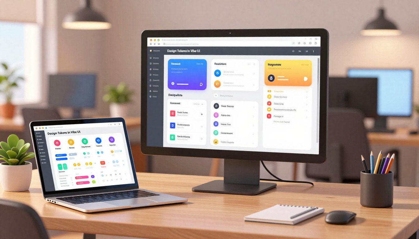
Create Core Tokens That Travel from Design to Code
Teams gain speed and predictability when core values move reliably between design files and production code.
Color roles: define background, surface, content, border, and interactive states. Ensure light/dark parity and add status colors—success, danger, warning, info—with contrast thresholds and usage notes.
Typography: publish families, weights, sizes, and numeric styles. Specify line-height and letter-spacing to lock vertical rhythm for headings, body, and captions.
Spacing & sizing: adopt a modular scale for gutters, stacks, and components to keep density consistent across surfaces.
Radii, shadows, motion: create tiers for corner radii, elevation shadows, and motion timing. Explain how depth and timing signal hierarchy and feedback.
Document rationale: pair each token with a live example and short notes that explain why a value exists. For mode switching, prefer token-level toggles rather than duplicating components.
| Category | What to publish | Why it matters |
|---|---|---|
| Colors | Roles + status | Consistent accessible contrast |
| Typography | Scale + numeric styles | Stable rhythm |
| Spacing | Modular steps | Faster layout decisions |
Map Tokens to Reusable Components for System‑Level Consistency
When semantic values tie directly to components, updates become predictable and fast.
Bind semantic tokens to component slots — text, background, borders, focus, hover, and pressed — so a single change cascades without manual patching. Define variants and states up front and bake accessibility rules (contrast, focus visibility, reduced motion) into each component.
Enforce a ban on raw values through CI and code review. Catch hex codes, stray px values, and one‑off shadows before they reach production code. Harden a prioritized set of high‑traffic components first: buttons, inputs, modals, and tables.
Provide clear usage examples with do/don’t guidance and state matrices that show how tokens apply across success, danger, and disabled cases. Once audited, promote components into the production library to replace custom forks and cut hidden debt.
- Bind semantics to slots so visual fixes propagate globally.
- Document variants, props, and a11y rules for every component.
- Run visual diffs, publish release notes, and offer codemods or lint fixes to ease migration.
The result: fewer regressions, faster updates across teams, and a coding workflow that favors reuse and measurable system health.
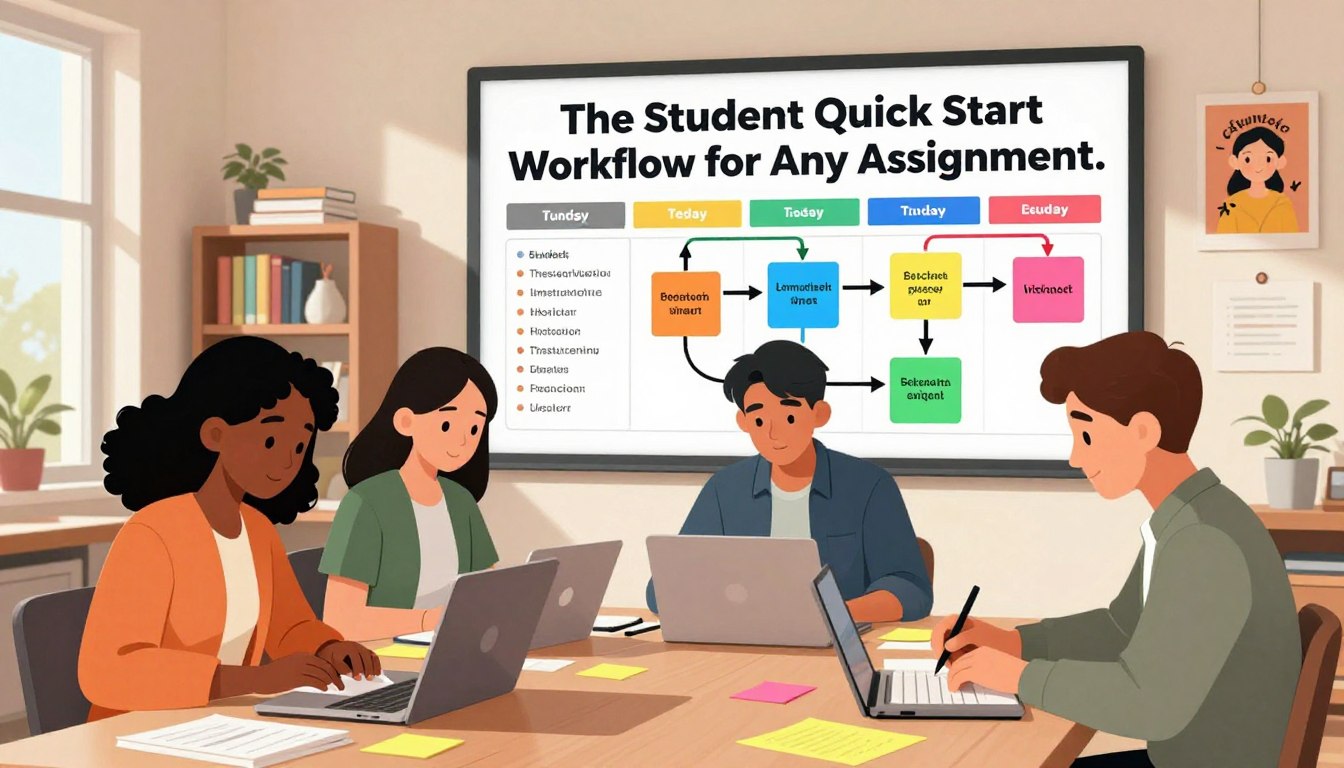
Design Tokens in Vibe UI: A Practical Workflow That Aligns Design and Code
Teams move faster when a brief speaks the language of production code. Start with a compact JSONC design brief that encodes roles, light/dark themes, and responsive breakpoints so the model receives clear, token-aware context.
- Step 1: Create the JSONC brief. Encode roles, themes, and breakpoints so prompts receive precise context instead of vague directions.
- Step 2: Bootstrap a token-aware starter: primitives, SEO essentials, branding rules, and AI guardrails to prevent brittle code and one-off patches.
- Step 3: Implement with a single, rigorous prompt that mandates responsive layouts, theme-aware components, and Tailwind token use—no magic strings.
Use automated verification (Playwright MCP) to check mobile, dark mode, and regressions. Sync Figma to the token source so product decisions land in the repo, not just in chat. Keep sample data isolated and split the UI into small components for safer, iterative coding.
Quote: “Reference tokens and components directly in prompts; avoid raw values to keep code maintainable.”
Tooling Stack That Keeps Tokens Accurate Over Time
When the tool stack centralizes change, drift becomes a measurable event rather than a surprise.
Use a token management platform as the single source of truth. Publish values to multiple targets so engineering consumes the same decisions designers approve. Supernova centralizes tokens, maps them to platforms, and exports production-ready artifacts.
Enable a Figma sync that detects name and value edits. Reconcile those edits into the registry and docs to eliminate drift. Supernova 3.0 adds Product Contexts and Specs on tap to keep names aligned.

- Add automated code exports and transformers to produce framework-ready code and reduce manual errors.
- Pair documentation with live examples, usage notes, and release notes that list what changed and migration steps.
- Integrate MCP or similar delivery so intent flows into editors and trackers as code and tickets without losing context.
The result: faster adoption, clear audit trails, and a system that treats docs as a product feature. For deeper process notes, see Vibe designing with AI.
Governance, Versioning, and Change Management for Tokens
Strong versioning and simple rules turn change into a predictable engineering step. A clear governance layer defines how contributions move from proposal to production. Ship releases with status labels and a deprecation window so upgrades are predictable rather than surprising.
Make adoption measurable. Track token coverage across the codebase, count how many custom components were replaced by system components, and measure time-to-update after each release. These metrics show whether the set is living or leaking.
- Publish a contribution path and review checklist: naming, scope, accessibility, and performance.
- Centralize release notes with diffs, migration steps, and risk flags so downstream apps can plan.
- Provide starters, CLI scaffolds, and templates so the default step generates on-system assets.
- Approve a library of prompts and standard scripts; coach teams to prefer those over free-form output.
Rollback and resilience matter. Keep tested previous versions available and require tests before merging. Treat governance as enabling: give guidance, tools, and approved prompts so compliance becomes the fastest route for teams.
For practical planning and checklists, see a concise guide on planning tokens the right way.
Performance, Modes, and Responsiveness: Tokenized Rules That Scale
Performance-focused token rules prioritize fast rendering while preserving visual rhythm across screens. This section explains how to make theme parity and responsive spacing reliable and measurable.
Start by defining theme-aware values for light and dark mode. Ensure parity so each component behaves predictably when a user toggles modes. Store role names for colors and shadows rather than sprinkling hex or inline px across the repo.
Theme-aware mode tokens
Map color roles and elevations for both modes at the token level. Keep identical keys for light and dark so switching is a value swap, not a rewrite.
Responsive spacing and breakpoints
Express spacing and type scales as step-based values that change per breakpoint. This prevents brittle overrides and keeps density consistent on small and large screens.
| Aspect | Rule | Why |
|---|---|---|
| Performance | Avoid costly shadows & blur tiers | Improves LCP and smoothness |
| Mode | Parity for light/dark keys | Predictable switches for the user |
| Spacing | Tokenized scale per breakpoint | Prevents layout fragility |
- Example: show a component-level case that swaps spacing and color keys across breakpoints.
- Run automated checks: dark contrast, text scaling, and viewport shifts.
- Measure CLS and LCP; adjust tiers if rendering cost spikes.
Quote: “Avoid magic strings; reference system values so code changes stay localized and safe.”
Document responsiveness as context: list which values change at each breakpoint and why. Keep responsive logic with components so refactors remain low risk and measurable.
Conclusion
A structured workflow—brief, starter, implementation—turns prompt-driven prototypes into predictable product work.
Pair fast coding with system rigor: publish named values as contracts, audit components for accessibility, and use one-shot prompts that reference those values rather than magic strings.
Keep the registry synced to Figma and CI rules that block raw values. Ship versioned releases with clear release notes, adoption metrics, and migration steps so teams measure progress and risk.
Provide templates, CLIs, and approved prompts so the right path feels like the easy path. When governance, tooling, and habit align, teams ship features faster, keep quality high, and preserve design intent across the product.
FAQ
What are the first steps to create consistent styles using design tokens?
Start by defining a clear taxonomy: separate semantic roles from primitives. Capture color roles, type scales, spacing, radii, shadows, and motion rules. Document intent and examples so teams share expectations before coding or prototyping.
Why do tokens matter now for speed and system consistency?
Tokens accelerate handoffs and reduce rework. When teams treat tokens as source‑of‑truth, updates propagate through components quickly, reducing visual drift and technical debt while improving development velocity.
How should teams plan a token taxonomy before designing?
Define scope by product, theme, and mode. Create semantic tokens for UI roles and primitive tokens for raw values. Name tokens by intent (e.g., “primary-action”) rather than appearance to keep usage flexible across contexts.
What core tokens should travel from design to code?
Include color roles with palettes and light/dark parity, typography tokens for families and numeric scales, spacing and sizing scales for rhythm, and tokens for radii, shadows, and motion timing. Link each token to live examples and rationale.
How do you map tokens to reusable components for consistency?
Map tokens to component variants and states, enforce accessibility rules, and ban raw values in UI code. Use CI checks and code reviews to prevent regressions and lift audited components into production to cut hidden debt.
What does a practical workflow look like to align design and code?
Begin with a structured JSONC brief that encodes token usage, write prompts that reference tokens and components, bootstrap a token‑aware starter codebase, and keep Figma synced so published tokens match implementation.
Which tools keep token data accurate over time?
Use a token management system that publishes to code, a Figma sync plugin that tracks changes, automated exporters/transformers for multi‑platform outputs, and documentation with live examples and release notes to maintain clarity.
How should governance, versioning, and change management work for tokens?
Adopt semantic releases, status labels, and deprecation policies. Instrument adoption with coverage metrics and time‑to‑update, and provide templates, CLIs, and approved prompts so the right path is the easiest.
How do tokens handle performance, modes, and responsiveness?
Design theme‑aware tokens for light and dark modes, and build responsive tokens tied to breakpoints. This prevents layout fragility and ensures consistent runtime behavior across devices and themes.
How can teams prevent token drift between design files and code?
Enforce a single published source, sync changes from Figma to the token registry, run automated checks on exports, and require token‑based PRs. Regular audits and living docs help catch divergence early.


