There is a moment every team knows: a prototype ships fast, users like it, and then the product drifts. That drift shows as mismatched spacing, brittle code, and a growing pile of undocumented choices. It feels personal—teams crave clarity and control.
The practical answer is simple and powerful: turn decisions into shared, versioned assets. Named values for color, type, spacing, radii, and motion act as contracts between design and code. When one component is audited, one fix can ripple across the system.
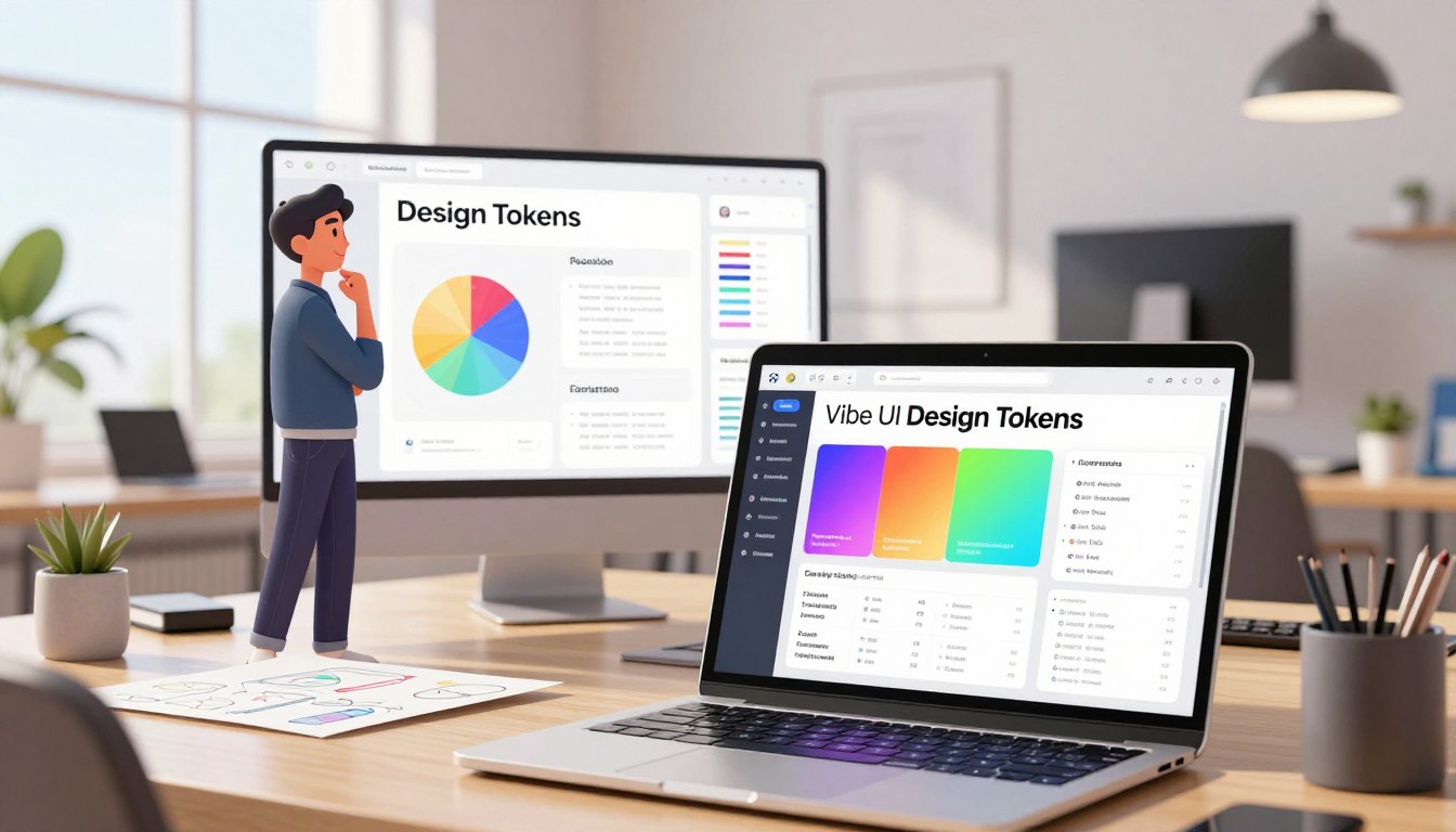
Vibe coding accelerates prototypes but creates hidden dependencies at scale. The right workflow centralizes values, syncs Figma to the system, exports code, and ships versioned releases with clear documentation.
For practical depth, this guide links to implementation notes like Design Tokens in Vibe UI and outlines a playbook: ban raw values in production, harden core components, govern changes, and publish with release notes.
Key Takeaways
- Shared, named values bridge design and code to prevent drift.
- Fast prototyping needs a system to avoid hidden complexity later.
- Centralize assets, sync from Figma, and automate code exports.
- Versioned releases and docs make adoption predictable.
- Governance—contribution paths and deprecations—reduces risk.
Why Design Tokens Matter for Fast, Consistent Vibe UI
Teams reward speed; systems demand repeatability.
Rapid prototyping with natural-language prompts accelerates validation with users, but it can fracture long-term quality. When code grows from many ad hoc snippets, architecture accumulates opaque dependencies and mismatched naming. That drift raises a performance and maintenance tax over time.
From rapid prototypes to production without UI drift
Tokens let decisions travel from mockups to the final product. By referencing named values, code stays predictable; one update can ripple system-wide. This keeps teams moving fast while avoiding visual fragmentation.
Risks of vibe coding at scale
- Code built by trial and error becomes brittle and costly to refactor.
- Decisions scattered across chat logs create documentation debt and slow onboarding.
- Duplicated patterns inflate testing and accessibility work, hurting performance.
| Problem | Impact | How named values help |
|---|---|---|
| Hidden dependencies | Slower refactors, bugs | Central references expose links and simplify changes |
| Documentation debt | Onboarding friction | Versioned specs and release notes keep intent visible |
| Visual drift | Inconsistent product experience | Audited components and naming guardrails prevent fragmentation |
Design Tokens in Vibe UI
Clear, named values make visual choices portable across teams and platforms.
Named decisions cover color, type, spacing, radii, shadows, motion, and semantic roles. Each name carries intent and context so a colour role or spacing step describes purpose, not just a raw value.
Named decisions for color, type, spacing, radii, shadows, and motion
Names become portable rules that components reference. That means variants and states can inherit the same set. Accessibility checks and QA run against the same source of truth, reducing divergence.
How tokens act as contracts from design to code and survive refactors
When code refers to a name, a refactor or theme change replaces the value without rewriting components. Supernova supports token management and publishing, mapping names to web, iOS, and Android and exporting usable code artifacts.
- Encode intent: roles store meaning—accent, background, or status—so teams use values correctly.
- Predictable updates: versioned rules and releases let change roll out safely.
- Figma sync: design edits map into the set to prevent manual drift.
| Concern | Outcome | How named values help |
|---|---|---|
| Scattered overrides | Inconsistent visuals | Central names apply across components and screens |
| Platform parity | Mismatch across platforms | Publish mappings to web, iOS, Android for identical behavior |
| Unclear intent | Wrong reuse and regressions | Annotations and descriptions guide correct usage |
For implementation notes and a practical playbook on avoiding coding pitfalls, see how design systems prevent the vibe coding.
Set Up Your Token Foundation: Workflow, Tools, and Structure
A solid token foundation begins with a clear workflow and a few decisive steps.
Centralize and name core values: Start with a single source of truth for color, typography, spacing, radii, and elevation. Define concise names so intent is obvious as the codebase grows. Use an agreed convention and document it in a shared file.
Sync and source of truth
Establish an automated path: Figma → token management → code exports. Supernova can map sets to web and native and generate usable code artifacts. Add CI checks to flag hardcoded hex and px values before they reach production.
Map to platforms without hardcoding
Publish consistent mappings so background and component behavior match across platforms. Ensure components read values from the system, not local constants.
Practical step sequence and how-to notes
- Create a JSONC design brief and bootstrap a starter kit with SEO essentials.
- Use prompts that enforce token usage, responsive layout, and dark mode.
- Document consumption examples and release notes for designers and engineers.
| Step | Action | Outcome |
|---|---|---|
| 1 | Centralize set | Single source of truth |
| 2 | Automate sync | Fewer drift issues |
| 3 | CI + docs | Safer updates |
For a practical recap and implementation notes, see session recap and a short playbook at vibe coding principles.
Apply Tokens to Components and Layouts in Vibe UI
A resilient product starts when each component has a clear anatomy and rules.
Define component anatomy: Document variants, states, props, and accessibility rules so intent is explicit and reproducible. Audited components let a single fix propagate across pages and screens.
Apply spacing across layouts: use named steps for grids, gaps, and container padding to keep rhythm and reliable space at scale. Components should consume those values, not local constants, so the codebase remains resilient.
Make accessibility a default. Embed keyboard focus, contrast checks, and ARIA patterns into the component so users get a consistent, accessible experience out of the box.
Plan and publish updates with migration notes and deprecations. Validate changes with visual and a11y checks before release to avoid regressions and ensure improvements reach everyone.

Practical example and guidance
Harden the top ten components and pair each with do/don’t examples and code snippets. Show one token change updating buttons, inputs, and banners so teams see the benefit.
- Compose complex UI from smaller, token-aligned parts to reduce duplication.
- Favor semantic roles so light and dark modes inherit consistent behavior without branching logic.
| Focus | Action | Outcome |
|---|---|---|
| Component anatomy | Document variants, states, props, ARIA | Predictable reuse and fewer regressions |
| Spacing & layout | Apply grid steps, gap tokens, padding | Consistent rhythm and scalable layouts |
| Updates & validation | Migration notes, visual/a11y checks | Safe rollouts and happier users |
| Themes | Semantic roles for color and elevation | Elegant dark/light parity |
Color Palettes, Modes, and Semantic Roles
Start color work by mapping intent: brand accents, surfaces, and states.
Use semantic color tokens to separate meaning from value. When names represent purpose, a brand update replaces values, not code. This keeps the app consistent and easier to maintain.
Defining light and dark mode with semantic color tokens
Define both light and dark mode from the start. Match each semantic role across modes and set contrast targets that meet WCAG AA for body and interactive text.
Preview real UI: cards, tables, and charts. Validate that roles read clearly for users and edge cases like overlays and focus rings.
Aligning brand accents, background, and status colors across the system
Keep a minimal, expressive color palette tied to surface, accent, and status roles (success, danger, warning, info). Document when to use each role so intent is clear to teams.
| Role | Light value | Dark value |
|---|---|---|
| Background – surface | #FFFFFF | #0F1720 |
| Accent – brand | #0D6EFD | #4EA8FF |
| Status – success | #198754 | #1E7A4C |
| Text – primary | #0B1726 | #E6EEF6 |
- Avoid raw hex in code; reference tokens so updates are safe.
- Leverage the design system so components inherit modes consistently.
- Capture edge cases and document migration notes for teams.
Governance, Versioning, and Documentation for Token Changes
Systemic change requires rules, not guesswork—define how updates move from proposal to release.
Define contribution paths: map who can propose changes, who reviews them, and which team owns final approval. Make ownership visible so management and stakeholders know responsibilities and milestones.
Use a review checklist to validate naming, accessibility impact, and downstream code consumption. Block merges that add raw values with CI checks.
Release signals and lifecycle
Apply clear status labels—experimental, beta, stable—to signal risk and readiness. Publish release notes that summarize rationale, migration notes, and expected impact so teams can plan updates.
Deprecation and coordination
Mark deprecated items with timelines and provide migration examples. Coordinate across tools so documentation, code exports, and design libraries update together.
| Practice | Action | Outcome |
|---|---|---|
| Contribution | Defined paths and owners | Faster, accountable change |
| Validation | Review checklist + CI rules | Fewer regressions |
| Rollout | Release notes + status labels | Predictable adoption |
Track adoption metrics—token coverage and time-to-update—to spot bottlenecks. Record the rationale for every change so future teams understand context and constraints. Include living before/after examples in the blog and docs to make each change tangible.
AI-Assisted Workflows: Prompts that Respect Tokens and Components
AI agents work best when given clear guardrails that map prompts to your system’s primitives.
Coach prompts, not vibes: write prompts that require token usage, component primitives, responsive layouts, and dark mode. State non-negotiables up front so agents emit code that references the system rather than ad hoc values.
Ban magic strings. Tell the agent to avoid raw hex and px and to reference token names or Tailwind scales. Add a CI check that fails builds containing raw values.
Practical prompt flow
Attach a JSONC brief, the component library, and a token map as context. Ask the agent to bootstrap a starter kit with routing, SEO basics, tests, and token usage.
- Require split files: components, styles, data, and tests.
- Include a one-shot prompt to generate code and a migration file for changes.
- Push results via MCP to editors and create tickets in Linear or Jira for human review.
| Step | Action | Outcome |
|---|---|---|
| Prompt | Explicit rules + context file | Predictable outputs |
| Generate | One-shot starter kit | Less rework |
| Verify | Automated checks + review | Safe merges |
Example usage: include a brief that maps token names to button parts, required breakpoints, and contrast checks. Iterate with screenshots and tests rather than rewrites. Capture stable prompts in docs so teams reuse the same way to request changes.
Conclusion
A repeatable path turns quick prototypes into reliable products that teams can ship with confidence.
Start with a JSONC brief, bootstrap a starter kit, and enforce prompts that refuse magic values. This step sequence preserves speed while adding guardrails.
When the codebase reads shared values, one update alters the whole page and app predictably. Theming stays safe: light and dark swaps follow semantic roles, not raw colors.
Keep docs, examples, and migration notes close to components. Measure adoption and time to update to prove success.
Next action: codify the token set, update your codebase to reference it everywhere, and make prompts non‑negotiable about token usage. For a concise primer, see design tokens primer.
FAQ
What are the first steps to create consistent styles using design tokens?
Start by auditing existing patterns across your product and identifying core values for color, type, spacing, radii, elevation, and motion. Centralize those named decisions in a single source of truth, map them to platform-friendly formats, and document usage rules so teams can apply tokens consistently during prototyping and production.
Why do tokens matter for fast, consistent Vibe UI work?
Tokens speed up iterations by turning visual choices into reusable code primitives. They reduce UI drift between prototypes and ship, make updates predictable, and cut down on duplication across components, pages, and apps—improving time-to-market and reducing maintenance overhead.
How can teams avoid risks like inconsistency and hidden dependencies at scale?
Enforce token usage through review checklists, component APIs, and linting. Document dependencies and migration paths, deprecate raw values, and require PR descriptions that reference the affected tokens. These steps reduce documentation debt and surface hidden coupling early.
What should a token foundation include—workflow, tools, and structure?
A robust foundation includes a centralized repository, a token management tool that integrates with Figma, clear naming conventions for color, typography, spacing, radius, and elevation, and automated exports to the codebase. Define a sync process so design updates flow to tooling and code without manual copy-paste.
How do tokens act as contracts from design to code and survive refactors?
When tokens are treated as immutable primitives with stable names and semantic intent, components reference those names rather than raw values. That contract lets engineers refactor internals while preserving appearance and behavior across versions, ensuring predictable updates.
How do you map tokens to multiple platforms without hardcoded values?
Use platform-specific mapping layers and build-time transforms that convert canonical token names into CSS variables, Swift/Android constants, or JSON payloads. Keep mapping logic isolated so tokens remain the source of truth and platform code avoids literal hex, px, or hardcoded spacing.
What are best practices for applying tokens to component anatomy?
Define variants, states, and accessibility rules at the component level and reference tokens for color, spacing, type, and elevation. Document a component’s required tokens and allowed overrides so teams can compose elements consistently while preserving accessible contrast and spacing.
How do spacing and layout tokens improve page and layout consistency?
Grids, gap scales, and container padding expressed as tokens create predictable rhythm across pages. Teams can use the same spacing primitives for micro and macro layouts, which speeds prototyping and keeps components aligned at system scale.
How should color palettes and modes be structured for light and dark themes?
Define semantic color tokens (background, surface, text, accent, success, warning) and map those tokens to distinct light and dark palettes. This approach separates brand accents from role-based colors, ensuring consistent behavior across modes and makes theme switches straightforward.
What governance, versioning, and documentation practices help manage token changes?
Establish contribution paths, a review checklist, and deprecation policies. Maintain clear release notes, status labels (stable, experimental, deprecated), and predictable rollouts. Automate changelogs and provide migration guides so product teams can plan updates with minimal disruption.
How can AI-assisted workflows respect tokens and component constraints?
Train prompts and internal coaching to require token usage and component primitives—avoid recommending raw hex, px, or ad-hoc spacing. Use prompt templates that reference the token catalog and component APIs so generated suggestions follow system rules and remain implementable.
What tooling helps sync Figma work to token management and code exports?
Use token management platforms that integrate directly with Figma and provide automated exports (JSON, CSS, Swift, Kotlin). Combine that with CI tasks that validate tokens against schema and run visual tests to catch regressions before release.
How do teams propagate a single token update system-wide with confidence?
Rely on automated build pipelines that apply token updates to component libraries and run visual regression tests. Maintain rollout strategies—feature flags or staged releases—and publish clear migration notes so product owners can schedule dependent changes.
What are common mistakes to avoid when adopting a token-first approach?
Avoid ad-hoc naming, mixing raw values and tokens, skipping documentation, and ignoring accessibility constraints. Also, don’t let token management live only in design files; make it a coordinated, cross-discipline process with engineering, product, and design stakeholders.
How do semantic tokens support brand accents and status colors across an app?
Semantic tokens decouple intent from raw palettes: brand accents, success, warning, and error roles are named for their purpose. That lets the same role adapt across themes while preserving tone and ensures consistent status signaling throughout the app.
How should teams handle deprecations and backwards compatibility for tokens?
Provide a deprecation schedule, automated warnings in builds, and clear migration paths. Mark tokens with status metadata, publish compatibility guides, and phase removals with replacements available—this keeps product stability while evolving the system.


