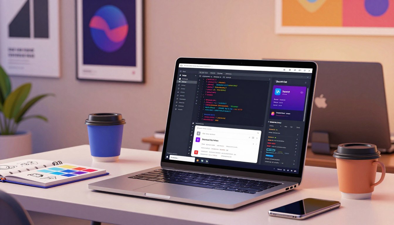
There are moments when a simple idea begs to become a product — a clean interface, a smooth dev loop, and the thrill of shipping. This guide meets that impulse with a clear path from scaffold to deploy.
The stack pairs a modern build tool with a utility-first CSS framework so teams move fast and stay precise. Developers see instant server starts, lightning-fast HMR, and thousands of composable utilities that cut custom CSS.
Readers will learn to scaffold a React project, wire up core css directives, and validate classes during local development. We explain setup commands, config steps, and how classes become the primary styling language for components.
Along the way, the article links practical plugins and vetted patterns to speed delivery without losing accessibility or maintainability. For a component library hook-in, consider the daisyUI install notes at daisyUI install, and for workflow and testing patterns see a modern React guide at Vibe coding techniques.
Key Takeaways
- Scaffold a project quickly and wire Tailwind directives into your main css.
- Use classes as the primary styling language for consistent components.
- Validate the setup with local dev to see instant class rendering.
- Adopt battle-tested plugins and component ecosystems to speed delivery.
- Keep the codebase clean by pruning starter files before building features.
Why Vite + Tailwind is a Modern Stack for Fast, Beautiful UIs
Fast feedback and predictable, class-based styles are the twin engines behind today’s agile UI workflows.
Key benefits: instant dev server, HMR, and utility-first styling
Vite provides an almost instant dev server and fast Hot Module Replacement, which keeps iteration loops measured in seconds.
Tailwind CSS uses utility classes so teams style in markup and write minimal custom css. That reduces global side effects and keeps components predictable.
Prerequisites and environment setup
A current Node.js and npm install is sufficient to get started. Run npm create vite@latest, choose react, then run npm install to prepare the workspace.
Choosing React aligns with examples later, but the wiring works for other frameworks and plain html projects too.
- Fast dev server + HMR: instant previews during development.
- Utility-first styling: granular control without large stylesheets.
- Simple baseline: Node.js, npm, scaffold, install, start.
| Feature | Benefit | Getting started |
|---|---|---|
| Dev server | Instant feedback, quick edits | npm create vite@latest → npm install |
| HMR | State-preserving reloads | Save files, view changes |
| Utility CSS | Consistent, composable styles | Add tailwind css directives to main stylesheet |
For a deeper walkthrough that pairs React with this stack, consult a modern React + Tailwind guide.
Tutorial: Vite + Tailwind — From Project Setup to First Run
Follow these concise steps to scaffold a React project, wire up utility CSS, and confirm live styles in the browser.
Scaffold and clean the starter
Run the scaffold command in your terminal: npm create vite@latest my-tailwind-project and choose the React template (or the TypeScript template). Then cd into the folder and run npm install.
Remove demo clutter: delete public/vite.svg and src/assets/react.svg, clear src/index.css, remove src/App.css, and simplify App.jsx/App.tsx to a lean component. A clean baseline reduces noise when you commit.

Install PostCSS, Autoprefixer and Tailwind
In the terminal run: npm install -D tailwindcss postcss autoprefixer. Initialize configs with npx tailwindcss init -p to create tailwind.config.js and postcss.config.js at the root.
Configure content and directives
Update tailwind.config.js content to ['./index.html','./src//*.{js,ts,jsx,tsx}'] so the JIT engine only generates used utilities.
Add these directives to src/index.css:
- @tailwind base;
- @tailwind components;
- @tailwind utilities;
Import that CSS in main.jsx or main.tsx before rendering App so styles load at start.
Hook into the build and verify
Optionally add the plugin import in vite.config: import tailwindcss from '@tailwindcss/vite' and include it in plugins alongside react().
Start the dev server with npm run dev. Verify classes like text-3xl and bg-gray-100 render correctly.
Project structure tips
Keep src for code, public for static assets, and root-level config files (tailwind.config.js, postcss.config.js, vite.config). Document the steps and commit early to preserve a clear history.
For a guide on building no-code AI products and related workflows, see this practical walkthrough.
Build the UI: Utilities, Components, and Advanced Tailwind Patterns
Designers and engineers build resilient layouts by combining spacing utilities, Flexbox, and Grid in predictable patterns.
Compose structure with p-, m-, and space-x-/space-y- utilities, then add flex (flex items-center justify-between gap-4) or grid (grid grid-cols-3 gap-4) to control flow. Layer responsive prefixes (sm:, md:, lg:) so the same html adapts from phones to desktops.
Use state variants like hover:, focus:, active:, and group-hover: to keep behavior close to markup. Pick a dark mode strategy explicitly: media for system-based switching or class for manual control, then apply dark:bg-gray-900 and dark:text-gray-100 for accessible contrast.
Extend theme in the config to add brand colors and fonts, and create reusable UI via @layer components with @apply (for .btn or .card). Add motion with transition duration-300 ease-in-out and animate-spin or custom keyframes. When precise sizes or colors are needed, use JIT arbitrary values (w-[430px], text-[#1f2937]).
Finally, safelist dynamic patterns in your tailwind.config (arrays or regex) to avoid missing classes in production. For a deeper setup example and config tips, see this comprehensive guide.
Optimize, Deploy, and Extend: Production Builds and Ecosystem Add‑Ons
When code is ready, a single production build transforms development files into a compact, deployable bundle.
Build for production with npm run build. The tool detects production mode and Tailwind’s JIT produces CSS only for the content paths defined in your config. This keeps the final files small and focused on used classes.
Preview the result locally with npx vite preview to catch layout or asset issues before you push. Validating the dist folder avoids surprises on the server and speeds troubleshooting.
- Deploy: point hosting at dist — Netlify (build: npm run build; publish: dist), Vercel (Git/CLI), GitHub Pages, or Firebase Hosting.
- Maintain: ensure the content array in tailwind.config covers all template paths so no classes are omitted in production.
- Extend: add official plugins like @tailwindcss/typography, @tailwindcss/forms, and @tailwindcss/aspect-ratio to the config for consistent UI primitives.
- Enhance UX: integrate Headless UI for accessible behaviors, use ShadCN/UI for ready primitives, or bring Material Design via @material-tailwind/html and APIs such as initAlert or AccordionConfig for typed control.
Centralize plugin registration in your config and document why each plugin exists. That simple discipline keeps the project coherent as it scales.
Conclusion
Following a predictable flow keeps the codebase tidy and the team productive.
strong, clear defaults and a lean scaffold make future work easier. Start the project, install the essentials, set your content paths, add the core css directives, and import the stylesheet in the entry file. Verify changes in the terminal with the dev server and commit early to record decisions.
Pick a dark mode strategy that fits users, safelist dynamic classes, and centralize plugins at the root so each plugin has a purpose. Deploy the dist output to Netlify, Vercel, or GitHub Pages and validate with a minimal example.
For a practical setup example and dev checks, see this dev environment guide. Use these steps as a durable foundation for components and future growth.
FAQ
What are the core steps to start a new project with Vite and Tailwind?
Create a project scaffold using the appropriate framework template, remove unnecessary starter files, install PostCSS and Autoprefixer, add the CSS framework package, and add its directives to your main stylesheet. Then configure content paths in the framework’s config file and import the stylesheet into the app entry before running the dev server.
How does the dev server speed and hot module replacement improve workflow?
The dev server boots almost instantly and HMR updates modules without a full reload. That combination reduces feedback time, lets designers and engineers test styles and interactions quickly, and shortens the edit-refresh-debug cycle for faster iteration.
Which PostCSS plugins are required and why?
Use PostCSS and Autoprefixer alongside the CSS utility package. PostCSS processes directives and plugins; Autoprefixer ensures broader browser support by adding needed vendor prefixes during the build.
How should the content paths be configured to prevent unused styles being purged?
Point the content array to all HTML, JS, TSX/JSX, and component files inside src, pages, and public templates. Include any dynamic or external template locations and safelist patterns for classes generated at runtime to avoid accidental removal.
Where do I place the framework directives and how do I import them?
Add the base, components, and utilities directives to a dedicated CSS entry (for example, src/styles/main.css). Then import that stylesheet in the main JavaScript/TypeScript entry so the build and dev server apply the styles globally.
Is a plugin required to integrate the utility framework with the build tool?
Integration works either by adding an official plugin or by configuring PostCSS with the framework’s processor. Both approaches are valid; choose the one that matches the project’s toolchain and team preference.
What folder layout helps keep a project organized?
Use src for app code, components, and styles; public for static assets; and root-level config files for the build tool, postcss, and the utility framework. This structure keeps configuration discoverable and separates runtime assets from source files.
How can components be made reusable with utility classes?
Compose common patterns using @apply in your CSS for repeated utility combinations, or build small component wrappers that accept class props. Centralize tokens in the config file for colors, spacing, and typography to ensure consistency.
What is the best strategy for dark mode and state variants?
Choose class-based dark mode when you need programmatic toggling and media-based dark mode when relying on user system preferences. Use state variants for hover, focus, and active; prefer small, focused utilities to keep components predictable.
How do JIT and arbitrary values improve design flexibility?
The JIT engine generates classes on demand, enabling arbitrary values and on-the-fly utilities without inflating your stylesheet. That makes it simple to test spacing, colors, and transforms while keeping the build lean.
What steps are needed to prepare a production build and deploy?
Run the build command for an optimized output, verify the dist folder contains the static assets, and test the preview locally. Deploy that output to platforms like Netlify, Vercel, or GitHub Pages, ensuring environment-specific base paths and asset handling are correct.
How can third‑party UI libraries and headless components extend the stack?
Add curated UI kits—such as Headless UI or component libraries that pair with the utility framework—to speed development of accessible patterns. Use design system primitives to retain control over style while accelerating component delivery.
What common pitfalls should developers avoid during setup?
Forgetting to include all content paths, not importing the main stylesheet, mismatching plugin versions, and neglecting to safelist dynamic classes are frequent causes of missing styles. Verify tool versions and run a full build to confirm everything appears as expected.


