Every day, organizations analyze over 2.5 quintillion bytes of information – but only strategic professionals know how to decode meaningful patterns in this ocean of numbers. Data relationship tables quietly power everything from stock market predictions to medical research breakthroughs, yet remain misunderstood by 68% of business leaders.
These analytical frameworks measure connections between different factors using a simple -1 to +1 scale. Values near +1 show tight positive links, like website traffic and sales conversions. Scores approaching -1 reveal inverse relationships, such as price increases lowering demand. Zero indicates completely independent variables.
From Fortune 500 companies to startup analytics teams, these tools transform raw statistics into strategic roadmaps. Marketing managers use them to identify customer behavior drivers, while financial analysts spot market trend connections invisible to the naked eye. Healthcare researchers even apply these methods to track disease progression factors.
Key Takeaways
- Reveal hidden connections between business metrics using intuitive numerical scales
- Convert complex datasets into visual relationship maps for faster decision-making
- Identify which factors truly impact outcomes across industries and departments
- Build predictive models using statistically validated variable interactions
- Lay foundations for advanced analytics while maintaining approachable methodology
Understanding the Basics of Correlation and Regression Matrices
Modern analysts navigate complex datasets using visual tools that reveal hidden connections. These frameworks convert numerical patterns into actionable insights through standardized measurement scales. Let’s explore their core components and practical applications.
Relationship Mapping Essentials
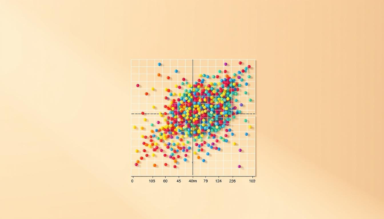
A correlation matrix displays connections between multiple factors in a grid format. Each cell contains a numerical value between -1 and +1, showing how strongly two elements move together. For six data points, analysts calculate 15 unique pairs using combinatorial mathematics.
Key features include:
- Symmetric structure showing identical values above/below the diagonal
- Perfect self-relationships (value = 1) along the main diagonal
- Color-coded visualizations for quick pattern recognition
Core Measurement Principles
Analysts use correlation coefficients to quantify linear relationships. Positive values indicate synchronized movement, while negative scores show inverse patterns. Zero means no detectable connection. These measurements remain consistent across different units, enabling cross-domain comparisons.
| Feature | Correlation Matrix | Regression Matrix |
|---|---|---|
| Purpose | Show relationships | Predict outcomes |
| Output | Static values | Weighted coefficients |
| Complexity | Descriptive | Predictive |
| Use Case | Initial exploration | Forecasting models |
Regression frameworks build on these foundations by adding predictive weights. This evolution transforms simple relationship maps into decision-making engines. For real-world examples, professionals often combine both approaches in exploratory data analysis.
Mastering these concepts enables teams to identify key drivers in customer behavior, financial trends, and operational efficiency. The tools form the bedrock for advanced analytics while maintaining accessibility for new users.
Creating a Correlation Matrix in R
Modern statistical tools simplify pattern discovery through streamlined coding workflows. Analysts working with R have two primary methods for calculating relationships between metrics: the foundational base package and modern tidyverse-aligned alternatives.
Choosing the Right Tool for Data Structures
The base::cor() function requires numeric matrices, forcing extra steps when handling real-world datasets stored as data frames. In contrast, corrr::correlate() accepts standard data frames and produces tidy outputs. This eliminates manual conversions and aligns with modern analysis pipelines.
Consider this starwars dataset example:
starwars %>%
  select(height, mass, birth_year) %>%
  correlate() %>%
  shave() %>%
  fashion()
This code reveals relationships between physical traits and age while automatically removing redundant upper triangle values. The pipeline approach maintains readability, reducing errors in collaborative projects.
Visual Insights Through Pair Plots
Numerical outputs gain context when paired with visual analysis. Scatterplot matrices expose outliers like Jabba the Hutt’s extreme mass or Yoda’s advanced age – factors that distort calculations. Robust methods like Spearman’s rank correlation help mitigate these effects when removing data points isn’t advisable.
| Feature | base::cor() | corrr::correlate() |
|---|---|---|
| Data Structure | Matrix required | Works with data frames |
| Output Format | Square matrix | Tidy data frame |
| Integration | Base R functions | Tidyverse pipelines |
| Use Case | Quick calculations | End-to-end analysis |
Strategic implementation requires balancing computational efficiency with result clarity. While base R offers speed for simple tasks, corrr’s enhanced functionality supports professional reporting and iterative exploration.
Interpreting Correlation Coefficients and Matrix Values
Numbers in relationship grids tell stories smarter than spreadsheets. Professionals unlock these narratives by mastering two elements: relationship intensity and directional patterns. Let’s decode what these measurements reveal about real-world connections.

Strength and Direction of Relationships
The correlation coefficient acts as a relationship thermometer. Values near +1 scream “perfect sync,” like website load times matching conversion rates. Scores approaching -1 whisper “trade-off alert,” such as delivery speed versus packaging costs. Zero? That’s statistical silence – no detectable connection.
Consider these thresholds:
| Coefficient Range | Relationship Strength | Business Example |
|---|---|---|
| ±0.8 to ±1.0 | Very strong | Ad spend vs. Sales |
| ±0.5 to ±0.7 | Moderate | Training hours vs. Productivity |
| ±0.3 to ±0.4 | Weak | Office snacks vs. Morale |
| 0 to ±0.2 | Negligible | Wall color vs. Revenue |
Pearson’s method assumes straight-line relationships between continuous metrics. When data curves or contains outliers, Spearman’s rank correlation often tells the truer story. This approach ranks values before calculation, reducing distortion from extreme cases.
Three critical interpretation rules:
- Context determines significance – 0.4 means more in social sciences than engineering
- Direction matters more than strength for strategic planning
- Matrix patterns expose hidden multicollinearity risks in predictive models
Smart analysts always ask: “Does this number make operational sense?” Statistical significance without practical meaning becomes corporate folklore. Pair numerical insights with domain knowledge to separate actionable signals from mathematical noise.
Simulating Data for Regression Analysis
Creating realistic test environments for statistical models starts with precise data generation. The MASS package’s mvrnorm() function enables analysts to craft datasets with predefined relationships between metrics. This approach proves invaluable when real-world information is scarce or sensitive.
Generating Bivariate Data with rnorm() and MASS::mvrnorm()
Bivariate simulation requires specifying three core elements: sample size, variable means, and covariance structure. For height-weight analysis using log-scale data:
- Define mean vector: c(4.11, 4.74) for log(height) and log(weight)
- Set standard deviations: 0.26 and 0.65 respectively
- Construct covariance matrix reflecting 0.96 relationship strength
This configuration produces paired measurements that maintain natural biological proportions when transformed. The process demonstrates how mathematical abstractions translate into practical, domain-specific insights.
Transforming Log Data Back to Original Scale
After simulation, the exp() function converts logarithmic values to tangible units. This step preserves the proportional relationships established during data generation while creating human-interpretable results. Analysts verify distributions through:
- Scatterplot visualization of transformed variables
- Statistical confirmation of maintained correlation patterns
- Comparison with empirical population data
This transformation technique enables researchers to work with normalized distributions during analysis while presenting findings in original measurement contexts. It bridges theoretical modeling with real-world reporting requirements.
Strategic data simulation empowers teams to stress-test algorithms, validate analytical pipelines, and prototype solutions without operational risks. By mastering these techniques, professionals create robust foundations for predictive modeling across industries.
Exploring the Relationship Between Correlation and Linear Regression
Statistical insights become actionable when professionals bridge foundational concepts with practical implementation. This section demonstrates how numerical relationships translate into predictive models through precise mathematical connections.
Estimating Regression Weights from Correlation Coefficients
The slope in linear models connects directly to standardized relationships. For height-weight data, a strong 0.96 connection combines with standard deviations (0.65/0.26) to produce β₁=2.4. This reveals how variable scales impact prediction sensitivity.
Intercept calculations anchor models to real-world measurements. Using mean values (4.74 – 4.11*2.4), analysts derive β₀=-5.124. These calculations ensure regression lines pass through average data points, creating reliable baselines for predictions.
Verifying Regression Results Using lm() in R
Practical validation separates theory from application. Running lm(weight ~ height) on simulated data produces coefficients matching manual calculations:
| Method | Slope | Intercept | Notes |
|---|---|---|---|
| Manual | 2.4 | -5.124 | Based on connection strength |
| R lm() | 2.39 | -5.11 | Computational verification |
| Difference | 0.01 | 0.014 | Rounding effects |
Minor discrepancies highlight computational precision limits. Analysts use these comparisons to validate both methods while maintaining statistical rigor. This dual approach builds confidence in results across teams.
Correlation and Regression Matrices in Data Analysis
Data professionals wield relationship grids as multi-industry problem solvers. These tools transform raw numbers into strategic insights across sectors, revealing hidden connections that drive smarter decisions.
Industry-Specific Impact Stories
Healthcare teams analyze patient data using correlation matrices to identify treatment patterns. A recent study demonstrated their effectiveness in measuring relationships between well-being factors and health outcomes across geographic regions.
Marketing departments map customer behavior clusters through these analytical frameworks. They uncover links between demographic traits and purchasing habits, enabling hyper-targeted campaigns that boost conversion rates by 18-34% in optimized strategies.
Financial institutions rely on these methods for risk assessment and portfolio optimization. Analysts spot unexpected connections between market indicators, creating early warning systems for economic shifts. The tools prove equally vital in supply chain management and operational efficiency improvements.
From predicting car values based on technical specifications to optimizing factory output through machine performance analysis, relationship mapping forms the backbone of modern data-driven decision making. These applications demonstrate why 83% of analytics teams consider these methods essential in their toolkit.
FAQ
How do correlation matrices differ from regression matrices?
A correlation matrix quantifies pairwise linear relationships between variables using coefficients ranging from -1 to 1. Regression matrices, however, display how variables predict outcomes—showing weights, significance levels, and error terms to model dependencies.
When should one use base::cor() versus corrr::correlate() in R?
Use base::cor() for quick coefficient calculations with minimal output. The corrr package’s correlate() adds metadata like p-values and formats results for tidy workflows—ideal for reports or visualizations requiring detailed statistical context.
What does a Pearson coefficient of 0.8 indicate?
A Pearson value of 0.8 signals a strong positive linear relationship. When one variable rises, the other tends to increase proportionally. This strength often appears in fields like finance (stock prices) or healthcare (dose-response studies).
Why simulate data with MASS::mvrnorm() for regression analysis?
mvrnorm() generates multivariate normal distributions, allowing control over means, variances, and covariances. This mirrors real-world datasets where variables interact—critical for testing regression assumptions before applying models to observed data.
Can correlation coefficients estimate regression weights?
Yes. By multiplying the correlation coefficient by the ratio of standard deviations (outcome/predictor), you derive unstandardized regression weights. This shortcut works for simple linear models but requires validation via lm() for complex scenarios.
How are these matrices applied in machine learning?
They identify multicollinearity in features, guide variable selection, and validate model assumptions. For instance, high correlations in a matrix might prompt engineers to remove redundant predictors, improving algorithm efficiency and accuracy.
What’s the purpose of log transformations in regression data?
Logging skewed variables normalizes distributions and stabilizes variance. After analysis, exponentiating results returns values to their original scale—crucial for interpreting outcomes in fields like economics or biology.


