What if a single mathematical concept could predict stock prices, optimize ad budgets, and forecast disease spread? This isn’t hypothetical—it’s the reality of a foundational technique quietly powering decisions across industries. At its core, this method reveals patterns in numbers, transforming raw information into strategic clarity.
Organizations rely on this approach because it turns uncertainty into actionable plans. By mapping relationships between outcomes and influencing factors, teams identify trends invisible to the naked eye. Retail giants use it to anticipate sales spikes, while healthcare systems predict patient admissions—all through structured data analysis.
What makes this tool indispensable? Its simplicity. Unlike black-box algorithms, it provides transparent equations that professionals at all levels can interpret. A marketing manager might use it to weigh campaign variables, while a researcher tests hypotheses about climate patterns. The applications are as diverse as the variables they analyze.
Key Takeaways
- Transforms raw data into clear predictive insights through straightforward equations
- Drives critical decisions in finance, healthcare, and tech industries
- Serves as a gateway to advanced statistical methods and machine learning
- Prioritizes interpretability over complexity for practical business use
- Bridges theoretical math with real-world problem-solving strategies
As we explore this methodology, you’ll discover how to turn scattered numbers into coherent stories. We’ll break down its mechanics, showcase industry applications, and reveal why it remains a cornerstone of modern regression analysis—even in our age of artificial intelligence.
Introduction to Linear Regression
How do professionals transform ambiguous data into precise strategic roadmaps? The answer lies in a method that quantifies connections between cause and effect—revealing patterns that shape modern business intelligence.
Overview and Importance
This statistical approach thrives on simplicity. By mapping how one variable influences another through a straight-line equation, it delivers insights even non-technical teams can grasp. Retailers predict inventory needs based on seasonal trends. Hospitals forecast patient admissions using historical records. Each application relies on the same transparent model.
Three factors cement its relevance:
- Interpretability: Unlike opaque AI systems, results come as clear equations
- Speed: Rapid analysis identifies trends faster than complex algorithms
- Foundation: Serves as the gateway to neural networks and logistic methods
User Intent and Data-Driven Decisions
Organizations don’t just want predictions—they crave actionable clarity. When marketing teams analyze campaign spend against sales, they’re not guessing. They’re quantifying exactly how dollar inputs drive revenue outputs.
As highlighted in IBM’s guide to this foundational technique, the method excels at turning “what-if” scenarios into measurable plans. Financial analysts use it to stress-test loan approvals. Tech firms optimize server costs based on user traffic patterns. Every decision starts with understanding the relationship between numbers.
This isn’t just math—it’s the language of proactive strategy. By showing how changing one factor impacts outcomes, it transforms reactive guesswork into confident foresight.
Fundamentals of Linear Regression Modeling
Imagine plotting sales data on a graph and seeing a clear path emerge—a diagonal slash cutting through scattered points. This visual anchor forms the backbone of predictive analysis. At its simplest, the method quantifies how one factor drives another through measurable connections.
Key Concepts and Terminology
Every analysis begins with two core elements: the dependent variable (outcome being predicted) and independent variables (factors influencing outcomes). Think of housing prices—square footage and location act as independent drivers, while the sale price depends on them.
Three critical components define the relationship:
- Slope (b): Measures how much Y changes per unit increase in X
- Intercept (a): Baseline value when X equals zero
- Residuals: Gaps between predicted and actual values
Simplest Form: The Straight Line Equation
The equation Y = a + bX acts as a universal translator for data patterns. For every $1,000 increase in marketing spend (X), sales (Y) might rise by $5,000—captured by a slope of 5. This straight line becomes a decision-making compass across industries.
| Component | Business Interpretation | Example |
|---|---|---|
| Slope | Impact strength | Each employee training hour increases productivity by 2.4% |
| Intercept | Baseline performance | $12,000 base sales with zero ad spend |
| R-squared | Explanatory power | 85% of revenue changes explained by campaign variables |
Financial analysts use this framework to assess risk, while marketers optimize budgets. The regression line doesn’t just describe data—it reveals opportunities hidden in the numbers.
Understanding Independent and Dependent Variables
Clarity in data analysis begins with mastering two pillars: what drives change and what needs predicting. These pillars—predictor variables and response variables—form the backbone of every strategic insight.
Defining Predictor and Response Variables
The response variable answers the “what” in your analysis. It’s the outcome you measure—like quarterly sales growth or patient recovery rates. Think of it as the destination on your analytical map.
Predictor variables act as the compass. These factors—marketing budgets, temperature readings, or customer demographics—guide the direction of your results. A retail chain might use store location (predictor) to forecast foot traffic (response).
| Variable Type | Role | Examples | Business Context |
|---|---|---|---|
| Continuous Predictor | Measured numerically | Ad spend, temperature | Optimizing campaign ROI |
| Categorical Predictor | Group-based analysis | Product category, region | Inventory allocation strategies |
| Response | Measured outcome | Revenue, conversion rate | Performance benchmarking |
Healthcare analysts might track medication dosage (predictor) against symptom improvement (response). The relationship reveals whether treatments deliver expected results.
Choosing variables requires domain expertise. A financial model predicting loan defaults needs different drivers than one forecasting energy consumption. The right pair transforms raw numbers into decision-making fuel.
The Mathematical Framework Behind Regression
Every strategic decision hinges on understanding cause and effect—mathematically quantified through two numerical anchors in regression equations. These components transform abstract relationships into measurable business rules.
Slope, Intercept, and Their Interpretations
The slope coefficient acts as an impact multiplier. In healthcare research analyzing height-weight relationships (Y = -133.18 + 1.16 × X), each centimeter of height corresponds to 1.16 kg weight increase. This precise quantification enables scenario modeling across industries.
| Component | Strategic Value | Real-World Example |
|---|---|---|
| Slope | Measures effect per unit change | 3.2 revenue increase per $1 marketing spend |
| Intercept | Baseline prediction at zero input | -133.18 kg weight at 0 cm height* |
| Coefficient | Direction & strength of relationship | 1.16 kg/cm weight-height ratio |
*Interpret intercepts cautiously—zero height isn’t practical here, but the value remains crucial for accurate predictions. As noted by McKinsey analysts: “Coefficients become decision catalysts when tied to operational contexts.”
Financial teams use these parameters to assess loan risk, while retailers optimize staffing based on sales forecasts. The regression line doesn’t just describe data—it prescribes actionable adjustments.
Assumptions Underlying Linear Regression Analysis
Trustworthy predictive models don’t emerge by accident—they’re built on rigorous statistical foundations. Validating core assumptions separates actionable insights from flawed conclusions that could misguide business strategies.
Linearity and Independence
The relationship between variables must follow a straight-line pattern. If marketing spend versus sales curves upward, transformations like logarithms might better capture the true relationship.
Independent observations prevent skewed results. Analyzing monthly revenue? Ensure each data point represents unique periods—not overlapping measurements that artificially boost accuracy.
Normality and Consistent Variance
Residuals should cluster around zero in a bell-shaped curve. This allows reliable confidence intervals—crucial when forecasting inventory needs or loan default risks.
Homoscedasticity maintains consistent error spread. Uneven variance? Predictions might falter for high-value customers or extreme temperatures. Diagnostic plots reveal these hidden issues.
| Assumption | Diagnostic Tool | Business Impact |
|---|---|---|
| Linearity | Scatterplot analysis | Identifies need for variable transformations |
| Independence | Durbin-Watson test | Prevents inflated accuracy claims |
| Normality | Q-Q plot | Ensures valid probability estimates |
| Equal Variance | Residual vs. fitted plot | Maintains prediction reliability |
As McKinsey notes in their analytics playbook: “Models built on validated assumptions become decision-making superpowers.” Regular checks using residual plots and statistical tests keep analyses grounded in reality—not mathematical fantasy.
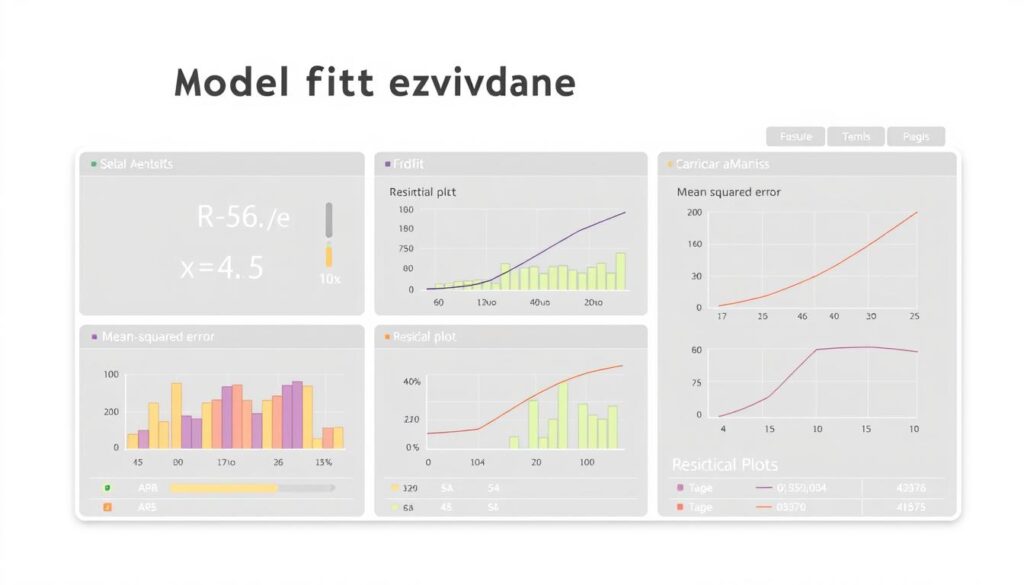
Evaluating Model Fit and Performance
A marketing team celebrates hitting their revenue target—only to discover their predictions missed crucial customer trends by 22%. This gap between theory and reality underscores why assessing model fit separates reliable forecasts from costly guesses.

The Story Behind R-Squared
The coefficient of determination (R²) acts as a truth-teller. Ranging from 0 to 1, it reveals what percentage of outcome variance your equation explains. A value of 0.85 means 85% of sales fluctuations link to your chosen predictors—leaving 15% unexplained. As detailed in this guide to assessing model fit, R² helps teams identify when to hunt for missing factors like competitor pricing or seasonal demand.
Prediction Errors That Speak Volumes
Root Mean Squared Error (RMSE) measures average prediction gaps in actual units—like dollars or product units. If your sales forecasts miss by $12,000 on average, RMSE quantifies that risk. But smart analysts don’t stop there. Residual plots expose hidden patterns: clusters of overestimates for premium products might signal pricing sensitivity.
| Metric | Strengths | Blind Spots |
|---|---|---|
| R-Squared | Shows explanatory power | Ignores absolute error scale |
| RMSE | Quantifies real-world impact | Doesn’t reveal error patterns |
One supply chain team discovered their “accurate” model (R²=0.91) consistently underestimated demand during holidays—a trend only visible in residual analysis. Combining metrics creates safety nets. High R² with erratic residuals? Your model might capture trends but miss exceptions. Low RMSE with weak correlation? Check for data leaks or measurement errors.
Gradient Descent and Parameter Optimization
How do algorithms transform raw numbers into precise predictions? The answer lies in a systematic approach that fine-tunes mathematical relationships until they mirror real-world patterns. This optimization process acts as the backbone of accurate forecasting across industries.
Understanding the Cost Function
The Mean Squared Error (MSE) measures prediction accuracy like a financial auditor scrutinizing discrepancies. It calculates the average squared difference between estimated and actual values. Lower MSE means tighter alignment between your model and observed data.
Consider a retail chain predicting holiday sales. Each 1% reduction in MSE could represent thousands in saved inventory costs. The cost function guides this refinement by quantifying where predictions diverge from reality.
Learning Rate and Convergence
Choosing step sizes in optimization resembles hiking down a foggy mountain. Large leaps might miss the optimal path, while tiny steps waste energy. The learning rate controls this balance:
| Learning Rate | Advantages | Risks |
|---|---|---|
| High (0.1-1.0) | Fast initial progress | Overshooting minima |
| Moderate (0.01-0.1) | Balanced approach | Potential slow convergence |
| Low (0.001-0.01) | Precise adjustments | Computationally intensive |
Financial analysts using gradient descent techniques often start with moderate rates, adjusting based on error reduction patterns. This mirrors how marketers A/B test campaign variables—iterative testing leads to optimal outcomes.
The best models evolve through controlled experimentation. By monitoring cost reduction curves, teams identify when adjustments yield diminishing returns—signaling it’s time to lock in parameters or gather fresh data.
Hands-on Coding: Building a Linear Regression Model
Transforming statistical theory into operational tools requires bridging the gap between equations and executable code. This practical approach converts abstract concepts into decision-making engines—one line of Python at a time.
Importing Libraries and Loading Data
Every analysis begins with three core tools: pandas for data manipulation, numpy for numerical operations, and scikit-learn for machine learning tasks. Loading a dataset reveals immediate insights—missing values, outliers, or unexpected patterns that demand attention.
Data Visualization and Model Fitting
Scatterplots expose relationships between variables, while histograms highlight distribution quirks. Fitting the model involves two critical steps:
- Defining predictor and response columns
- Training the algorithm on historical patterns
Making Predictions
The trained model generates forecasts on new data. Analysts evaluate accuracy through metrics like R-squared—quantifying how well advertising spend predicts sales, or how temperature affects energy consumption.
Real-World Applications of Linear Regression
From Wall Street trading floors to digital marketing war rooms, organizations leverage predictive power to shape critical strategies. This statistical approach transforms raw numbers into actionable roadmaps—revealing patterns that drive measurable outcomes across industries.
Predictive Analysis in Finance and Marketing
Financial institutions deploy linear regression to assess credit risk and forecast market trends. Analysts evaluate how variables like employment history and debt ratios influence loan repayment rates. These models help banks balance profitability with risk exposure in real-time decision-making.
Marketing teams use regression analysis to optimize advertising budgets. By testing campaign variables against conversion rates, they pinpoint high-impact channels. A/B test results become quantifiable guides for allocating resources across platforms.
Retailers apply these methods to predict holiday inventory demands. Healthcare systems forecast patient admissions using historical patterns. Each case demonstrates the versatility of data-driven models in solving complex operational challenges.
The true value emerges when theoretical frameworks meet real-world data. Whether predicting stock fluctuations or customer lifetime value, linear regression turns historical patterns into strategic foresight—proving its enduring role in modern analytics.
FAQ
How do predictor and response variables differ in analysis?
Predictor variables (independent) are inputs used to explain changes in the response variable (dependent), which represents the outcome being studied. For instance, in marketing campaigns, ad spend might predict sales revenue, where revenue is the response.
Why are normality and homoscedasticity critical in residuals?
These assumptions ensure statistical tests remain reliable. Normality allows accurate confidence intervals, while homoscedasticity—consistent residual variance—prevents skewed error terms that could distort conclusions.
What does R-squared reveal about model performance?
R-squared quantifies how well predictor variables explain the response variable’s variance. A value of 0.8 means 80% of variance is accounted for, though it doesn’t confirm causation or guarantee out-of-sample accuracy.
How does gradient descent optimize model parameters?
By iteratively adjusting coefficients to minimize the cost function (like Mean Squared Error), gradient descent “descends” toward optimal values. The learning rate controls step size, balancing speed and precision to avoid overshooting minima.
Can these techniques predict trends in financial markets?
Yes—they identify relationships between variables, such as interest rates and stock prices. However, market complexities like volatility often require hybrid approaches (e.g., adding regularization) to improve robustness.
What’s a common pitfall when interpreting coefficients?
Assuming correlation implies causation. For example, while higher education levels may correlate with income, unobserved factors like networking opportunities often play hidden roles. Always validate with domain expertise.


