Slow and cluttered websites can lose trust. A founder lost a pitch because the demo froze. This is common: 42% of visitors leave if a site doesn’t work well.
38% leave if a site looks bad. This guide is for those who want design to help their business grow.
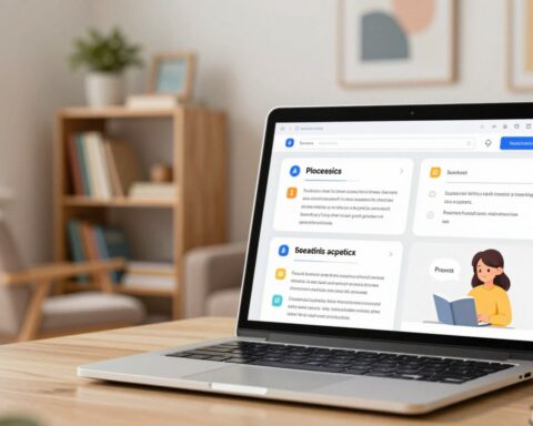
Web design is about making sites work well. It’s about being fast, easy to use, and looking good on all devices. It’s about being found online and being easy for everyone to use.
This article shares tips for making websites better. You’ll learn about typography, colors, and how to make your site easy to use. You’ll see examples from big names like Burberry and Netflix.
It’s written for people who want to make a difference. Each part gives you steps to follow and ways to check if it works. It’s all about making your site better.
Key Takeaways
- Design must balance visuals with usability to protect conversions.
- Website optimization targets speed, responsiveness, and clear navigation.
- User experience is central: accessibility and SEO-friendly structures matter.
- Real-world examples (HubSpot, Netflix, Semrush) show practical application.
- The guide provides actionable steps to turn design work into measurable outcomes.
Understanding the Importance of Web Design
The first look at a site can change how users act. A site’s look tells if it’s trustworthy and what it does quickly. Sites like Semrush and Hostinger use big images and clear messages to grab attention fast.
Google’s simple homepage shows how less is more. It makes things easier to understand and faster to get. Good design means choosing the right fonts, colors, and images to help users quickly get what they need.
Good design has clear goals like keeping users longer and making them take action. Use the 60/30/10 color rule to guide the eye. A clear layout and space help users find what they need fast.
This makes the site better for users and helps it work better for the business.
The Role of First Impressions
People decide fast if they want to stay. Cluttered or old sites often lose visitors. A clean hero section and clear message build trust and make users less likely to leave.
Design elements must match to show a strong brand. This meets what users expect.
User Experience and Engagement
Being easy to use keeps users coming back. Clear navigation, fast loading, and working well on phones keep users interested. Hick’s Law says to limit choices to make decisions quicker.
Brands that make it easier to act often see more people doing so.
- Limit primary choices to reduce decision fatigue.
- Prioritize mobile flow and load performance for retention.
- Use whitespace and hierarchy to lead the eye to CTAs.
Small changes can make a big difference. Testing different CTA words, layouts, or images can really help. Focusing on how users feel helps improve the site and business over time.
Key Elements of Effective Web Design
A good website is both pretty and useful. This text talks about the main ways to make a site easy to use, show off a brand, and work well on all devices. It’s useful for teams at startups, agencies, and in-house design groups.
Responsive Design Techniques
Start by thinking about mobile users first. Make sure important content is easy to find and use on small screens.
Use flexible grids, fluid images, and CSS breakpoints to make layouts work on all devices. Make desktop menus smaller for phones; Etsy does this to make navigation easier.
Test your site on different devices and make sure it works well on touchscreens. Claire Escobedo says hover actions don’t work on phones, so use tap-friendly options instead.
Color Theory and Branding
Color affects how we feel and what we do. Use the 60/30/10 rule: main color for brand, secondary for structure, and accent for calls to action. This makes things clear and focused.
Choose colors that work well together and make text easy to read. Avoid using pure black for long text; a darker gray is better for your eyes.
Look at real brands for inspiration. BuzzFeed uses bright colors to energize and blue for links. A small studio might use cream and red to draw attention.
Typography Considerations
Choose fonts that are safe for the web and easy to read on all devices. Use about 16px for body text to make it readable on phones and tablets.
Stick to two or three font families and have a clear order: body (14–16px), subheads (18–22px), and headings (up to 32px). This makes it easy to scan.
Use fonts with lots of characters for translations and support for many languages. Wrike’s choice of a strong font family shows how important typography is for global teams.
Crafting a User-Centric Experience
A user-centric site is clear, fast, and easy to predict. Designers think about what visitors want to find and do. They make decisions based on this, improving the site for everyone.
Prioritizing Navigation
Make primary menus simple and put them at the top. This way, users can scan quickly. Keep options limited and site maps shallow.
Use a search bar and footer navigation for extra help. Add links in body copy to help users find their way. Make sure dropdowns and mega menus are clear and offer mobile options.
Test how users navigate your site. Tools like Hotjar show where people get stuck. This helps improve your site’s navigation.
Accessibility Features
Begin with semantic HTML and good alt text for screen readers. Make sure keyboard navigation works everywhere. Avoid controls that don’t work on touch devices.
Design for color contrast and resizable text. Choose easy-to-read fonts and keep sizes consistent. Test translations to keep everything looking right.
Clean code is key for accessibility and speed. It helps assistive tools and makes your site work better. This improves the site for everyone.
For tips and examples, check out web design best practices. They cover menu names, breadcrumbs, and testing methods.
Implementing Visual Hierarchy
A clear visual hierarchy helps users find what’s important. It uses size, color, and placement to guide the eye. This makes it easy to navigate and improves results.

Using Layouts for Clarity
Layouts aim to show what’s most important first. Use rules like the rule of thirds to place key elements. This follows how people naturally look at things.
Use only three sizes for text and images: big, medium, and small. This makes pages easy to read. For landing pages, use symmetrical layouts for balance. For a more dynamic look, choose asymmetrical grids.
Look at Semrush and Mercedes-Benz to see how it works. Adding simple visual cues helps users scan faster. Learn more at visual analytics techniques.
The Impact of Whitespace
Whitespace makes things easier to understand. It uses big spaces between sections and small spaces in text. This helps users quickly find what they need.
Google uses simple pages to draw attention. The right amount of space makes buttons and forms stand out. Use whitespace with borders or blocks to group things together.
When whitespace matches the visual hierarchy, teams make better decisions. Small gaps help focus and keep users engaged.
Optimizing Website Speed
Fast loading speed is key for a good brand image. It lowers bounce rates and boosts mobile use. Small tweaks can greatly improve user experience and keep them coming back.
First, find out where your site slows down. Look at big images, scripts, and CSS. Then, use smart fixes like compressing images and caching to make your site fast.
Image Compression Methods
Use new formats like WebP or AVIF for smaller images. Make images responsive so they fit each device well. Focus on big images and thumbnails for the biggest savings.
Choose the right compression level for each image. Use automated tools to optimize images during the build. Add lazy loading for images not yet seen to speed up the site.
Browser Caching
Use Cache-Control and ETag to let visitors reuse resources. Cache static assets for a long time and update them only when needed. A CDN makes your site faster by serving assets closer to users.
Minify CSS and JavaScript and inline critical CSS to speed up your site. Keep an eye on cache performance and adjust as needed. These steps help your site load faster and stay fast.
| Area | Action | Expected Impact |
|---|---|---|
| Images | Convert to WebP/AVIF; resize; lazy load | Lower bytes, faster first paint, improved mobile performance |
| Assets | Minify CSS/JS; inline critical CSS | Reduced render-blocking, quicker interactivity |
| Caching | Set Cache-Control; use ETag; implement hash-based caching | Fewer requests, faster repeat views, lower bandwidth |
| Delivery | Use CDN; enable HTTP/2 or HTTP/3 | Lower latency across geographies, improved perceived speed |
| Build Process | Automate image compression methods; asset fingerprinting | Consistent small payloads and reliable cache invalidation |
The Role of Content in Design
Good content makes a site look great. It sends clear messages and has a nice structure. It also uses visuals well to turn visitors into customers.
Creating compelling copy starts with headlines that grab attention fast. Use short lines and easy-to-read subheads. Words like “Get Started” help people take action.
Match your messages with what buyers want. Use short bullets to answer questions. Try different call-to-actions to see what works best.
Incorporating visuals strategically helps people understand faster. Use pictures and charts to explain things quickly. Make sure images help tell the story, not get in the way.
Make every image count: save space, look good on all devices, and add text for search engines. Choose images that help move things forward.
Design your content for every part of a page. Keep text and images easy to read on any device. This makes your site work well everywhere.
- Use concise headlines to state the core benefit.
- Place visuals near the supporting claim or data point.
- Write CTAs with clear verbs tied to user intent.
- Ensure responsive, accessible images with alt text.
Combine text and images to tell a clear story. When teams work together on copy and visuals, they create a smooth experience. This experience encourages people to take action.
Mobile-First Design Approach
The world is moving to mobile screens. We need to focus on content, speed, and touch. Start with the smallest screen and make everything bigger. This makes websites work better on phones.
Now, let’s talk about making websites for touchscreens and testing them on different devices. We’ll share tips to make websites feel right on phones and tablets.
Designing for Touchscreens
Make sure buttons are big and far apart. Buttons should be at least 44×44 pixels. Don’t put controls near the edges where thumbs rest.
Remove actions that only work with a mouse. Use clear tap feedback instead. Make navigation simple and use a hamburger menu or bottom navigation for complex sites.
Put important calls to action where thumbs can easily reach them. Etsy’s mobile app shows how big images and simple product flows can increase sales.
Make forms easy to use on the go. Use special input types to get the right keyboard. Enable autofill and ask for fewer fields. Avoid pop-ups that interrupt the flow on small screens.
Testing Across Devices
Test websites on real devices and emulators. Use Google’s Mobile-Friendly Test and Lighthouse audits for feedback. Check how fonts and images look and how touch works on different systems.
Test how websites work on slow networks. Check how websites look on different devices. Make sure websites are accessible on mobile, including screen readers and color contrast.
Use the table below to compare key test areas, tools, and success criteria. This helps teams focus on what needs to be fixed to improve mobile experience.
| Test Area | Recommended Tools | Success Criteria |
|---|---|---|
| Performance | Lighthouse, WebPageTest | First Contentful Paint ≤ 1.5s; Core Web Vitals in good range |
| Touch Interaction | Real devices (iPhone, Pixel), Browser devtools | Buttons ≥ 44px; no hover-only controls; consistent tap feedback |
| Responsive Layouts | Chrome DevTools, BrowserStack | Content readable at all breakpoints; no horizontal scroll |
| Form Usability | Manual testing, automated form tests | Appropriate input types; autofill enabled; low abandonment |
| Accessibility | axe, VoiceOver, TalkBack | High contrast; screen reader labels; keyboard focus order logical |
| Network Simulation | Chrome DevTools throttling, Network Link Conditioner | Acceptable perceived speed on 3G/4G; graceful loading of assets |
SEO Best Practices in Design
Good web design and search performance go together. When teams focus on SEO-friendly design, they make pages that both users and search engines like. Start by planning the structure, then refine the markup, metadata, and visuals for speed and clarity.
Clear structure helps crawlers and screen readers. Keep code lean and logical so pages load fast. Clean code reduces DOM depth and minimizes parsing time. This improves user experience and indexing efficiency.
Next, add focused markup and tags that signal relevance. Use schema where useful to enable rich results. Craft concise titles and descriptions that invite clicks without keyword stuffing.
Apply the following practical steps to align design with search goals.
Structuring HTML for Search Engines
- Use semantic HTML5 elements: header, nav, main, article, section, footer for clear content zones.
- Maintain heading hierarchy: one H1, logical H2 and H3 flow, descriptive headings that match user intent.
- Embed schema.org markup for products, articles, FAQs, and events to surface rich snippets.
- Keep clean code and shallow DOM: fewer nested elements speeds rendering and improves crawlability.
Integrating Meta Tags Effectively
- Write concise meta titles and descriptions that include primary keywords and prompt clicks.
- Provide descriptive alt text for images that is useful to users and includes relevant phrases naturally.
- Optimize URL slugs for readability and relevance; set canonical tags to prevent duplicate content issues.
- Implement Open Graph and Twitter Card tags to control social previews and boost share CTR.
| Area | Design Action | SEO Benefit |
|---|---|---|
| HTML Structure | Use semantic elements and logical headings | Improved crawlability and accessibility |
| Code Quality | Minimize DOM depth and remove unused scripts | Faster rendering and lower bounce rates |
| Meta Implementation | Craft targeted titles, descriptions, and alt text | Higher CTR and clearer search relevance |
| Structured Data | Add schema for applicable content types | Eligibility for rich results and enhanced listings |
| Social Tags | Include Open Graph and Twitter Card metadata | Better appearance when shared, higher engagement |
Using Call-to-Actions Wisely
Good call-to-actions help when design, words, and testing work together. This part shows how to make them better and test them for better results.
Put main CTAs in easy-to-see spots: at the top, near the big picture, and at page ends. Don’t confuse users with too many choices. Use Hick’s Law to guide them to one action.
Make CTAs pop with contrast, space, and size. Square’s white “Get Started” button on a video background is a great example. Remember, mobile users need big, clear buttons to click easily.
Placement and Visibility
Use the same look for CTAs so users know where to find them. Put extra actions below or next to the main one. Test colors, shapes, and words to see what works best.
Icons and short text help without making it too busy. Show live updates like new sign-ups to build trust. For more design ideas, check out a focused gallery of CTA patterns here.
A/B Testing for Optimization
Make a guess before testing: change one thing at a time, like words or color. Watch the main numbers like CTR and conversion rate. Also, keep an eye on bounce rate and time on page.
Use small animations to catch the eye without messing up the flow. Skylum’s small text changes show how small tweaks can make a big difference.
Keep testing and improving. A regular A/B testing routine helps get better results. Keep track of what works, scale it up, and fix any problems.
Analytics and User Feedback
Data helps make design choices. Using numbers and what users say makes websites better. Teams that use both improve things that help more people and make things easier.
Utilizing Heatmaps and Analytics Tools
Use tools like Google Analytics, Hotjar, or Microsoft Clarity to see how users move. Heatmaps show where people click and scroll. This helps find content that’s not seen and where to put calls to action.
Look at bounce and conversion rates with session recordings. This helps decide what to fix first. Do A/B tests to check if changes are good. Use tools to see how things change over time and how each change affects things.
Collecting User Feedback
Use short surveys and on-page widgets to get what users think. Short surveys get more answers. Keep surveys to four questions to make them quick.
Use different ways to ask for feedback like email, mobile app, social media, and phone calls. Don’t ask too often to keep users interested. Offer rewards like points or discounts to get more feedback.
Also, do interviews and usability tests to check your ideas. Make a list of things to fix, from small changes to big ones. Use what you learn to keep making your website better.
| Method | Typical Time | Strength | Use Case |
|---|---|---|---|
| On-page survey | ~1 minute | High completion | Quick sentiment check on a page |
| Email feedback | 2–3 minutes | Moderate response | Detailed user comments after interaction |
| Usability interview | 15–45 minutes | Deep insight | Validate design decisions and personas |
| Heatmaps & session recordings | Continuous | Visual behavior data | Identify interaction gaps and mobile issues |
| A/B testing | Varies | Statistical validation | Confirm changes improve conversion rates |
For tips on when to ask for feedback and how often, check out this guide: user feedback best practices. Use what you learn to make it easier for users to see how great your product is.
Staying Updated with Design Trends
Keeping a site current is a mix of watching and acting. Web design changes fast. Teams should watch trends, test ideas, and update based on results.
This keeps the site easy to use. It also lets in new ideas to make things clearer and better.
Following Industry Leaders
Watch sites like Awwwards, Smashing Magazine, Flux Academy, and HubSpot blogs. They show new trends in design and performance. Look at how Burberry or Netflix updated their look.
See how they changed their text and calls to action. Also, follow Google Lighthouse and Web.dev for updates on making sites better for everyone.
Adapting to User Preferences
Start with data: check ideas with numbers and user tests. Mix new with what’s known—pick trends that make things better. Avoid trends that make things hard to use.
Do regular checks, compare with others, and try new things. This helps keep up with changes like more mobile use, different languages, and making sites better for everyone.
FAQ
What are the core priorities for modern websites?
Modern websites should load fast and be easy to use. They should look good and work well on all devices. It’s also important to make sure they can be found online.
How quickly do first impressions form and why do they matter?
First impressions happen in seconds. They show if a website is trustworthy and clear. Good images and clear text help make a good first impression.
What usability issues most commonly drive users away?
Users often leave because of bad navigation, slow loading, and mobile problems. Make sure your website is easy to use and loads quickly.
Should designers build mobile-first or desktop-first?
Design for mobile first. Most people use mobile devices to visit websites. This helps make sure your website works well on all devices.
How should color be used to support branding and conversions?
Use colors to make your brand stand out. Stick to a few colors and use them consistently. Make sure text is easy to read.
What are key typography guidelines for web readability?
Choose fonts that are easy to read on the web. Use a few fonts and keep text sizes consistent. This makes your website easy to read.
How deep and simple should site navigation be?
Keep your navigation simple and easy to find. Use clear labels and don’t have too many levels. This helps users find what they need quickly.
What basic accessibility features are essential?
Make sure your website is easy for everyone to use. Use clear language, images with text, and make sure it works with keyboards. This helps everyone access your website.
How does layout influence user attention and conversions?
A good layout draws attention to important parts. Use size, color, and placement to guide users. A clear layout helps users find what they need.
Why is whitespace important in web design?
Whitespace makes your website easy to read. It helps highlight important parts and makes your website look clean. This improves how users understand your website.
Which image formats and techniques best improve load speed?
Use new image formats like WebP to make your website faster. Serve images that fit the screen size and compress them. This makes your website load quickly.
How can browser caching and CDNs improve performance?
Use caching and CDNs to make your website faster. This helps your website load quickly for everyone. It also makes your website more reliable.
What makes copy compelling on a homepage?
Use clear and concise language on your homepage. Make sure your message is clear and easy to understand. This helps grab users’ attention.
How should visuals be used to support messaging?
Use images and graphics to explain complex ideas. Make sure your visuals are clear and easy to understand. This helps users understand your message better.
What are best practices for designing touch-friendly interfaces?
Make sure your website is easy to use on mobile devices. Use large buttons and clear text. This makes it easy for users to interact with your website.
How should teams test responsive behavior across devices?
Test your website on different devices and browsers. Use tools to check how your website looks and works on various devices. This helps make sure your website works well everywhere.
Which HTML practices help SEO and accessibility?
Use HTML5 and clear structure to help search engines and users. Make sure your website is easy to navigate and understand. This helps everyone find and use your website.
What meta and social tags should be included?
Use clear and descriptive tags to help people find your website. Make sure your website looks good on social media. This helps more people see your website.
Where should CTAs be placed for maximum impact?
Place CTAs where they are most visible and important. Use clear and large buttons to make them stand out. This helps users take action.
How should A/B testing be run for design changes?
Test different versions of your website to see what works best. Use clear goals and measure the results. This helps you make your website better.
Which analytics tools reveal user behavior effectively?
Use tools like Google Analytics to understand how people use your website. Combine this with feedback from users. This helps you make your website better.
How can teams collect actionable user feedback?
Ask users for feedback and listen to what they say. Use this feedback to make your website better. This helps improve your website for everyone.
Where can designers follow emerging patterns and case studies?
Follow websites and blogs that share new ideas and examples. Look at how other websites work and what they do well. This helps you make your website better.
How should teams decide which design trends to adopt?
Choose trends that make your website better. Test new ideas and see if they work. This helps you make your website the best it can be.

