Did you know modern data systems generate over 2.5 quintillion bytes daily? Yet 90% of organizations struggle to extract meaningful patterns from this avalanche of numbers. One century-old statistical method quietly powers breakthroughs in fields ranging from genetic research to climate modeling by turning chaos into clarity.
First conceptualized by Karl Pearson in 1901, this approach revolutionized how we handle complex datasets. It thrives where traditional methods falter—processing incomplete records, mixed data types, and measurement errors. By identifying hidden relationships across variables, it transforms overwhelming spreadsheets into visual roadmaps for decision-makers.
From Fortune 500 companies to cutting-edge labs, teams use these techniques to spot trends, isolate anomalies, and simplify intricate systems. Its mathematical elegance lies in preserving critical information while stripping away redundant noise—a digital decluttering process for the information age.
Key Takeaways
- Foundational statistical method for simplifying complex datasets across industries
- Excels at handling messy real-world data with missing values and mixed formats
- Reduces information overload without sacrificing critical insights
- Rooted in early 20th-century mathematics with modern applications
- Enables visual discovery of patterns through multivariate data analysis
Introduction to Dimensionality Reduction in Data Analysis
Imagine navigating a library where every book is written in a different language—this mirrors the chaos of high-dimensional datasets. Modern systems track everything from genetic markers to consumer behaviors, creating intricate webs of interconnected variables. Simplifying these complex relationships isn’t just helpful—it’s a strategic imperative for effective decision-making.
Understanding High-Dimensional Data and Its Challenges
Real-world datasets often resemble sprawling cities with countless streets (variables) and intersections (relationships). In genomics, researchers might measure 20,000 gene expressions across 100 patients—a 200:1 variable-to-sample ratio. Financial models tracking market indicators face similar complexity, with hundreds of economic metrics influencing outcomes.
Three critical issues emerge:
- Distance calculations lose meaning as data points scatter across dimensions
- Visualization tools hit hard limits beyond 3D space
- Traditional statistical methods collapse under computational weight
The Curse of Dimensionality Explained
Adding dimensions exponentially increases the “empty space” between data points. Imagine searching for a friend in a stadium—easy with seat rows (2D), impossible if seats also float at different heights (3D+). This spatial dilution makes pattern recognition and machine learning models less effective.
In practice, datasets with 1,000 variables require 1 billion data points to maintain the same density as a 10-variable dataset. Most organizations work with sparse information, creating mathematical ghosts—relationships that appear significant but vanish under scrutiny.
Overview of Principal Component Analysis
In an era where data complexity outpaces human comprehension, a century-old technique reshapes how we process information. This method converts tangled variables into clear patterns through mathematical orchestration—transforming noise into actionable intelligence.

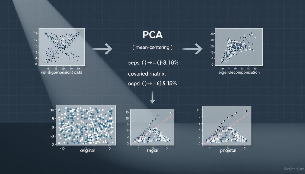
The approach works by identifying dominant directions in multidimensional data. These directions—called principal components—capture the most significant variations between data points. Imagine condensing a 300-page financial report into three bullet points that preserve 90% of its insights.
Three core strengths define this method:
- Creates simplified visual maps from chaotic datasets
- Prioritizes variables contributing most to data spread
- Maintains statistical rigor while reducing complexity
By maximizing captured variance, the technique preserves critical relationships between observations. Financial analysts use it to spot market trends hidden across 50+ indicators. Biologists apply it to isolate gene expressions driving diseases from thousands of measurements.
The mathematical backbone ensures reliability. Through eigenvalue decomposition, the system ranks components by importance. First components explain most variation—later ones address residual patterns. This hierarchy lets professionals focus on what matters while auditing minor factors separately.
Mechanics Behind PCA: Scaling, Covariance, and Eigen Concepts
What do master chefs and data scientists have in common? Both know raw ingredients need proper preparation before creating something extraordinary. In dimensional reduction, variables require careful adjustment to reveal their true relationships.
Data Standardization and Mean Centering
Imagine comparing temperatures in Fahrenheit and Celsius without conversion. Standardization solves this by giving all variables equal footing. The Z-score method transforms measurements to have a mean of 0 and variance of 1, preventing dominant scales from distorting patterns.
| Variable | Raw Data | Standardized |
|---|---|---|
| Income | $12,000 – $250,000 | -1.2 to 2.8 |
| Age | 18 – 85 years | -0.7 to 1.9 |
| Purchase Frequency | 0 – 30/month | -1.1 to 3.4 |
Mean centering shifts data around a new origin—the average observation. This repositioning simplifies calculating how variables spread and interact. Without it, the analysis would be like navigating a city without street signs.
Computing the Covariance Matrix and Extracting Eigenvalues
The covariance matrix acts as a relationship map between variables. Diagonal entries show individual spread, while off-diagonal cells reveal hidden partnerships. A financial dataset might expose how interest rates and stock prices move together.
“Eigenvectors are the compass needles pointing to a dataset’s true north—the directions where meaningful variation occurs.”
Extracting eigenvalues ranks these directions by importance. The highest values correspond to vectors capturing the most variance. This process transforms chaotic data into an organized hierarchy of insights. For a practical guide on implementing these steps, explore this dimensional reduction process.
Three critical outcomes emerge:
- Standardized data ensures fair variable comparison
- Covariance matrices expose hidden relationships
- Eigenvalues prioritize impactful patterns
Step-by-Step Exploration of the PCA Process
Think of data points as stars in a galaxy—their true relationships become visible only when viewed from the right angle. This method constructs mathematical lenses to reveal hidden patterns in multidimensional datasets. Let’s examine how professionals transform raw variables into strategic insights through systematic simplification.
Deriving the First and Second Principal Components
The journey begins by identifying the primary axis of variation. Through advanced calculations, this line captures the most spread in the data—like finding the main street in a city’s chaotic road network. Each data point gets projected onto this axis, creating simplified coordinates called scores.
Next comes the secondary axis, mathematically guaranteed to point in a completely different direction. This orthogonal relationship ensures no overlap in captured patterns. Together, these axes explain most data spread while maintaining independence—like using longitude and latitude to map Earth’s surface.
Forming the Model Plane and Projecting Data
When combined, the two axes create a visualization window. This plane acts as a strategic filter, preserving critical relationships while discarding noise. Data points transform into constellations on this 2D map, revealing clusters and outliers invisible in higher dimensions.
“The model plane turns mathematical abstraction into actionable intelligence—a GPS for navigating complex datasets.”
Professionals use these projections to make precise comparisons. A healthcare analyst might spot patient subgroups based on 50 biomarkers. A marketer could identify consumer segments from hundreds of survey responses. The process turns overwhelming spreadsheets into clear decision-making tools.
| Dataset Features | Original Space | Model Plane |
|---|---|---|
| Variables | 150+ columns | 2 axes |
| Data Points | 10,000 rows | 2D coordinates |
| Analysis Time | Days | Minutes |
PCA for Visualization: Interpreting Score and Loading Plots
Picture a treasure map where X marks patterns instead of gold—this captures the power of dimensional visualization. By converting numerical chaos into strategic maps, analysts uncover hidden relationships through spatial storytelling.
Decoding Score Plots in Dimensional Analysis
Score plots act as geographic maps for data points. In European dietary studies, Nordic nations cluster tightly—their similar crispbread and fish consumption creates a distinct fingerprint. Central countries like Germany sit near the plot’s heart, representing average profiles across multiple food variables.
Distance tells stories here. Points close together share underlying traits, while distant outliers reveal unique patterns. This spatial logic helps marketers identify niche customer groups or researchers spot anomalous gene expressions.
Understanding Loading Vectors for Variable Influence
Loading plots reveal why points cluster. Variables like frozen fish and crispbread huddle together—their positive correlation drives Nordic countries’ placement. Garlic and sweetener sit on opposite axes, their negative relationship explaining why regions favoring one often avoid the other.
Vector length matters. Longer lines indicate stronger influencers—the “heavy hitters” shaping plot patterns. Analysts use this hierarchy to prioritize key drivers while auditing minor factors. For hands-on guidance, explore this visual interpretation resource.
“Loading vectors are compass needles pointing to data’s true north—where meaningful relationships live.”
Strategic interpretation combines both plots. Food scientists might reformulate products based on ingredient correlations. Financial teams could balance portfolios using opposing market indicators. The visual language transcends spreadsheets, turning numbers into actionable narratives.
Practical Applications: PCA in Diverse Fields
From supermarket shelves to research labs, dimensional simplification reshapes how professionals extract insights. Let’s explore two real-world scenarios where this technique turns complex measurements into strategic clarity.
Decoding European Dietary Patterns
A study of 16 nations reveals how food choices define cultural borders. Nordic countries cluster tightly on plots—their shared love of crisp bread and frozen fish creates a distinct nutritional fingerprint. Belgium and Germany hover near the center, representing average consumption across 20 variables.
Garlic consumption acts as a culinary dividing line. Southern regions show strong positive correlations, while Northern areas display inverse patterns. Analysts use these insights to predict market trends and optimize supply chains. For a step-by-step breakdown of similar projects, explore this detailed guide.
Gene Expression Made Manageable
Biologists face a unique challenge: thousands of genes measured across limited samples. This technique condenses RNA-seq data into visual maps, revealing which genetic markers drive diseases or traits. Clusters emerge showing genes that activate together—critical for developing targeted therapies.
Both examples demonstrate a powerful truth: complex relationships become actionable when viewed through the right lens. By transforming overwhelming numbers into spatial stories, professionals across fields make decisions with newfound confidence.
FAQ
Why is dimensionality reduction critical for analyzing complex datasets?
High-dimensional data often contains redundant or noisy features that obscure patterns. Reducing dimensions simplifies analysis, improves computational efficiency, and helps visualize relationships—key steps for tackling challenges like the “curse of dimensionality.”
How does the curse of dimensionality impact machine learning models?
As data dimensions increase, the volume of space grows exponentially, making observations sparse. This reduces model accuracy, increases overfitting risks, and complicates pattern detection—issues addressed by techniques like standardization and eigen decomposition.
What role does data standardization play in PCA?
Standardizing variables (mean-centering and scaling) ensures equal weighting during analysis. Without this step, features with larger scales could disproportionately influence results, distorting the true variance structure of the dataset.
How do covariance matrices and eigenvalues shape PCA outcomes?
The covariance matrix reveals how variables co-vary. Eigenvalues quantify variance explained by each eigenvector (principal component), guiding the selection of axes that capture the most information with minimal dimensions.
What distinguishes the first principal component from the second?
The first component aligns with the direction of maximum variance in the data. The second component captures the next highest variance while being orthogonal to the first, ensuring no correlation between derived axes.
How does projecting data onto a model plane enhance interpretability?
Projection transforms high-dimensional data into a lower-dimensional subspace. This preserves critical relationships while enabling visualization—like 2D score plots—that reveal clusters, outliers, or trends hidden in raw data.
What insights do loading vectors provide in PCA?
Loading vectors quantify how original variables contribute to each principal component. High absolute values indicate strong influence, helping identify which features drive patterns observed in score plots.
In which fields is PCA commonly applied today?
It’s widely used in bioinformatics for gene expression analysis, food science for consumption pattern studies, finance for risk modeling, and image processing for feature extraction—demonstrating versatility in simplifying complex datasets.


