“If you can’t explain it simply, you don’t understand it well enough.” — Albert Einstein. This idea frames a simple promise: clarity wins attention.
Modern readers scan messages on phones between meetings. Dense paragraphs and buried action items get skipped. A message that works is clear in seconds, shows one next step, and leaves no guesswork.
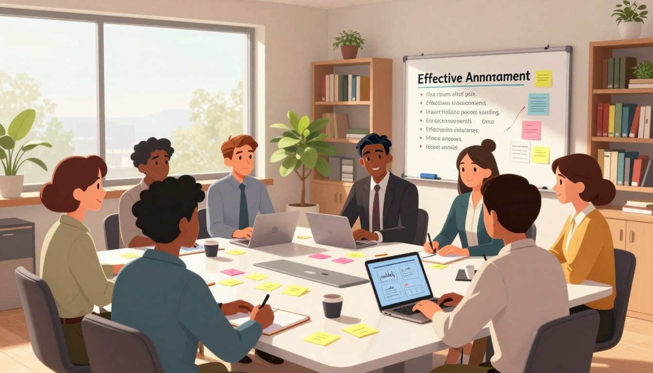
The guide lays out a repeatable structure: audience, channel, timing, then subject line, opening line, formatting, details, and a single call to action. It aims to reduce back-and-forth and earn attention.
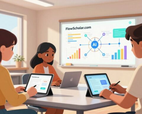
Schools, training teams, and edtech operators need announcements that cut through inbox overload without sounding robotic. For education contexts, the Education AI Tool FlowScholar offers practical support; explore it at FlowScholar after applying this framework.
Practical promise: clear over clever, specific over vague, action over ambiguity. Examples will be adaptable for email, newsletters, social posts, and live updates. For related messaging craft and metadata tactics, see meta-tag optimization tips.
Key Takeaways
- Design announcements for skimmability and one clear next step.
- Lead with the outcome; place the CTA front and center.
- Use short subject lines and opening sentences that state purpose.
- Format for phone scanners: bullets, bold, and short paragraphs.
- Apply the framework across channels; adapt tone for the audience.
- Explore FlowScholar for education-focused workflow support.
How to Write Announcements People Actually Read
Notifications compete for attention; announcements should win in a glance. Most readers triage their email and newsletter on a phone. If an update feels like work, it gets skipped.
Write for now: lead with the main point, keep each text chunk to one idea, and remove preamble words. A one-screen message beats a wall of text every time.
Match the message to the moment
Urgent changes need bold headers and a clear action. Time-sensitive invites belong near the top with an RSVP link. FYIs should be short and link out for details.
Pick one primary goal
Inform, invite, remind, or request—choose one. If it cannot be summarized in a single sentence, it likely has too many things.
- Readers scan email and newsletter updates in a crowded inbox; treat that as the reality.
- Assume the reader is on a phone: lead with meaning and keep bullets short.
- Give people what they actually want: minimum info that enables action; everything else behind a link.
| Message Type | Primary Emphasis | CTA Example |
|---|---|---|
| Schedule change | Urgency + next step | Confirm new time |
| Event invite | Date/time + benefit | Register now |
| Policy FYI | One-sentence summary | Read details |
For practical templates and a channel-specific checklist, see a short guide on effective Slack announcements. Later sections show the one-screen approach, limited bullets, and a single CTA that makes the next step obvious.
Know your audience, channel, and timing before you write
Effective messages begin with a clear sense of who will act on them and where they’ll see them.
The core stays constant across channels: a single purpose, the essential details, and one clear action. Packaging shifts; the intent does not.
Email, newsletter, website, social media, or live: what changes and what stays the same
Email is direct and action-focused; it asks recipients to click, confirm, or reply. A newsletter builds relationship and context; it can carry multiple but related items for subscribers.
A website post is evergreen and linkable; social media demands a headline-first approach and fast scannability. Live updates require brevity and repetition for clarity.

Send-time basics that affect whether people even see it
Best windows often land early morning (6–8am) or late afternoon (4–5pm). Tuesdays through Thursdays usually yield higher open rates; avoid Monday morning backlog.
Schedule across time zones and test within an email service. Segmentation matters: targeted lists raise open rates and response from the right subscribers.
| Scenario | Primary Channels | Why |
|---|---|---|
| Urgent update | email + website | Direct reach and canonical record |
| Event | newsletter + social media + website | Relationship, reach, and details |
| Policy change | website canonical + email summary | Reference plus direct notice |
Operationalize this in a short checklist for the team: word limit, required fields, and one CTA. Timing won’t fix a weak message, but it ensures a strong one is seen.
Write subject lines and headlines that earn the open
A subject line often decides whether an email earns a glance or lands in the archive. Treat that single line as the gatekeeper: it must promise a clear benefit or state the next step.
Clarity over clever: make the benefit obvious
Vague or salesy phrasing kills interest. Lead with value—what the reader gains or what they must do next.
Keep it short for phones: aim for under 50 characters
Mobile displays trim long text. Place the most important words at the front so the core meaning survives truncation.
Use specificity: reference the topic, outcome, or next step
Concrete details build trust. Compare “Important update” with “Schedule change: Friday session moved to 2pm.”
When questions work: make them personal
Questions boost open rates only when they tap a real need—e.g., “Need the updated syllabus by Friday?” Avoid generic prompts.
Subject line examples you can adapt
- Updated agenda + what to do next
- Action needed: confirm attendance by 5pm
- New policy starts Feb 1—summary inside
- Reminder: submit forms by Tuesday
- Your access details for tomorrow’s session
Practical rule: if the subject does not imply a benefit or next step, rewrite it before touching the body. For more research-backed subject examples, see research-backed subject examples.
Hook readers immediately with a first line that matters
The opening line must prove this message deserves a moment of the reader’s attention.
Lead with context they care about
First-line test: readers decide within seconds. Start with what changed, what’s required, or the key result.
Use a quick “why now” to create relevance
Link the note to a trigger—an updated schedule, a closing registration, or a policy start. That reason makes the email timely and worth a glance.
Example openers for common use cases
- Update: “The schedule for next week has changed—here’s the new time and location.”
- Invitation: “Registration opens today for the March workshop; seats are limited.”
- Reminder: “Forms are due Friday at 5pm.”
- Change: “Starting Feb 1, attendance will be digital—here’s what to do.”
If you only read one line: place the action there—this respects readers and reduces follow-up messages.
“Strong first lines cut confusion and lower follow-ups.”
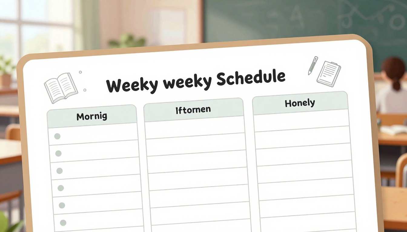
Make your announcement skimmable with simple structure and formatting
A crisp, scannable layout keeps readers from bouncing before they act. Adopt a one-screen mindset: if the main point fits on a phone screen, readers grasp it fast and follow the next step.
Apply the 3×3 rule: keep every paragraph to about three lines, give each chunk a single idea, and cut preamble. Short lines force concise words and clear action.
Break block text into readable chunks
Use mini-headers such as What’s happening, When/Where, and What to do now. These headers anchor the reader and make the content skimmable.
Bullets that get read
- Limit a list to three or four items.
- Keep each bullet under two lines and start with a verb.
- Visually isolate the action so it cannot be missed.
Stack Q&A for multiple questions
Repeat each question and place the answer immediately below. This form prevents jumbled replies and speeds triage.

“Format is not decoration; it is a tool that saves time and raises response quality.”
Before-and-after example: convert a long block text into three labeled chunks with one clear CTA. The result: fewer follow-ups, faster action, and less inbox friction.
Include only what people need, then point to links for the rest
A tight summary plus a single link beats a long explanation every time.
The essential details checklist
Give the facts first: date, time, place, a one-line description, and the intended audience.
That checklist gives fast clarity. Many people scan the first screen; this order meets them there.
Replace vague phrases with vivid specifics
Swap generic language for concrete items: list the menu, activities, or services. Readers grasp clear details faster.
Use a website or blog post as the source of truth
Keep the announcement short and link out for deeper information. A single, stable post on your website makes updates easy.
| Element | Why it belongs | Example |
|---|---|---|
| Date | Sets expectation | Mar 24 |
| Time | Enables scheduling | 2:00–3:30 PM |
| Place | Removes guesswork | Library, Room 201 / Zoom link |
| Brief description | Explains value | Hands-on lab for new curriculum |
One clear call to action: register, reply, sign up, or mark your calendar. If you serve two audiences, send two short posts rather than one crowded message.
For education teams, point readers to a dedicated post for full resources. For example, read the full update and resources and explore FlowScholar at FlowScholar.
When details change, update the blog post and keep the announcement as the quick pathway. That split—summary plus links—gives everyone the information they need while preserving the inbox for what many people actually want.
For tactics on content and monetization, consider a practical guide on start a niche blog as a model for building a reliable post and list of links.
“Make the first screen complete; let links host the depth.”
Conclusion
A strong close ties every choice in the message back to the reader’s limited time.
Plan for the audience and moment, earn the open, hook with the first line, format for skimming, include essentials, and finish with a single CTA. This system keeps emails and newsletter items focused and useful for busy subscribers.
Respect attention: shorter messages are not vanity; they match how subscribers scan and act. Before hitting send, run a quick checklist: purpose, timing, subject clarity, first-line relevance, one-screen layout, limited bullets, essential details, single next step.
Track clicks, replies, and confusion points; iterate based on what the audience does. Create templates, keep a linkable “more info” page, and standardize formatting so writing gets faster and more consistent.
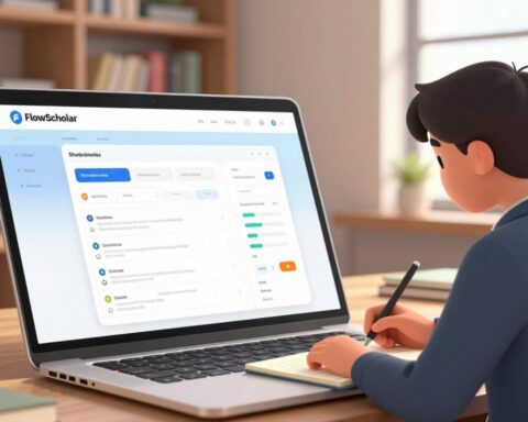
For education teams ready to streamline workflows and ship clearer communications faster, explore FlowScholar at https://www.flowscholar.com. For guidance on crafting effective closures, see the short guide on writing strong conclusions.
FAQ
How should an announcement open for mobile readers?
Lead with a short, relevant first line that explains why the message matters now—name the outcome or next step so readers decide to keep reading on a single glance.
What’s the single goal an announcement should have?
Choose one primary action—register, reply, read the post, or mark a date—and design every element to drive that specific response.
When deciding channel, what changes between email, social, and a website post?
Tone and length shift: email can be personal and action-focused; social needs punchy hooks and visuals; web posts host depth and links. The core message stays the same—clarity and relevance—but format the copy for each inbox or feed.
Which send-time factors influence open rates?
Consider recipient time zones, day of week, and the audience’s work rhythm. Midweek mid-morning often performs well for professionals, while earlier or later times suit other segments; test and iterate for your list.
How long should subject lines be on phones?
Aim under 50 characters so key information remains visible in most mobile inboxes; prioritize benefit, topic, or a clear next step.
When is a question an effective subject line?
Use questions when they are personal and solve a reader-focused problem—ask what the reader gains or what they need next, not a generic curiosity prompt.
What belongs in the essential details checklist?
Include date, time, location or access link, and a one-sentence description of why the reader should care. Add one clear call to action and a “more info” link if needed.
How can an announcement stay skimmable?
Use short paragraphs, one idea per chunk, clear headers, and concise bullets limited to three to five items. Highlight action items and place the call to action above the fold.
What’s a practical way to shorten block text?
Convert long sentences into bullets or numbered steps, remove jargon, and strip any background that isn’t essential for the reader’s next move.
Where should deep details live if the announcement must stay brief?
Host in a blog post or a dedicated webpage and link to it from the announcement. Use a single, labeled link—“Read full agenda” or “Full details here”—to reduce friction.
How many subject-line variations should one test?
Start with two to four clear variations that differ in length, specificity, or tone; measure opens and clicks, then refine based on real audience behavior.
What are effective openers for reminders versus invitations?
For reminders, lead with the imminent detail—time or deadline. For invitations, start with the value or outcome the attendee gains in the event.
How should calls to action be phrased?
Use specific, outcome-focused language: “Register for the webinar,” “Save the date,” or “View the product update”—verbs plus result work best.
How can teams reduce announcement mistakes before sending?
Use a short checklist: goal defined, audience segment selected, subject tested, essential details present, and links verified. Have one reviewer confirm clarity and tone.
What’s an easy edit that increases clarity?
Remove the first-sentence preamble that explains context and replace it with one line that states the action or benefit. Readers respond to relevance, not history.
How should one handle multiple FAQs within an announcement?
Stack short Q&A blocks under clear headers; keep each answer one to three sentences and link to a detailed FAQ page for complex topics.