Someone building a product remembers the first time an app made them feel seen. That reaction—small, immediate, human—drives the work behind modern interfaces. Designers and developers want tools that let intention become motion without long waits or fragile handoffs.
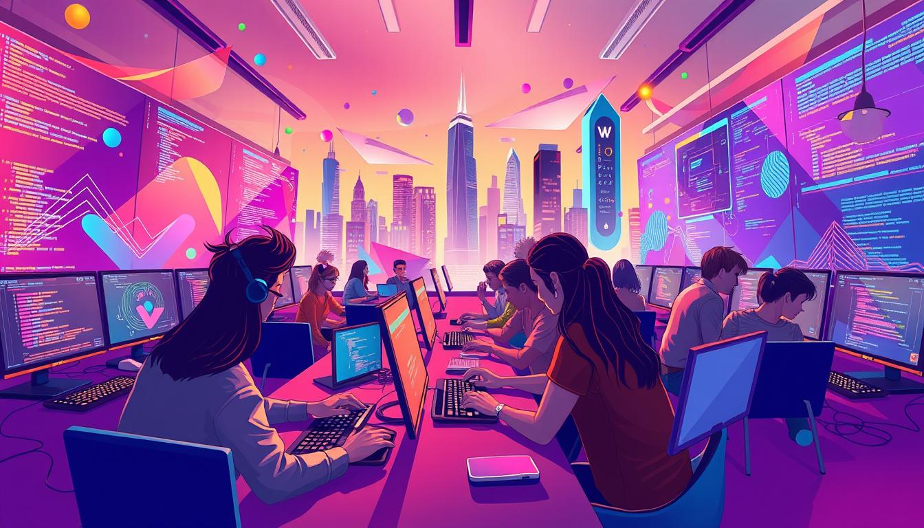
Anima’s Playground turns natural language into working UI and motion. Paste a Figma file link and the Playground spins up a running app in seconds. The AI agent writes the code, updates live previews, and accepts commands like “Make the header stick” or “Add a time and date picker.”
Teams iterate in a sandbox with undo, rollbacks, and version history. Designers validate experience fast; developers get clean, structured code ready for frameworks such as ShadCN UI and Tailwind CSS. This approach reduces friction and measures feedback in minutes, not hours.
Key Takeaways
- Vibe coding bridges idea to implemented interaction by letting AI produce code from intent.
- Paste a file and see live previews—no local setup or plugin required.
- Designers validate UX quickly; developers receive production-ready code.
- Sandboxed edits, rollbacks, and version history protect the main project.
- Small effects guide attention and improve the overall app experience.
Understanding the “vibe coding” workflow for emotional UI
A clear workflow turns a design impulse into a timed, readable motion in seconds. Teams express an idea in plain language and get a live preview that reflects the intended emotion. This loop shortens feedback cycles and keeps focus on user feeling rather than implementation details.
User intent matters: designers say what they want—phrases like “calm fade” or “confident snap”—and the system maps those prompts to timing, easing, and effects. Precise language accelerates alignment and reduces back-and-forth.
Context guides choices. Onboarding needs reassurance; task screens require quick, responsive micro-interactions; alerts demand decisive movement. Matching intent to context improves perceived speed and trust in the app.
From words to working code: the Playground converts Figma layouts into frontend code instantly so teams can prototype several things quickly. Designers describe feel; AI generates code; stakeholders validate changes in the live preview and comment right away.
- Express an idea in language, get motion that fits.
- Use concise prompts to anchor timing and style.
- Document patterns so effects stay consistent across the interface.
When micro-interactions explain system state, they help users rather than distract them. Encourage rapid prototypes, compare alternatives in context, and keep a short rationale note for each motion pattern so teams can scale decisions with confidence.
Read a deep dive on the to see examples and practical prompts that ship.
Setting up your playground: From Figma to live code in the browser
A single Figma file link turns into a live, editable app inside the browser. This removes friction between design intent and working code so teams spend less time on tool setup and more time on product decisions.
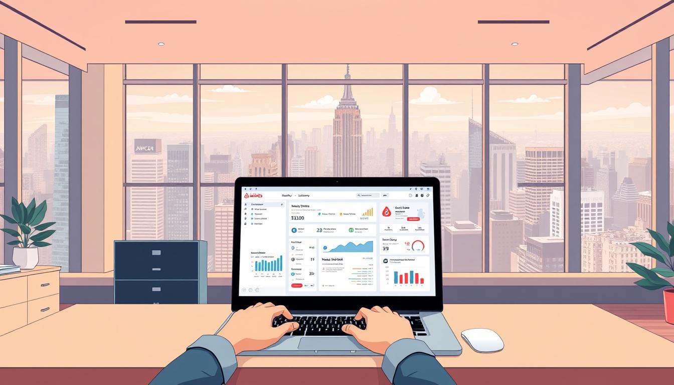
Pasting a Figma link into Anima’s Playground generates a running preview in seconds. There is no plugin or local environment needed: paste the file, wait a moment, and the preview mirrors layout and assets for immediate review.
Pasting a Figma link into Anima’s Playground for instant app previews
The zero-setup flow is simple: paste the Figma file link, confirm the import, and open a live preview. Stakeholders can click through the app and call out layout or motion issues right away.
No local setup: WebContainers, live preview, and fast iteration
Under the hood, WebContainers compile and run the code entirely in-browser. Teams skip installing Node, cloning repos, or configuring build scripts. That saves time and reduces onboarding friction for new collaborators.
Choosing libraries and components (ShadCN UI, Tailwind CSS)
By default, the Playground generates standard code using ShadCN UI and Tailwind CSS. Accessible, composable components create a tidy baseline that developers can extend during development.
- Starter structure: theme tokens, layout shells, and clear state boundaries.
- Routine: import once, verify layout fidelity, then layer in motion progressively.
- Maintainability: customize carefully—extend components rather than diverging from the baseline.
- Capture environment decisions in a short README to onboard teammates fast.
- Check responsive behavior early so motion and layout remain robust on small screens.
- Use the tidy baseline to reduce debugging noise when prompts change code or animation.
Prompts that ship: Designing animations by conversation
Clear, actionable prompts close the gap between intent and deployable code. Teams speak in plain language and the assistant applies changes to a running preview in real time.
Examples of effective prompts
Use specific targets and acceptance criteria. Try: “Make the header stick to the top on scroll”, “Add a time and date picker component”, or “Add a subtle fade-in modal”. The Playground updates the live app and shows the generated code immediately.
Using natural language to refine timing and effects
Iterate timing and easing: say “ease-out over 200ms,” “spring with low bounce,” or “delay until content loads.”
- Bundle context: what triggers the change and what the user should perceive.
- Test small changes in sequence, then consolidate once motion feels right.
- Save prompt-result pairs as internal playbooks and use clear naming so updates stay traceable.
| Prompt Pattern | Example | Expected Change |
|---|---|---|
| Sticky behavior | “Make header stick to top on scroll” | Header gains fixed position at scroll threshold; code adds sticky class and tests on mobile |
| Component add | “Add time and date picker component” | New picker component with props and accessible labels; live preview includes selection flow |
| Motion tweak | “Subtle fade-in modal, ease-out 180ms” | Modal animation added with easing and fallback to instant show when prefers-reduced-motion is set |
Give corrective feedback when outcomes differ and time-box prompt exploration. Conversational iteration keeps code consistent and preserves design intent while you try new things.
Implementing 3D motion with AI help: From Three.js to your app
Drop a Three.js particle snippet into the AI tool and get a clean React component ready to mount. The assistant parses the demo, extracts the renderer loop, and scaffolds a reusable component with props for intensity, palette, and speed.

Copy-paste technique: Translating a 3D planet particle system into React
Paste the example and ask for a React export. The LLM returns structured code: a canvas wrapper, init/resize handlers, and cleanup. You get a component that mounts where the page expects it.
Keeping buttons clickable: pointer-events and layered interactions
Layer the canvas as a background and set overlay panes to pointer-events: none for non-interactive layers. Then explicitly enable pointer events on interactive elements so buttons and menus remain usable.
Styling polish: backdrop blur for readable text over motion
Improve legibility with backdrop-filter: blur(3px) and contrast variables. Cap particle counts and avoid heavy additive blending to keep frames steady.
- Refactor generated code into hooks or subcomponents for clarity.
- Document props—intensity, color, speed—as a pattern library entry.
- Gate 3D on
prefers-reduced-motionand offer a static image fallback.
“Natural-language edits—like ‘make it look like a galaxy’—reshape the effect in real time.”
QA checklist: verify keyboard focus, screen-reader landmarks, and that motion does not interrupt core work. Capture final settings so the team can reuse the thing later.
Real-time feedback loops: Try it, feel it, fix it
Seeing changes appear in a live preview makes decisions faster and more confident.
The Playground pairs an AI chat panel with a running app preview. Every change shows up right away. Designers can ask the assistant to “make the tab items work” or change a color to a hex value, then watch the result.
The platform logs iterations in chat history and links them to a version timeline. Teams can undo or rollback experiments in a safe sandbox, separate from production. This setup lets people explore bold ideas with low risk.
Use the live preview as a continuous usability test: validate timing, spacing, and transitions immediately. Keep micro-benchmarks for time-to-first-meaningful-motion so interactions feel snappy.
Collaboration and traceability
- Involve designers and PMs early for fast, low-friction reviews.
- Isolate changes to specific components to avoid regressions.
- Maintain a change log tied to prompts for clear traceability.
| Feature | What it does | Team benefit |
|---|---|---|
| Live preview | Shows updates instantly in the app | Faster validation of motion and spacing |
| Chat history | Records prompt-driven iterations | Traceable reasoning and repeatable changes |
| Version timeline | Snapshots of work over time | Safe rollbacks and side-by-side comparison |
| Sandbox | Isolated environment outside production | Encourages bold experiments without risk |
vibe coding animations that enhance UX (not distract)
Thoughtful transitions frame interactions so users understand what changed. Designers can ask the Playground for a specific motion, then tweak timing until the emotion reads correctly.
Mapping emotions to motion: calm fades, confident snaps, playful parallax
Map intent to primitives: calm fades reassure, confident snaps signal completion, and playful parallax adds delight. Apply these consistently so each effect supports the product tone.
Micro-interactions for buttons, tabs, and menus that feel intentional
Standardize micro-interactions for a cohesive design system. For a button, use brief scale and opacity changes. For tabs, animate underline position. For menus, combine subtle fade and slide to show causality.
- Guardrails: short durations, clear start/stop states, predictable easing.
- Set motion tokens—duration, easing, distance—in the design system for reuse.
- Run A/B tests when ideas are unclear; pick the effect that improves task comprehension.
| Pattern | Primary Use | Accessibility |
|---|---|---|
| Calm fade | Onboarding microcopy | Prefers-reduced-motion: static fade |
| Confident snap | Action confirmation | Short duration; high contrast |
| Playful parallax | Decorative headers | Limit intensity; offer off toggle |
Keep one rule: every effect must communicate state or causality, not just decorate. Small, intentional motion speeds comprehension and improves the user experience.
Performance, accessibility, and usability for motion at scale
Motion at scale must be planned like a performance budget—small overruns add up quickly. The Playground runs in WebContainers, so teams still must defer heavy assets, code-split non-critical motion, and keep a static baseline file when possible.
Optimizing FPS, reducing reflows, and managing code splitting
Establish stable FPS targets and avoid main-thread work during transitions. Use requestAnimationFrame and throttle updates to prevent layout thrash.
Code-split motion-heavy bundles and load 3D textures lazily. Optimize images and use lightweight textures to cut memory and draw-call number.
Respecting prefers-reduced-motion and keyboard/focus behavior
Accessibility is non-negotiable: honor prefers-reduced-motion, keep focus order intact, and update ARIA roles in time. Test keyboard flows to avoid traps and preserve readable overlays with backdrop blur when needed.
- Measure time to interactive on mid-range devices.
- Lint for performance anti-patterns and validate in varied network conditions.
- Progressive enhancement: start with a static file baseline, then add motion based on capabilities.
Document limits and budgets so designers and developers share the same constraints. Clear rules keep effects meaningful and code maintainable as features grow.
Collaboration and handoff: From playground to production code
A clear handoff workflow turns a working preview into a reviewable pull request in minutes. Teams export production-ready code or push a branch to GitHub with one click. This keeps momentum and reduces manual copy-paste work.
Export or push to repo: share a live preview link, open a branch, and create a PR with context. Stakeholders test interactions in the app before a merge. Branch previews make reviews concrete and fast.
Exporting clean code or pushing to GitHub for review
The Playground uses a clean baseline (ShadCN UI + Tailwind CSS) so the codebase stays tidy. Map Playground files to your repo conventions to reduce integration friction and avoid surprises when merging.
Branch previews, PR comments, and AI-assisted updates right away
In Fusion-like workflows, a developer can tag an agent in a PR comment with a prompt—e.g., “move this component to its own file.” The agent applies updates right away and opens a follow-up commit for review.
- Smooth path: export or push, open a PR, add notes and screenshots.
- Use branch-based previews so stakeholders click through the app before merge.
- Define review checklists for accessibility, performance, and naming consistency.
- Tag owners for critical parts of the UI to speed decisions and reduce bottlenecks.
- Squash commits for clarity and note which changes affect user-visible behavior.
“Small things are refined quickly without derailing the project timeline.”
Log lessons from PR feedback so future work is faster. The result: developers focus on domain logic while motion ships sooner. This collaborative loop keeps the project steady and predictable.
Toolbox and ideas library: Animations, components, and updates to try
A central ideas library helps teams try new effects without breaking the main branch.
Curated sources save time. Motion+ offers a vault of 290+ motion examples, premium APIs, and VS Code tools with lifetime updates for a one-time payment. CodePen and community repos supply copy-paste snippets—3D particle systems, glowing text, small UI effects—that AI tools can translate into framework-specific code.
Build a reusable library with tokens for duration, easing, and distance. Wrap patterns as a component with clear props and demo states so designers and developers reuse the same parts.
Pair each example with a concise prompt. Ask the assistant to convert a sample into your component, then open a branch to review changes and run a quick performance check.
- Catalog images, textures, and shaders with license notes and file-size targets.
- Snapshot a version for every idea and measure runtime performance before adoption.
- Create a contribution guide so designers add patterns without breaking standards.
- Track a small number of core effects; deprecate redundant ones over time.
“Start small, measure reuse, then fold the best ideas into the design system.”
Conclusion
A short loop from prompt to preview lets teams prove an idea in minutes. vibe coding in Anima’s Playground moves a Figma file into running code, supports conversational edits, and keeps experiments safe with undo and version history.
Start small: pick one button micro-interaction and ship it. Track a few metrics—FPS, interaction delay, and success rate—to guide choices and curb rework hours across the project.
Balance performance and accessibility: optimize images, respect prefers-reduced-motion, and keep the codebase tidy as the project grows. Curate a library of proven effects so each motion earns its place in the experience.
Operationalize the workflow: document prompts, review loops, and handoff practices. In time, the team will convert more ideas into tested code and faster development cycles.
FAQ
How do designers translate user intent into motion that feels right?
Designers start by defining the user’s goal for each interaction—what they want to do and how they should feel doing it. From that intent, they pick timing, easing, and scale that match the emotional tone: calm fades for comfort, snappy springs for confidence, and gentle parallax for play. Prototyping in small, testable loops helps validate the effect quickly.
Why do micro-interactions and motion matter for emotional UI?
Micro-interactions communicate state, guide attention, and reward completion. When crafted with purpose, they make interfaces feel alive and trustworthy. Well-designed motion reduces friction, clarifies outcomes, and strengthens brand personality without overwhelming the user.
Can I preview Figma designs in a browser without local setup?
Yes. Pasting a Figma link into a cloud playground enables instant app previews. Tools with WebContainers or similar tech provide live previews and hot reloads so teams can iterate without installing dependencies locally.
Which libraries work best for production-ready components and motion?
Popular choices include component libraries like shadcn/ui and utility frameworks like Tailwind CSS, paired with animation tools such as Framer Motion or GreenSock. These options balance composability, performance, and accessibility when used with disciplined patterns.
How do natural-language prompts help design animations?
Natural-language prompts let teams describe desired behavior—“make the header stick” or “fade-in modal”—then refine timing, easing, and offsets through iteration. This approach speeds ideation and bridges designers and developers by focusing on intent rather than implementation details.
Is it possible to convert a Three.js effect into a React component quickly?
Yes. A copy-paste technique, combined with small adaptions for React lifecycle and hooks, can port a particle system or 3D scene into a React app. Developers should preserve performance considerations and encapsulate pointer-events and layering to keep UI controls responsive.
How do you keep buttons clickable when layering motion-rich canvases or WebGL?
Use pointer-events, proper z-indexing, and transparent overlays to ensure interactive elements remain reachable. Separating the visual canvas from UI layers and applying backdrop blur or masks helps maintain readability while preserving interactivity.
What’s the best way to validate motion, spacing, and transitions fast?
Rely on live preview and rapid feedback loops. Test variations in real contexts, use AB checks for critical flows, and collect qualitative feedback from stakeholders. Version history and undo make it safe to explore bolder options without permanent risk.
How do undo, rollbacks, and version history support creative exploration?
They lower the cost of experimentation. Teams can try radical timing or new micro-interactions, then revert or branch if the idea doesn’t land. Branch previews and PR comments streamline review and keep production code stable.
How should motion map to specific emotions like calm or confidence?
Map emotional goals to motion parameters: calm uses slow, smooth easing with low amplitude; confidence uses short, pronounced snaps and clear direction; playfulness adds offset and stagger. Consistency across components creates a coherent emotional language.
What micro-interactions should designers prioritize for buttons, tabs, and menus?
Prioritize feedback that confirms action—press states, hover previews, and subtle focus transitions. Ensure timing is concise (80–260ms) and consistent. Keep interactions intentional so they clarify purpose rather than distract.
How do teams keep animations performant at scale?
Optimize by reducing main-thread work, using transforms and opacity to avoid layout thrashing, and applying code splitting for large effects. Monitor FPS, defer nonessential animations, and profile heavy scenes—especially with 3D content—to maintain snappy UX.
How can accessibility be respected when using motion?
Respect prefers-reduced-motion by offering reduced or simplified transitions. Ensure keyboard focus and visible focus rings are preserved, and provide clear pauses or controls for prolonged motion. Test with screen readers and assistive tech to confirm usability.
What’s the recommended workflow for exporting and handing off animated work to developers?
Export clean, documented code snippets or push branches to GitHub for review. Include usage examples, timing tokens, and accessibility notes. Use branch previews and PR comments for iterative refinement and AI-assisted updates when available.
Where can teams source effects and example implementations?
Look to CodePen, Motion+ vaults, community repositories, and curated component libraries for patterns. Collect snippets into a shared library or design system so teams can reuse well-tested effects across projects.
How do you build a reusable animation library for a codebase and design system?
Standardize tokens for durations, easings, and motion scales. Componentize common patterns—modals, toasts, collapses—and document expected states and accessibility behavior. Maintain a versioned library so updates and rollbacks are traceable.