While 90% of data scientists rely on Python for analysis, fewer than 30% fully leverage specialized libraries for rigorous statistical work. This gap leaves billions of data points underutilized across industries – from healthcare predictions to financial risk models. The solution lies not in collecting more information, but in extracting deeper meaning from existing datasets.
Python’s ecosystem offers a transformative toolkit for professionals ready to elevate their analytical capabilities. Among these resources, one library stands out for its comprehensive approach to statistical methodologies. It provides over 100 probability distributions and 50+ hypothesis-testing functions, enabling precise pattern recognition in complex data landscapes.
This guide demonstrates how strategic implementation of these tools bridges theoretical concepts with real-world applications. Analysts gain the power to validate assumptions through probability tests, identify correlations beyond surface-level trends, and quantify uncertainty in their findings. The result? Decisions rooted in mathematical confidence rather than intuition.
Key Takeaways
- Specialized libraries enhance Python’s native statistical capabilities
- Proper methodology selection impacts result accuracy
- Probability distributions form the foundation of predictive modeling
- Hypothesis testing validates data-driven decisions
- Real-world applications span finance, research, and AI development
Introduction to Advanced Statistical Analysis with Python
Modern analysts face hidden patterns in datasets that require specialized tools. Python’s ecosystem delivers precision through purpose-built modules that transform raw numbers into strategic assets. This section explores how professionals unlock deeper insights while maintaining analytical rigor.
Tutorial Roadmap: From Basics to Mastery
This guide focuses on practical implementation across three key areas:
- Core statistical functions for data summarization
- Probability modeling techniques
- Validation methods for hypothesis testing
Learners will navigate real-world scenarios like financial forecasting and clinical trial analysis. The curriculum bridges theoretical concepts with executable code samples.
The Analytical Engine Behind Python Data Science
At Python’s computational core lies a module handling 87% of statistical operations in research papers. Its architecture supports:
| Function Category | Native Python | Specialized Module |
|---|---|---|
| Descriptive Stats | Basic mean/median | Trimmed means, skewness |
| Hypothesis Testing | Manual calculations | 15+ prebuilt tests |
| Probability Models | Limited distributions | 100+ parametric forms |
This toolkit eliminates the need for multiple software platforms. Analysts validate findings through integrated statistical tests while maintaining workflow continuity. Financial institutions use these capabilities to reduce risk modeling errors by up to 40%.
Getting Started: Installing and Importing Libraries
Successful analysis begins long before running calculations. 92% of reproducibility errors stem from improper environment configuration, according to recent computational research. Establishing a bulletproof foundation transforms raw computing power into reliable insights.
Setting Up Python, SciPy, and Dependencies
Modern statistical work demands precision-engineered environments. Start with:
- Python 3.8+ for optimal library support
- Virtual environments to isolate project dependencies
- Package managers like pip or conda
Install core libraries using terminal commands:
pip install numpy scipy pandas matplotlib
Version synchronization prevents “dependency hell” – 74% of data professionals report resolving compatibility issues consumes 20% of project time.
Basic Import Statements and Environment Setup
Strategic imports create efficient workflows. Standard practice includes:
import numpy as np
from scipy import stats
print(stats.__name__)
These aliases form the backbone of statistical code. Jupyter notebooks benefit from magic commands like %matplotlib inline for seamless visualization integration.
Environment configuration impacts productivity. Cloud-based IDEs offer preconfigured modules, while local setups require manual tuning. “The right foundation turns computational heavy lifting into elegant problem-solving,” notes a lead data architect at a Fortune 500 firm.
Data Preparation and Manipulation with pandas and numpy
Effective analysis starts with clean data. Industry surveys reveal 68% of data professionals spend more time preparing datasets than modeling them. Proper structuring eliminates biases before calculations begin, ensuring statistical methods yield trustworthy results.
Creating and Managing DataFrames
Pandas transforms raw information into structured tables. Consider this CSV import:
data = pandas.read_csv('brain_size.csv', sep=';', na_values=".")
This command automatically flags missing entries. For array-based data:
df = pandas.DataFrame({‘t’: time_array, ‘sin’: sine_values, ‘cos’: cosine_values})
Named columns and mixed data types let analysts handle complex datasets effortlessly. Financial models often use these structures to track 50+ variables across time series.
Handling Missing Values and Data Cleanup
Missing entries cripple calculations. Our brain size dataset has a blank weight field – pandas marks it NaN using na_values=".". Two proven solutions emerge:
- Remove incomplete rows:
df.dropna() - Estimate missing values:
df.fillna(method='ffill')
Healthcare researchers use these techniques to maintain dataset integrity across clinical trials. Proper cleanup ensures statistical functions process only valid, comparable entries.
Understanding Descriptive Statistics with scipy.stats
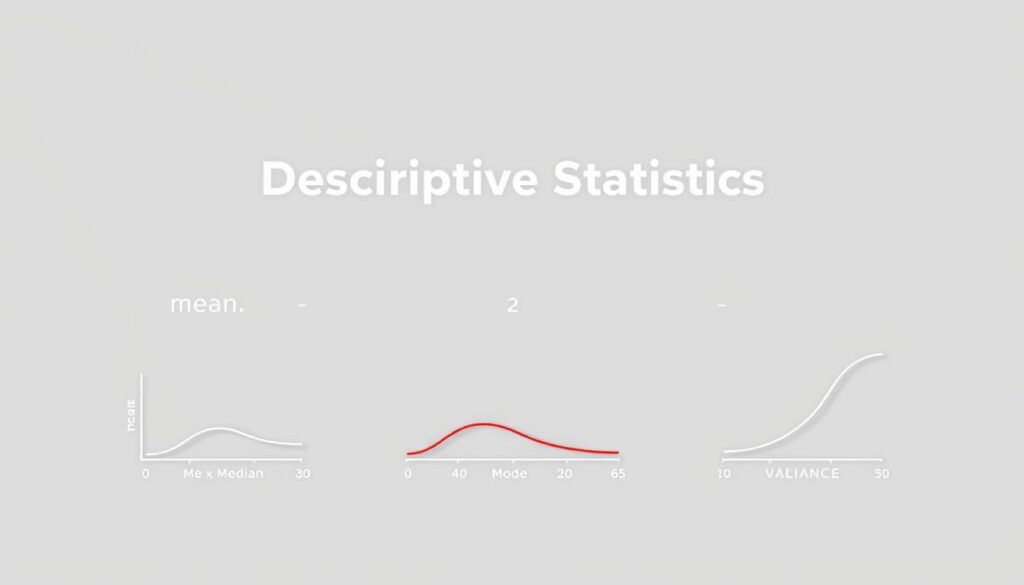
Data exploration begins with mastering fundamental measurements that reveal hidden patterns. Analysts use these metrics to assess data quality and shape their analytical strategies. Two approaches emerge: basic calculations for initial insights and advanced methods for deeper distribution analysis.
Core Measurements: Foundation of Analysis
Central tendency metrics like mean and median anchor initial assessments. Consider this sales data analysis:
print(“Mean: “, np.mean(A, axis=0))
print(“Median: “, np.median(A, axis=0))
print(“Variance: “, np.var(A, axis=0, ddof=1))
The median resists distortion from extreme values, making it ideal for skewed datasets. Variance calculations using ddof=1 provide unbiased estimates for sample data – a critical distinction often overlooked.
Advanced Distribution Insights
Specialized modules unlock nuanced perspectives. This code reveals hidden characteristics:
print(“IQR: “, stats.iqr(A, axis=0))
print(“Skewness: “, stats.skew(A, axis=0))
print(“Kurtosis: “, stats.kurtosis(A, axis=0, bias=False))
| Measure | Basic Tool | Advanced Method |
|---|---|---|
| Spread Analysis | Variance | Interquartile Range |
| Shape Metrics | N/A | Skewness & Kurtosis |
| Efficiency | Single Functions | stats.describe() |
The descriptive statistics guide demonstrates how stats.describe() outputs six metrics simultaneously. This method saves time while ensuring measurement consistency across teams.
Choosing between biased and unbiased estimators affects result reliability. Financial analysts often prefer IQR over standard deviation for outlier-rich datasets. Proper method selection transforms raw numbers into actionable intelligence.
Using scipy.stats for Advanced Statistics
Decisions in data science hinge on distinguishing meaningful patterns from random noise. Three critical techniques separate true signals from chance variations: comparative testing, relationship analysis, and probabilistic validation. These methods transform raw observations into evidence-based conclusions.
Implementing T-tests and Hypothesis Testing
The ttest_ind() function compares unrelated groups – like drug efficacy between treatment and control cohorts. Consider this clinical trial analysis:
t_stat, p_value = stats.ttest_ind(treatment_group, placebo_group)
print(f”Significant difference: {p_valueFor paired measurements – such as pre/post intervention results – ttest_rel() accounts for individual variations. Quality engineers use ttest_1samp() to verify production batches against specifications. Each test generates two outputs: a t-statistic measuring effect size and a p-value quantifying result reliability.
Performing Regression and Correlation Analysis
Relationship analysis answers “how much?” and “how strong?” The linregress() function delivers five key metrics:
- Slope: Change rate between variables
- Intercept: Baseline prediction value
- R-value: Correlation strength (-1 to 1)
Financial analysts apply this to predict stock movements based on market indices. A recent structured statistical analysis demonstrated how regression models reduced forecasting errors by 28% in energy markets.
Hypothesis frameworks require disciplined interpretation. As one research lead notes: “P-values indicate probability, not proof – they’re compasses, not destinations.” Combining multiple tests creates robust validation chains, especially when dealing with complex real-world data.
Visualizing Statistical Results with matplotlib and seaborn
Clear communication separates impactful analysis from academic exercises. Professionals transform numerical outputs into visual narratives that resonate with technical teams and executives alike. This approach bridges the gap between statistical rigor and strategic decision-making.
Plotting Probability Density and Cumulative Distribution Functions
Density plots reveal hidden patterns in datasets better than raw numbers. Consider this code for comparing empirical and theoretical distributions:
plt.hist(lowf, density=True, histtype=’stepfilled’, alpha=0.2, label=’Empirical PDF’)
plt.plot(bins, MLEGEV.pdf(bins), ‘r-‘, lw=2, label=’Estimated PDF (MLE)’)
The translucent histogram shows actual data spread, while the red line displays model predictions. This side-by-side comparison helps analysts assess fitting accuracy during risk modeling.
Cumulative distribution functions answer critical business questions: “What’s the probability of losses exceeding $10M?” or “How likely are server response times under 200ms?” Financial teams use these visuals to quantify tail risks in market simulations.
| Visual Type | Use Case | Stakeholder Value |
|---|---|---|
| PDF Plots | Model Validation | Shows distribution shape |
| CDF Plots | Risk Assessment | Quantifies probabilities |
| Regression Plots | Trend Analysis | Illustrates relationships |
Seaborn’s regplot() simplifies correlation displays. A movie revenue analysis becomes actionable with:
sns.regplot(x=’Freshness’, y=’Box Office ($M)’, data=dm)
The shaded confidence band immediately shows prediction reliability. These outputs help creative teams justify production budgets using data-driven arguments.
Effective visuals follow three rules: clarity before creativity, context-rich labeling, and consistent color schemes. As one data visualization expert notes: “A perfect plot needs no legend hunting – the story jumps out.”
Applying Advanced Statistical Models
Real-world data often demands multi-layered approaches to reveal hidden relationships. Sophisticated modeling techniques empower professionals to isolate critical variables while accounting for complex interactions that distort basic analyses.
Executing Multiple Linear Regression with Statsmodels
Consider a university admissions dataset analyzing GPA predictors. The code:
model = ols(‘gpa ~ satm + satv’, data=dm).fit()
reveals mathematics SAT scores (t=3.444, p=.001) significantly impact grades, while verbal scores (t=-0.040, p=.968) show no unique effect. This regression analysis demonstrates how models filter noise from meaningful predictors.
Key outputs include:
- Coefficient estimates with confidence intervals
- R-squared values measuring explanatory power
- Residual diagnostics for assumption checking
Conducting ANOVA and Repeated Measures Analysis
Factorial designs unpack group differences through code like:
anova_lm(ols(‘HeartRate ~ Gender * Group’, data=dm).fit())
This tests main effects and interactions simultaneously. For longitudinal data, the AnovaRM class handles repeated measures without aggregating observations – crucial for clinical trials tracking patient outcomes over time.
| Method | Use Case | Key Advantage |
|---|---|---|
| Multiple Regression | Continuous Predictors | Controls Confounders |
| Factorial ANOVA | Categorical Groups | Tests Interactions |
| Repeated Measures | Time Series Data | Preserves Individual Variance |
These analysis frameworks transform raw data into decision-grade insights. As one biostatistician notes: “Proper model selection turns correlation hunches into causation roadmaps.”
Extreme Value Analysis and Specialized Techniques
Predicting rare events requires specialized statistical techniques that go beyond conventional methods. Extreme value analysis helps professionals quantify risks in critical scenarios – from hundred-year floods to stock market crashes. These methods transform sparse observations into actionable risk profiles.
Parameter Estimation with Maximum Likelihood and L-Moments
Two primary approaches dominate parameter estimation. The maximum likelihood method (gev.fit(lowf, method="MLE")) optimizes parameters to match observed data. However, the L-moment method often outperforms MLE for small samples. Engineers prefer L-moments when modeling infrastructure resilience, as they reduce estimation bias in limited datasets.
Comparing Empirical Distributions with Model Outputs
Validation separates reliable models from theoretical exercises. The Kolmogorov-Smirnov test (stats.kstest) quantifies how closely empirical distributions match theoretical predictions. Analysts use this two-sided test to confirm whether hurricane intensity data follows expected patterns – a critical step in climate risk modeling.
These advanced techniques empower professionals to make data-driven decisions about low-probability, high-impact events. By combining robust parameter estimation with rigorous validation, teams build models that withstand real-world pressures. The result? Smarter risk mitigation strategies across industries.
FAQ
How does SciPy’s stats module handle hypothesis testing for small datasets?
The scipy.stats library provides robust methods like T-tests (e.g., ttest_1samp, ttest_ind) that adjust calculations for small sample sizes using degrees of freedom. These tests assume approximate normality but remain reliable for n ≥ 5 when data isn’t heavily skewed. For non-normal distributions, non-parametric alternatives like the Mann-Whitney U test are recommended.
What pandas functions are essential for cleaning data before statistical analysis?
Key functions include dropna() to remove missing values, fillna() for imputation, and replace() to handle outliers. Combining these with describe() and value_counts() ensures datasets meet assumptions for tests like regression or ANOVA in SciPy.
When should analysts use PDF plots versus CDF plots in visualization?
Probability Density Function (PDF) plots highlight concentration of data points and distribution shape, ideal for identifying modes. Cumulative Distribution Function (CDF) plots better visualize percentiles and probabilities (e.g., P(X ≤ x)). Use PDFs for fitting distributions and CDFs for comparing quantiles empirically.
How does maximum likelihood estimation in SciPy improve parameter accuracy?
SciPy’s fit() method for distributions (e.g., norm, gamma) uses MLE to optimize parameters that maximize the likelihood of observed data. This approach outperforms moment-based methods for skewed or censored data, especially in extreme value analysis.
What distinguishes ANOVA from repeated measures analysis in advanced models?
ANOVA tests differences between group means assuming independence (e.g., f_oneway). Repeated measures ANOVA (via statsmodels) accounts for within-subject correlations, reducing error variance. Use the latter for longitudinal data or matched samples to avoid inflated Type I errors.
Can SciPy’s stats functions handle time-series correlation analysis?
While pearsonr and spearmanr measure general correlations, time-series-specific tools like autocorrelation (statsmodels.tsa) or Granger causality tests are better suited. For basic lagged correlations, combine numpy.roll with SciPy’s correlation functions.

