Organizations collect mountains of information daily, but most struggle to unlock its true value. A powerful yet often overlooked tool—the empirical cumulative distribution function (ECDF)—turns unstructured numbers into actionable insights. This method creates a visual map of your data’s behavior without requiring complex assumptions about patterns or trends.
The ECDF works by plotting each observation as a step, rising by equal increments. This reveals exactly how values spread across your dataset. For example, it can show what percentage of customer orders fall below $50 or identify risk thresholds in financial portfolios—tasks where averages alone fail.
Industries from healthcare to logistics rely on this approach to spot hidden opportunities. Unlike traditional models, it adapts to real-world chaos, making it ideal for messy, unpredictable datasets. Leaders use these step-function graphs to validate AI predictions, optimize supply chains, and even streamline marketing campaigns.
Key Takeaways
- Transforms raw data into visual, step-by-step probability insights
- Requires no assumptions about underlying patterns
- Identifies value frequencies more clearly than averages
- Critical for risk assessment and model validation
- Bridges theoretical stats with practical business decisions
- Used across finance, engineering, and tech industries
This guide will show you how to build, interpret, and apply ECDFs like a data strategist. You’ll learn to see beyond spreadsheets and make decisions backed by empirical truth—not guesswork.
Understanding Probability Distributions
Data-driven decisions rely on grasping how values behave. Probability distributions act as blueprints—they map possible outcomes and their likelihoods. Whether analyzing sales figures or production times, these tools reveal patterns hidden in raw numbers.
Probability Density vs. Mass Functions
Discrete data—like customer sign-ups or defect counts—uses probability mass functions (PMFs). These assign exact probabilities to whole numbers. For example: P(X=3) could show the chance of three service calls per hour.
Continuous metrics—such as delivery times or revenue—require probability density functions (PDFs). Instead of fixed points, PDFs measure likelihood across ranges. The area under their curve between two values equals the probability of outcomes in that interval.
| Feature | PMF | |
|---|---|---|
| Data Type | Discrete | Continuous |
| Output | Exact probabilities | Density values |
| Calculation | Sum probabilities | Integrate area |
| R Functions | dbinom, dpois | dnorm, dt |
Cumulative Distribution Functions Explained
Cumulative distribution functions (CDFs) answer practical questions: What’s the chance sales stay below 500 units? When does 95% of website traffic arrive? They stack probabilities from lowest to highest values, creating a rising curve.
In R, functions like pnorm() calculate these accumulated probabilities. This approach transforms abstract density curves into actionable thresholds—critical for setting safety stock levels or quality control limits.
Comparing Empirical and Theoretical Distributions
Real-world data rarely fits neatly into textbook examples, demanding flexible analytical approaches. While mathematical models offer clean frameworks, they often clash with the messy truths hidden in business metrics. This tension shapes how professionals validate hypotheses and uncover actionable patterns.
When Data Defies Theory
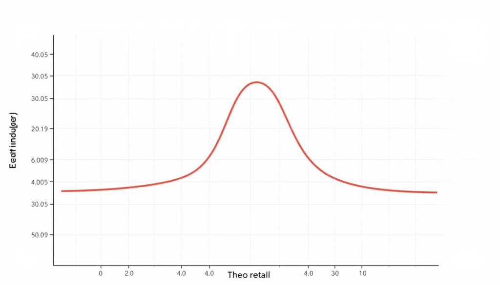
Theoretical models like normal or binomial curves rely on fixed parameters—average, standard deviation, or success probability. These assume predictable patterns. But raw sales figures, manufacturing defects, or customer wait times frequently break these rules. Empirical methods sidestep assumptions, plotting each data point’s actual frequency.
Consider a retailer analyzing purchase amounts. A normal curve might suggest 68% of transactions fall within one standard deviation of the mean. The empirical approach, however, could reveal clusters around $19.99 and $49.99—price points invisible to parametric models. This truth-telling capability makes ECDFs indispensable for detecting hidden trends.
Three critical contrasts define these methods:
- Foundation: Theoretical CDFs use predefined equations; ECDFs mirror observed values
- Flexibility: Parametric models require shape assumptions; empirical graphs adapt to irregularities
- Transparency: Mathematical curves smooth outliers; step functions highlight data’s raw edges
Financial analysts, for instance, compare theoretical risk models with empirical loss histories. Discrepancies expose flawed assumptions, prompting strategy revisions. This validation step separates robust analytics from wishful thinking.
Empirical Cumulative Distribution Function: Definition and Importance
Analysts face a critical challenge: transforming raw numbers into reliable insights without mathematical guesswork. The empirical cumulative distribution function solves this by converting observations into visual probabilities through rigorous statistical mechanics.
Key Concepts and Mathematical Foundations
At its core, this method uses a simple formula: F̂ₙ(x) = (1/n) Σ I(xᵢ ≤ x). Each observation acts as a trigger—the indicator function I counts how many values sit below any chosen threshold. For 100 data points, probabilities jump by 1% at each measurement, creating a staircase-like graph.
Three pillars uphold its reliability:
- Non-parametric design: No assumptions about mean or standard deviation
- Step-by-step accuracy: Every data point directly shapes the curve
- Self-correcting nature: Larger samples naturally align with true patterns
Properties, Consistency, and Convergence
The method’s power lies in its mathematical guarantees. As datasets grow, the Glivenko-Cantelli theorem ensures graphs converge uniformly to real-world distributions. This bridges theory and practice—analysts gain confidence that their visualizations mirror actual trends.
| Property | Impact | Practical Example |
|---|---|---|
| Unbiased | Accurate average estimates | Quality control limits |
| Consistent | Improves with more data | Risk modeling |
| Non-parametric | Works with irregular data | Startup revenue analysis |
These traits make the technique indispensable for validating machine learning models or assessing financial risks. When 95% of loan defaults fall below a specific debt ratio, that threshold becomes actionable—no advanced statistics required.
Computing and Visualizing ECDF in R
Turning raw data into actionable insights starts with mastering visualization tools in R. The ecdf() function transforms numeric vectors into stepwise probability graphs—a skill every analyst needs for quick diagnostics.
Using the ecdf() Function Effectively
R’s built-in ecdf() converts data into reusable probability calculators. For the rock dataset, Fn <- ecdf(rock$area) creates a function object. Call Fn(8000) to instantly find 62.5% of areas fall below this threshold—no manual calculations required.
Step-by-Step Guide to Plotting ECDF
Visualization takes three steps:
- Generate the ECDF object
- Plot it with
plot(Fn) - Customize axes and labels using standard R graphics
The resulting step plot reveals value clusters and gaps. Sharp vertical jumps highlight common measurements, while flat stretches show sparse data regions.
Overlaying Theoretical Distributions for Comparison
Contrast empirical results with expected patterns using:
plot(ecdf(rock$area))
curve(pnorm(x, mean(rock$area), sd(rock$area)),
      add=TRUE, col="blue")
This overlays a normal curve based on the data’s mean and standard deviation. Significant deviations between steps and the smooth line signal non-normal behavior—critical for validating assumptions.
Analysts gain a strategic edge by combining automated ECDF generation with tailored visual comparisons. These techniques turn abstract numbers into boardroom-ready evidence for data-driven strategy shifts.
Real-World Applications and Practical Interpretation
Industries transform raw measurements into strategic assets using ECDF analysis. This approach uncovers patterns that drive decisions in energy exploration, financial forecasting, and medical research—turning abstract numbers into practical insights.
Analyzing Data Distributions in Practice
Consider rock sample analysis: ECDF plots revealed a 62.5% probability of pore areas being ≤8000 units. By overlaying a normal curve with matching mean and standard deviation, analysts quickly assess distribution alignment. Tools like qqnorm() and qqline() add validation layers—critical for petroleum engineers evaluating reservoir viability.
Interpreting ECDF Plots for Decision Making
Steep graph slopes signal value clusters—like frequent product defect sizes in manufacturing. Flatter segments highlight data gaps, guiding resource allocation. Financial teams use these insights to set risk thresholds, answering questions like: “What portfolio value has a 95% survival probability during market crashes?”
Healthcare researchers apply ECDFs to patient recovery times, identifying treatment efficacy without assuming theoretical distribution shapes. The method’s adaptability makes it indispensable for compliance reporting and cross-industry benchmarking.
Conclusion
Data analysis evolves rapidly, demanding tools that reveal truths without theoretical constraints. The ECDF stands apart by transforming raw numbers into strategic maps—step-by-step visualizations showing exact value frequencies. This approach thrives where traditional models falter, adapting to unpredictable patterns in sales figures, risk assessments, or operational metrics.
Professionals gain an edge through its non-parametric design. Unlike rigid distribution assumptions, it lets data speak for itself—critical when analyzing startup growth or supply chain disruptions. Implementation in R simplifies integration, turning complex probability concepts into interactive dashboards for team collaboration.
The method’s mathematical rigor bridges theory and practice. Financial teams validate risk thresholds, while engineers pinpoint quality control limits—all using observable patterns rather than hopeful guesses. Organizations adopting this function make decisions anchored in reality, not idealized curves.
As datasets grow more chaotic, ECDF analysis becomes essential literacy. It transforms spreadsheet columns into clear action plans, proving that sometimes, the most powerful insights come from letting the data chart its own course.
FAQ
How does an ECDF differ from a traditional CDF?
An ECDF estimates the cumulative probability of real-world data points without assuming a predefined model. Traditional CDFs describe idealized distributions (like normal or binomial) mathematically. The ECDF adapts to observed data, making it practical for analyzing actual datasets.
When should analysts use probability density functions instead of ECDFs?
Density functions excel when examining the likelihood of specific values in continuous data. ECDFs are preferable for visualizing overall distribution patterns, identifying percentiles, or comparing datasets without smoothing assumptions.
What makes the ecdf() function in R valuable for data exploration?
R’s ecdf() automates the calculation of cumulative probabilities, enabling quick visualization of data spread, median identification, and outlier detection. It provides a foundation for comparing sample data against theoretical models like normal distributions.
Can ECDF plots replace histograms in data analysis?
While histograms highlight frequency clusters, ECDFs reveal precise cumulative proportions and avoid binning bias. They complement each other—use ECDFs for quantile analysis and histograms for modal trends.
How reliable are ECDFs for small datasets?
With fewer than 30 observations, ECDFs may appear step-heavy and less smooth. However, they still provide unbiased estimates of percentiles and distribution shape. Bootstrap methods can enhance reliability in such cases.
Why overlay theoretical distributions on ECDF plots?
Overlaying models (e.g., normal curves) helps assess how well assumptions fit real data. Deviations between the ECDF and theoretical line indicate potential mismatches, guiding better model selection or data transformations.
What practical insights can ECDFs offer business decision-makers?
They quantify outcomes like “75% of customers wait under 5 minutes” or “10% of sales exceed
FAQ
How does an ECDF differ from a traditional CDF?
An ECDF estimates the cumulative probability of real-world data points without assuming a predefined model. Traditional CDFs describe idealized distributions (like normal or binomial) mathematically. The ECDF adapts to observed data, making it practical for analyzing actual datasets.
When should analysts use probability density functions instead of ECDFs?
Density functions excel when examining the likelihood of specific values in continuous data. ECDFs are preferable for visualizing overall distribution patterns, identifying percentiles, or comparing datasets without smoothing assumptions.
What makes the ecdf() function in R valuable for data exploration?
R’s ecdf() automates the calculation of cumulative probabilities, enabling quick visualization of data spread, median identification, and outlier detection. It provides a foundation for comparing sample data against theoretical models like normal distributions.
Can ECDF plots replace histograms in data analysis?
While histograms highlight frequency clusters, ECDFs reveal precise cumulative proportions and avoid binning bias. They complement each other—use ECDFs for quantile analysis and histograms for modal trends.
How reliable are ECDFs for small datasets?
With fewer than 30 observations, ECDFs may appear step-heavy and less smooth. However, they still provide unbiased estimates of percentiles and distribution shape. Bootstrap methods can enhance reliability in such cases.
Why overlay theoretical distributions on ECDF plots?
Overlaying models (e.g., normal curves) helps assess how well assumptions fit real data. Deviations between the ECDF and theoretical line indicate potential mismatches, guiding better model selection or data transformations.
What practical insights can ECDFs offer business decision-makers?
They quantify outcomes like “75% of customers wait under 5 minutes” or “10% of sales exceed $1,000.” Such clear thresholds support resource allocation, risk assessment, and performance benchmarking without complex statistical jargon.
,000.” Such clear thresholds support resource allocation, risk assessment, and performance benchmarking without complex statistical jargon.
